In this Angular Material tutorial, we’re going to learn How to add a File Browse button with an Input text field to show names of files selected by using the Material library components.
When using the Material UI components in the Angular project to create a Form, we always miss control for uploading a file.
Like in Bootstrap there is a customized control, which can be used in place of an Input: file. This looks like this

To add a similar Form control, I tried to create a mix of a few Material components to have something similar. So I created this
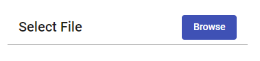
Let’s quickly check how to build this file browse control in Angular using Material components.
Importing Material Components
To create a Browse component package, we need to import a few Material component modules, including MatToolbarModule, MatButtonModule, MatFormFieldModule and MatInputModule
After updating the app.module.ts file will look like this
import { BrowserModule } from '@angular/platform-browser';
import { NgModule } from '@angular/core';

import { AppComponent } from './app.component';
import { BrowserAnimationsModule } from '@angular/platform-browser/animations';

import { FormsModule } from '@angular/forms';

import { MatButtonModule } from '@angular/material/button';
import { MatToolbarModule } from '@angular/material/toolbar';
import { MatFormFieldModule } from '@angular/material/form-field';
import { MatInputModule } from '@angular/material/input';


@NgModule({
  declarations: [
    AppComponent
  ],
  imports: [

    FormsModule,
    BrowserModule,
    BrowserAnimationsModule,

    MatToolbarModule,
    MatButtonModule,
    MatFormFieldModule,
    MatInputModule
  ],
  providers: [],
  bootstrap: [AppComponent]
})
export class AppModule { }
Adding Form with Browse File Button
In the template add the following <mat-form-field />
<mat-form-field>

    <div class="myfilebrowser">

      <mat-toolbar>

        <!-- Readonly Input to show File names -->
        <input matInput [(ngModel)]="myfilename" readonly name="memberContactNo" />

        <!-- Browse Button -->
        <button mat-flat-button color="primary">
          Browse
        </button>

      </mat-toolbar>

      <!-- Fetch selected filed on change -->
      <input type="file" #UploadFileInput id="fileUpload" (change)="fileChangeEvent($event)" name="fileUpload"
        multiple="multiple" accept="image/*" />

    </div>

</mat-form-field>
Here we have a <mat-toolbar> to align a text field with readOnly and button control. They are wrapped inside a div with class="myfilebrowser" to add some custom style.
The <input type="file" /> control is placed on the top of the text field and button by using position:absolute; , so that whenever a user clicks, the file selection window will open.
The input: file control is having (change) event listener to fetch selected files and update the input: text filed with file names.
There is also a template variable #UploadFileInput to reset any previous file selected to enable a user to select a previously selected file again otherwise which is not possible.
Update the Component Class
In the component class, we’ll add the method called on (change) event
import { Component, ViewChild, ElementRef } from '@angular/core';

@Component({
  selector: 'app-root',
  templateUrl: './app.component.html',
  styleUrls: ['./app.component.scss']
})
export class AppComponent {
  title = 'angular-material-file-upload-app';

  @ViewChild('UploadFileInput') uploadFileInput: ElementRef;
  myfilename = 'Select File';


  fileChangeEvent(fileInput: any) {

    if (fileInput.target.files && fileInput.target.files[0]) {


      this.myfilename = '';
      Array.from(fileInput.target.files).forEach((file: File) => {
        console.log(file);
        this.myfilename += file.name + ',';
      });

      const reader = new FileReader();
      reader.onload = (e: any) => {
        const image = new Image();
        image.src = e.target.result;
        image.onload = rs => {

          // Return Base64 Data URL
          const imgBase64Path = e.target.result;

        };
      };
      reader.readAsDataURL(fileInput.target.files[0]);

      // Reset File Input to Selct Same file again
      this.uploadFileInput.nativeElement.value = "";
    } else {
      this.myfilename = 'Select File';
    }
  }

}
You can handle events inside the fileChangeEvent method like uploading the file straight away or set model to upload when the complete form is submitted.
Add CSS Style
There is also a small CSS custom code to position the input:file button and a few arrangements for the toolbar component.
.myform-wrapper {
    margin: 50px;
    width: 350px;

    .mat-form-field {
        width: 100%;
    }

    .mat-toolbar-single-row {
        height: auto !important;
        background: transparent;

        button {
            width: 30%;
        }
    }
}

#fileUpload {
    position: absolute;
    z-index: 9;
    opacity: 0;
    height: 100%;
    width: 100%;
    left: 0px;
    top: 0px;
    cursor: pointer;
}
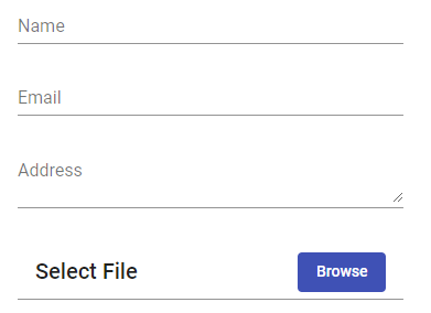
The file browse control we created can be easily used with other elements to match the style
Conclusion
We managed to create a File Browse control using Material components which can be used to mix with other form controls easily. You can also check this post on how to upload file in base64 format with validation of file size and file type.