In this tutorial, we will install Ng Bootstrap in the Angular project and learn How to implement Bootstrap Modals in our Angular application.
Modals are dialogue box/ popup UI containers that are used to display content on top of others. It floats in the center of the screen which can be closed after actions.
Angular Bootstrap Modal will look like this after installation:
What is ng-bootstrap?
NgBootrap is the Angular adapted version of Bootstrap UI components. Using ng-bootstrap we can easily integrate the bootstrap library to our Angular project and use its awesome UI components very easily.
Why bootstrap is used in angular?
Using Bootstrap in the Angular project makes UI development very smooth. Bootstrap is tried and tested and fully responsive for multiple platforms and screen sizes. Moreover, it is now an industrial standard adopted almost everywhere.
Is angular material better than bootstrap?
According to my for UI development in Angular project Material is recommended due to its compatibility, but personally, I favor NgBootstrap as it is easier and integrates its components, and theming or customization proves much simpler than Material components.
Let’s start…
#Update Angular CLI
Angular CLI tool needs to be updated for creating an Angular project with the latest stable version. Here we are currently using version 9.1.3. You can update the Angular CLI to the latest version by running following command
$ npm install -g @angular/cli
#Create New Angular Project
Run following ng command in the terminal and answer a few configuration questions to create a new Angular project.
$ ng new angular-bootstrap-datepicker-tutorial
? Would you like to add Angular routing? Yes
? Which stylesheet format would you like to use? CSS
Move to the project director
$ cd angular-bootstrap-datepicker-tutorialIf you have Visual Studio Code installed then run the following command to open the project in VS Code directly.
$ code .
#Install and Configure the ng-bootstrap package
After successfully setting up the Angular project, now we will install the ng-bootstrap package by executing below npm command at the project root.
$ npm install --save @ng-bootstrap/ng-bootstrapNote: To install any previous version of ng-bootstrap to support older Angular version, you can add @x after the above command. For example, the Angular 7, run $ npm install --save @ng-bootstrap/ng-bootstrap@4
#Adding Bootstrap Styling
The ng-bootstrap includes UI component modules only, to add styling to these components we need to include bootstrap.css styling file in the index.html at Angular project root
<link rel="stylesheet" href="https://stackpath.bootstrapcdn.com/bootstrap/4.4.1/css/bootstrap.min.css" >
#Import Bootstrap Module
To use ng-bootstrap UI components across the application, we need to import the NgbModule in the App’s main module.
Import NgbModule ( Bootstrap module ) & FormsModule ( for Angular as we’ll use [(ngModel)] ) in the app.module.ts file
import { BrowserModule } from '@angular/platform-browser';
import { NgModule } from '@angular/core';

import { AppComponent } from './app.component';

import { NgbModule } from '@ng-bootstrap/ng-bootstrap';
import { FormsModule } from '@angular/forms';

@NgModule({
  declarations: [
    AppComponent
  ],
  imports: [
    BrowserModule,
    FormsModule,
    NgbModule
  ],
  providers: [],
  bootstrap: [AppComponent]
})
export class AppModule { }
That’s it we are done with ng-bootstrap setup and configuration part. Next, we will check how to use Bootstrap Modal components.
Use Angular Bootstrap Modal in Component using Template
To Bootstrap modals in components add an ng-template container with the let-modal directive and a TemplateRef variable #mymodal
<ng-template #mymodal let-modal>
<div class="modal-header">
<h4 class="modal-title" id="modal-basic-title">Bootstrap Modal</h4>
<button type="button" class="close" aria-label="Close" (click)="modal.dismiss('Cross click')">
<span aria-hidden="true">×</span>
</button>
</div>
<div class="modal-body">
Here I am!
</div>
<div class="modal-footer">
<button type="button" class="btn btn-outline-dark" (click)="modal.close('Save click')">Ok</button>
</div>
</ng-template>To open this modal add following button with a (click) event calling the open() method which is passing the TemplateRef.
<button class="btn btn-lg btn-outline-primary" (click)="open(mymodal)">Open My Modal</button>In the component class import NgbModal , ModalDismissReasons and NgbModalOptions classes. Also, add NgbModal in class constructor to provide its methods.
// app.component.ts
import { Component } from '@angular/core';

import {NgbModal, ModalDismissReasons, NgbModalOptions} from '@ng-bootstrap/ng-bootstrap';

@Component({
  selector: 'app-root',
  templateUrl: './app.component.html',
  styleUrls: ['./app.component.css']
})
export class AppComponent {
  title = 'ng-bootstrap-modal-demo';
  closeResult: string;
  modalOptions:NgbModalOptions;

  constructor(
    private modalService: NgbModal
  ){
    this.modalOptions = {
      backdrop:'static',
      backdropClass:'customBackdrop'
    }
  }

  open(content) {
    this.modalService.open(content, this.modalOptions).result.then((result) => {
      this.closeResult = `Closed with: ${result}`;
    }, (reason) => {
      this.closeResult = `Dismissed ${this.getDismissReason(reason)}`;
    });
  }

  private getDismissReason(reason: any): string {
    if (reason === ModalDismissReasons.ESC) {
      return 'by pressing ESC';
    } else if (reason === ModalDismissReasons.BACKDROP_CLICK) {
      return 'by clicking on a backdrop';
    } else {
      return  `with: ${reason}`;
    }
  }
}
<strong>NgbModal</strong> provides from methods
<strong>open</strong>: Opens a new modal window with the specified content and supplied options.
dismissAll: Dismisses all currently displayed modal windows with the supplied reason.
hasOpenModals: Indicates if there are currently any open modal windows in the application.
ModalDismissReasons: It is used to identify the method used to close the modal ie. using ESC key or clicking on Babkdrop area.
<strong>NgbModalOptions</strong> is used to configure Modal which can have the following properties:
<strong>backdrop</strong>: It is the shadow created on Modal back, default is true, if set to 'static'then Modal doesn’t close on clicking outside.
<strong>backdropClass</strong>: Append custom class to modal backdrop element.
<strong>beforeDismiss</strong>: Callback triggered before modal is dismissed.
<strong>centered</strong>: If set to true modal is vertically centred, default is false.
<strong>container</strong>: To specify the element to which new modal is appended, the default is the body.
<strong>size</strong>: Modal window size can be set with "sm" | "lg" | "xl"
Open Model using Component
Instead of added ng-template in the same component which we did above, we can have a separate component to show Modal content for that we simply pass our Modal Component in open method.
Note: Don’t forget to add the modal component in entryComponents array as well in app.module.ts file as these are loaded dynamically.
Check below steps to create:
Step 1) Run following NG command to create a new component mymodalcomponent
$ ng generate component mymodalcomponent
Step 2) Open app.module.ts file to add mymodalcomponent in the declarations as well as in the entryComponents array:
// app.module.ts
import { BrowserModule } from '@angular/platform-browser';
import { NgModule } from '@angular/core';

import { AppRoutingModule } from './app-routing.module';
import { AppComponent } from './app.component';

import { NgbModule } from '@ng-bootstrap/ng-bootstrap';
import { MymodalComponent } from './mymodal/mymodal.component';

@NgModule({
  declarations: [
    AppComponent,
    MymodalComponent
  ],
  imports: [
    BrowserModule,
    AppRoutingModule,
    NgbModule
  ],
  entryComponents:[
    MymodalComponent
  ],
  providers: [],
  bootstrap: [AppComponent]
})
export class AppModule { }
Step 3) In the mymodal.component.ts import NgbActiveModal to use modal methods. Here we are getting Title and Content as dynamic values sent from App component using @input decorators
// mymodal.component.ts
import { Component, OnInit, Input } from '@angular/core';
import { NgbActiveModal } from '@ng-bootstrap/ng-bootstrap';
@Component({
  selector: 'app-mymodal',
  templateUrl: './mymodal.component.html',
  styleUrls: ['./mymodal.component.css']
})
export class MymodalComponent implements OnInit {

  @Input() my_modal_title;
  @Input() my_modal_content;

  constructor(public activeModal: NgbActiveModal) {}

  ngOnInit() {
  }

}
Step 4) Update mymodal.component.html file with below code. This will show dynamic Title and Content.
<div class="modal-header">
<h4 class="modal-title">{{my_modal_title}}</h4>
<button type="button" class="close" aria-label="Close" (click)="activeModal.dismiss('Cross click')">
<span aria-hidden="true">×</span>
</button>
</div>
<div class="modal-body">
<p> {{my_modal_content}}</p>
</div>
<div class="modal-footer">
<button type="button" class="btn btn-outline-dark" (click)="activeModal.close('Close click')">Close</button>
</div>Now we will call from App component having a template button with open method:
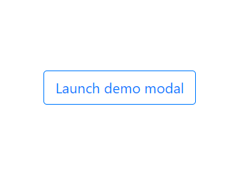
<button class="btn btn-lg btn-outline-primary" (click)="open()">Launch demo modal</button>In app.component.ts file add the open method declaration as shown below:
  open() {
    const modalRef = this.modalService.open(MymodalComponent);
    modalRef.componentInstance.my_modal_title = 'I your title';
    modalRef.componentInstance.my_modal_content = 'I am your content';
  }
Conclusion
So in the above post, we discussed how to install Ng Bootstrap in Angular project and how to add a Modal using NgTemplate and Component method while passing dynamic values using @input decorator.