We have already discussed other Image and Content carousel-like Slick and Swiper to implement in Angular application. Swiper is a very popular carousel which also used with Ionic known as Slides.
Update: This library is not supported by the latest Angular version. You can check this latest Owl Carousel 2 for Angular without using jQuery.
In this post, we will discuss another very popular Image/ Content Carousel know as Owl Carousel 2. Owl Carousel 2 is a jQuery plugin with very powerful features like Responsive layout, Autoplay, Auto Width support, a wide number of options to make highly customizable Carousel. You can also check the official website to check various demos.
Here we will implement Owl Carousel 2 with custom Navigation in Angular’s latest version 8. We will use Angular CLI to create new Angular project.
Also, See:
Slick Carousel in Angular 6/7
Swiper Carousel in Angular 6/7
Owl Carousel 2 with Custom Navigation in jQuery
Before we start make sure you have the latest version on Angular CLI installed
Install latest Angular CLI
$ npm install -g @angular/cli</pre> Create a new project <pre class="wp-block-prismatic-blocks"><code class="language-javascript">$ ng new NgOwlCarousel2Demo $ cd NgOwlCarousel2Demo</pre> we have not used routing and styling is CSS. <strong>Install Owl Carousel in Angular Project</strong> Next, we will install the npm package for Owl Carousel and also jQuery dependency. Run following CLI command to install <pre class="wp-block-prismatic-blocks"><code class="language-javascript">$ npm install jquery --save $ npm i ngx-owl-carousel --save</pre> As we have installed jQuery and Owl Carousel 2 packages, we will include these libraries in <strong>angular.json</strong> file <pre class="wp-block-prismatic-blocks"><code class="language-javascript">... ... "styles": [ "src/styles.css", "./node_modules/owl.carousel/dist/assets/owl.carousel.css", "./node_modules/owl.carousel/dist/assets/owl.theme.default.css" ], "scripts": [ "./node_modules/jquery/dist/jquery.js", "./node_modules/owl.carousel/dist/owl.carousel.js" ], ... ...</pre> In the<strong> app.module.ts</strong> file, after importing Owl Module then add in <em>Imports</em> array as shown below <pre class="lang:js mark:7,15 decode:true">import { BrowserModule } from '@angular/platform-browser'; import { NgModule } from '@angular/core'; import { AppComponent } from './app.component'; // Import your library import { OwlModule } from 'ngx-owl-carousel'; @NgModule({ declarations: [ AppComponent ], imports: [ BrowserModule, OwlModule ], providers: [], bootstrap: [AppComponent] }) export class AppModule { } </pre> Add Owl Carousel's directive in the <strong>app.component.html</strong> file <pre class="wp-block-prismatic-blocks"><code class="language-javascript"> <owl-carousel [options]="carouselOptions" [items]="images" [carouselClasses]="['owl-theme', 'row', 'sliding']"> <div class="item" *ngFor="let image of images;let i= index"> <img class="slide-image" src="{{image.image}}" > <div class="slide-text"> <h4>{{image.text}}</h4> </div> </div> </owl-carousel></pre> <code><strong>[options]</strong>: will take an object with options for Owl Carousel. You can check more options here<strong>[items]</strong>: used if items are dynamically changed. It is the same item object which is provided in*ngForIn the app.component.ts file, we will add items and options objects.import { Component } from '@angular/core'; @Component({ selector: 'app-root', templateUrl: './app.component.html', styleUrls: ['./app.component.css'] }) export class AppComponent { title = 'OwlCarousel2 in Angular7 with Custom Navigation Arrows'; carouselOptions = { margin: 25, nav: true, navText: ["<div class='nav-btn prev-slide'></div>", "<div class='nav-btn next-slide'></div>"], responsiveClass: true, responsive: { 0: { items: 1, nav: true }, 600: { items: 1, nav: true }, 1000: { items: 2, nav: true, loop: false }, 1500: { items: 3, nav: true, loop: false } } } images = [ { text: "Everfresh Flowers", image: "https://freakyjolly.com/demo/jquery/PreloadJS/images/1.jpg" }, { text: "Festive Deer", image: "https://freakyjolly.com/demo/jquery/PreloadJS/images/2.jpg" }, { text: "Morning Greens", image: "https://freakyjolly.com/demo/jquery/PreloadJS/images/3.jpg" }, { text: "Bunch of Love", image: "https://freakyjolly.com/demo/jquery/PreloadJS/images/4.jpg" }, { text: "Blue Clear", image: "https://freakyjolly.com/demo/jquery/PreloadJS/images/5.jpg" }, { text: "Evening Clouds", image: "https://freakyjolly.com/demo/jquery/PreloadJS/images/7.jpg" }, { text: "Fontains in Shadows", image: "https://freakyjolly.com/demo/jquery/PreloadJS/images/8.jpg" }, { text: "Kites in the Sky", image: "https://freakyjolly.com/demo/jquery/PreloadJS/images/9.jpg" }, { text: "Sun Streak", image: "https://freakyjolly.com/demo/jquery/PreloadJS/images/10.jpg" } ] }In the above code, we have custom Navigation HTML added which is optional.
In addition, if you want to change navigation arrows with stylish images, add following CSS in the styles.css file
.owl-carousel { width: 90% !important; margin: 10% auto; } .owl-carousel .owl-nav { overflow: hidden; height: 0px; } .owl-carousel .nav-btn { height: 47px; position: absolute; width: 26px; cursor: pointer; top: 30% !important; } .owl-carousel .owl-prev.disabled, .owl-carousel .owl-next.disabled { pointer-events: none; opacity: 0.2; } .owl-carousel .prev-slide { background: url(./assets/images/nav-icon.png) no-repeat scroll 0 0; left: -33px; } .owl-carousel .next-slide { background: url(./assets/images/nav-icon.png) no-repeat scroll -24px 0px; right: -33px; } .owl-carousel .prev-slide:hover { background-position: 0px -53px; } .owl-carousel .next-slide:hover { background-position: -24px -53px; }Find the navigation image in jQuery demo here
Now you can run the application in a browser by running
$ ng serve --open
Update: This library is not supported by the latest Angular version. You can check this latest Owl Carousel 2 for Angular without using jQuery.
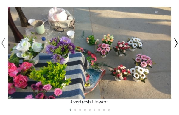
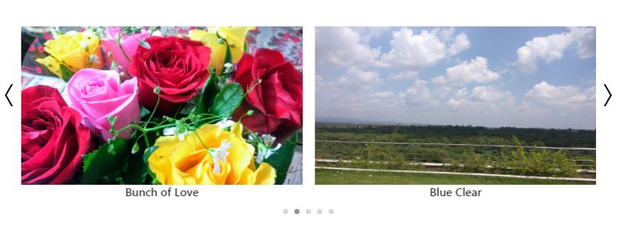
above are screenshots of OwlCarousel 2 in responsive mode.
So by using the above method, you can easily add a responsive Image/ Content Slider in Angular application in a few steps.
Category: Angular

Leave a Reply