In this post, we’ll discuss how to add Owl Carousel 2 in Angular application using the ngx-owl-carousel-o package. This package doesn’t need any jQuery support like the ngx-owl-carousel package.
The Owl Carousel 2 is one of the most popular images and content slider library. It provides a number of feature which makes it compatible and fully controlled and customizable carousel plugin. Moreover, its awsome support for the responsive environment makes it a better choice.
In this tutorial, we will discuss how to add Owl Carousel 2 in Angular’s latest version 9 using the ngx-owl-carousel-o package.
Here we will discuss all features, options, and events to fully customize and control the view of Owl Carousel 2.
Let’s begin!
Install the latest version of Angular using the below command,
$ npm install -g @angular/cli</pre> or update it to the latest version 9 by following steps explained <a href="https://www.freakyjolly.com/upgrade-angular/" target="_blank" rel="noopener noreferrer">here</a>. <h3></h3> <h3>1) Install Owl Carousel</h3> To install Owl Carousel in Angular project, open terminal at project root and run following NPM command: <pre class="wp-block-prismatic-blocks"><code class="language-javascript">$ npm install ngx-owl-carousel-o</pre> <h3></h3> <h3>2) Update App Module</h3> For using Owl Carousel component in project, open the app.module.ts file them import <code>CarouselModuleand alsoBrowserAnimationsModuleto enable an animation on carousel slide.// app.module.ts import { BrowserModule } from '@angular/platform-browser'; import { NgModule } from '@angular/core'; import { AppComponent } from './app.component'; import { AppRoutingModule } from './app-routing.module'; import { OwlCarouselDemoComponent } from './components/owl-carousel-demo/owl-carousel-demo.component'; import { BrowserAnimationsModule } from '@angular/platform-browser/animations'; import { CarouselModule } from 'ngx-owl-carousel-o'; @NgModule({ declarations: [ AppComponent, OwlCarouselDemoComponent ], imports: [ BrowserModule, AppRoutingModule, BrowserAnimationsModule, CarouselModule ], providers: [], bootstrap: [AppComponent] }) export class AppModule { }Note: For demo purpose, we created a new component OwlCarouselDemoComponent, just run $ ng generate component components/owl-carousel-demo to quickly create one.
3) Adding CSS/ SCSS for Carousel
There two methods to add stylings in the project for carousel
Update the angular.json file's styles property:
... ], "styles": [ "node_modules/ngx-owl-carousel-o/lib/styles/prebuilt-themes/owl.carousel.min.css", "node_modules/ngx-owl-carousel-o/lib/styles/prebuilt-themes/owl.theme.default.min.css", "src/styles.css" ], ...Or by adding imports in src/styles.sass or src/styles.scss:
@import '~ngx-owl-carousel-o/lib/styles/scss/owl.carousel'; @import '~ngx-owl-carousel-o/lib/styles/scss/owl.theme.default';</pre> <h3></h3> <h3>4) Adding Simple Owl Carousel</h3> The simplest implementation of Owl Carousel starts by importing <code>OwlOptionsin component class which is used to configure the carousel properties:// owl-carousel-demo.component.ts import { Component, OnInit } from '@angular/core'; import { OwlOptions } from 'ngx-owl-carousel-o'; @Component({ selector: 'app-owl-carousel-demo', templateUrl: './owl-carousel-demo.component.html', styleUrls: ['./owl-carousel-demo.component.css'] }) export class OwlCarouselDemoComponent implements OnInit { customOptions: OwlOptions = { loop: true, mouseDrag: false, touchDrag: false, pullDrag: false, dots: false, navSpeed: 700, navText: ['Previous', 'Next'], responsive: { 0: { items: 1 }, 400: { items: 2 }, 740: { items: 3 }, 940: { items: 4 } }, nav: true } constructor() { } ngOnInit(): void { } }
In the owl-carousel-demo.component.html file add an
owl-carousel-odirective component to wrap multiplecarouselSlidedirective for each slide as shown below:<owl-carousel-o [options]="customOptions"> <ng-template carouselSlide> <div class="slide"> <img src="https://i.picsum.photos/id/905/400/300.jpg"> </div> </ng-template> <ng-template carouselSlide> <div class="slide"> <img src="https://i.picsum.photos/id/507/400/300.jpg"> </div> </ng-template> <ng-template carouselSlide> <div class="slide"> <img src="https://i.picsum.photos/id/609/400/300.jpg"> </div> </ng-template> <ng-template carouselSlide> <div class="slide"> <img src="https://i.picsum.photos/id/995/400/300.jpg"> </div> </ng-template> <ng-template carouselSlide> <div class="slide"> <img src="https://i.picsum.photos/id/1054/400/300.jpg"> </div> </ng-template> </owl-carousel-o></pre> This will create Owl carousel which looks like this: <a href="https://www.freakyjolly.com/wp-content/uploads/2020/02/angular-owl-carousel-2-demo-1.gif"><img class="aligncenter size-full wp-image-3189" src="https://www.freakyjolly.com/wp-content/uploads/2020/02/angular-owl-carousel-2-demo-1.gif" alt="" width="800" height="244" /></a> <h3></h3> <h3>Using Dynamic Object of Slides</h3> Slides in an Owl Carousel can be generated by looping over an object using <strong><code>*ngFordirective as shown below:<owl-carousel-o [options]="customOptions"> <ng-template carouselSlide *ngFor="let slide of slidesStore" [id]="slide.id"> <img [src]="slide.src" [alt]="slide.alt" [title]="slide.title"> </ng-template> </owl-carousel-o>with an object
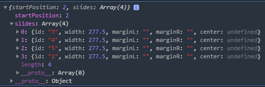
slidesStorewith a local or server-side response:... slidesStore = [ { id:1, src:'https://i.picsum.photos/id/976/400/250.jpg', alt:'Image_1', title:'Image_1' }, { id:2, src:'https://i.picsum.photos/id/996/400/250.jpg', alt:'Image_2', title:'Image_3' }, { id:3, src:'https://i.picsum.photos/id/400/400/250.jpg', alt:'Image_3', title:'Image_3' }, { id:4, src:'https://i.picsum.photos/id/316/400/250.jpg', alt:'Image_4', title:'Image_4' }, { id:5, src:'https://i.picsum.photos/id/705/400/250.jpg', alt:'Image_5', title:'Image_5' } ] constructor() { }</pre> <h2></h2> <h2>Event & Methods</h2> Let's check some events available for the carousel. <h3></h3> <h3><code>translatedThis is fired after the carousel finishes the slide event or transitional animations. It returns the starting slide and set of visible slides.<owl-carousel-o [options]="customOptions" (translated)="getPassedData($event)" > <ng-template carouselSlide *ngFor="let slide of slidesStore" [id]="slide.id"> <img [src]="slide.src" [alt]="slide.alt" [title]="slide.title"> </ng-template> </owl-carousel-o>// owl-carousel-demo.component.ts import { Component, OnInit } from '@angular/core'; import { SlidesOutputData, OwlOptions } from 'ngx-owl-carousel-o'; @Component({ selector: 'app-owl-carousel-demo', templateUrl: './owl-carousel-demo.component.html', styleUrls: ['./owl-carousel-demo.component.css'] }) export class OwlCarouselDemoComponent implements OnInit { customOptions: OwlOptions = { ... } slidesStore = [ ... ] activeSlides: SlidesOutputData; constructor() { } getPassedData(data: SlidesOutputData) { this.activeSlides = data; console.log(this.activeSlides); } ngOnInit(): void { } }
draggingThis is fired after the user starts or stops dragging the carousel, return
trueon start andfalsewhen stops.<owl-carousel-o [options]="customOptions" (dragging)="startDragging($event.dragging)" > ... ... </owl-carousel-o>... startDragging(event){ console.log(event); } ...</pre> <h3></h3> <h3><code>initializedThis is fired when the carousel initialized after page loads.<owl-carousel-o [options]="customOptions" (initialized)="getData($event)" > ... </owl-carousel-o>... getData(data: SlidesOutputData) { console.log(data); } ...</pre> <h3></h3> <h3><code>changeIt fires after each change in the carousel (click on dots, nav buttons).<owl-carousel-o [options]="customOptions" (change)="getData($event)" > ... </owl-carousel-o>
changedIt fires when the user clicks dots or nav buttons and new data about active slides becomes known.
<owl-carousel-o [options]="customOptions" (changed)="getData($event)" > ... </owl-carousel-o>
Conclusion: The ngx-owl-carousel-o package provides an awesome component to use the Owl Carousel 2 image and content slider in Angular application with the latest version. The Owl Carousel 2 carousel gives a lot of flexibility and responsive support which makes it one of the topmost preferred slider for web applications.
Category: Angular