In this article, you will learn how to use MUI or Material UI components in the Next js application with examples including Buttons, Cards, Forms having Form fields with Radio lists, Datatables, Dialog boxes etc.
MUI aka Material UI is a popular React component library that provides Google’s Material UI design. MUI provides a number of accessible, responsive and customizable components which can be easily used to build our application’s UI.
Next.js is a widely used React framework used to build server-side rendered React applications. It provides various top-notch features like static site generation, server-side rendering, resource prefetching and much more…
By using MUI with Next js we can easily enhance the development experience and provide user-friendly applications with optimised UI components at hand. Let’s walk through quick steps to start using MUI Component in your Next js application with examples.
How to use MUI or Material UI components in the Next js application?
Follow these quick steps to integrate MUI, configure and use UI components in the Next js app:
Step 1 – Create Next Js Application
Step 2 – Install MUI Libraries for Next js
Step 3 – Configure Theme Object
Step 4 – Import MUI CSS Style
Step 5 – Example MUI Components
Step 1 – Create Next Js Application
First of all, let’s create a new Next js application by executing below create-next-app npx command by providing the app name:
npx create-next-app@11 my-app
Enter into the application directory:
cd my-app
To run the application on the local web server, execute the following command:
npm run dev
Step 2 – Install MUI Libraries for Next js
To use MUI component in the Next js app, we will install the @mui/material, @emotion/react and @emotion/styledpackages by executing the below command:
npm install @mui/material @emotion/react @emotion/styledThe @emotion/react package is a peer dependency of MUI which is used for styling purposes.
Step 3 – Configure Theme Object
Thereafter we will create a theme object in our application root folder with the name theme.js with the following content in it:
// theme.js

import { createTheme } from "@mui/material/styles";

const theme = createTheme({
  // theme settings
});

export default theme;
We need to have a theme.js object file for:
- Centralize theme customization – Common place to define color palette, typography, etc in one place rather than duplicating it.
- Provide theme to components – The theme file exports the theme object which can be provided globally via ThemeProvider.
- Override MUI styles – To customize MUI component style defaults like color, sizing, etc.
- Dark/light mode – Easily switch between dark and light themes.
- Access theme in components – Use the useTheme hook to access the theme for dynamic styles.
- Custom components – Create custom components wrapped with styled() that use the theme.
- Responsive styles – Set responsive breakpoints, styles in the theme.
Step 4 – Import MUI CSS Style
Now, we need to import the MUI CSS into the application. For that open the _app.js file and wrap our app in the ThemeProvider which allows us to access the theme in our components as shown below:
import '../styles/globals.css'
import { ThemeProvider } from '@mui/material/styles';
import theme from "../theme";
function MyApp({ Component, pageProps }) {
  return (
    <ThemeProvider theme={theme}>
      <Component {...pageProps} />
    </ThemeProvider>
  )
}

export default MyApp
Step 5 – Example MUI Components
We are ready to use the MUI components in our Next.js app! lets create simple pages to demonstrate them one by one:
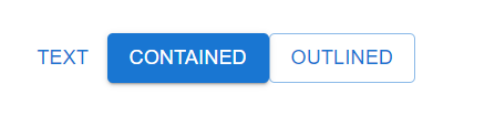
Buttons Page
This page demonstrates the different MUI Button variants.
// pages/buttons.js

import Button from '@mui/material/Button';

export default function Buttons() {
  return (
    <div>
      <Button variant="text">Text</Button>
      <Button variant="contained">Contained</Button>
      <Button variant="outlined">Outlined</Button>
    </div>
  );
}
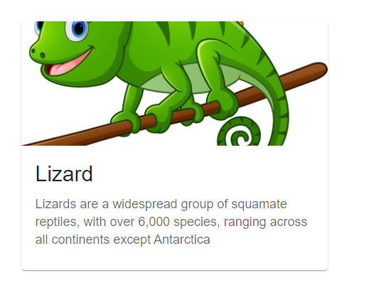
Cards Page
This shows a Card with Media and Content.
// pages/cards.js

import Card from '@mui/material/Card';
import CardContent from '@mui/material/CardContent';
import CardMedia from '@mui/material/CardMedia';
import Typography from '@mui/material/Typography';

export default function Cards() {
  return (
    <Card sx={{ maxWidth: 345 }}>
      <CardMedia
        component="img"
        height="140"
        image="/image.png"
        alt="green iguana"
      />
      <CardContent>
        <Typography gutterBottom variant="h5" component="div">
          Lizard
        </Typography>
        <Typography variant="body2" color="text.secondary">
          Lizards are a widespread group of squamate reptiles, with over 6,000
          species, ranging across all continents except Antarctica
        </Typography>
      </CardContent>
    </Card>
  );
}
Dialogs Page
// pages/dialogs.js

import Dialog from '@mui/material/Dialog';
import DialogActions from '@mui/material/DialogActions';
import DialogContent from '@mui/material/DialogContent';
import DialogContentText from '@mui/material/DialogContentText';
import DialogTitle from '@mui/material/DialogTitle';
import Button from '@mui/material/Button';
import { useState } from 'react';

export default function Dialogs() {
  const [open, setOpen] = useState(false);

  const handleClickOpen = () => {
    setOpen(true);
  };

  const handleClose = () => {
    setOpen(false);
  };

  return (
    <div>
      <Button variant="outlined" onClick={handleClickOpen}>
        Open Dialog
      </Button>
      <Dialog open={open} onClose={handleClose}>
        <DialogTitle>Dialog Title</DialogTitle>
        <DialogContent>
          <DialogContentText>
            This is an example dialog popup.
          </DialogContentText>
        </DialogContent>
        <DialogActions>
          <Button onClick={handleClose}>Close</Button>
        </DialogActions>
      </Dialog>
    </div>
  );
}
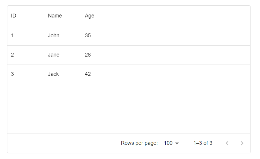
Data Grid
Make sure to install the following package to use MUI Data grids:
npm install @mui/x-data-grid// pages/datagrid.js
import { DataGrid } from '@mui/x-data-grid';
const columns = [
{ field: 'id', headerName: 'ID' },
{ field: 'name', headerName: 'Name'},
{ field: 'age', headerName: 'Age' },
];
const rows = [
{ id: 1, name: 'John', age: 35 },
{ id: 2, name: 'Jane', age: 28 },
{ id: 3, name: 'Jack', age: 42 },
];
export default function DataGridDemo() {
return (
<div style={{ height: 400, width: '100%' }}>
<DataGrid
rows={rows}
columns={columns}
/>
</div>
);
}
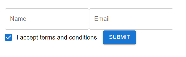
Forms Page
This page will have Form Controls, Checkboxes and Text field.
// pages/form.js

import {
  Button,
  Checkbox,
  FormControlLabel,
  TextField } from '@mui/material';

export default function Form() {
  return (
    <form>
      <TextField label="Name" />

      <TextField
        label="Email"
        type="email"
      />

      <FormControlLabel
        control={<Checkbox />}
        label="I accept terms and conditions"
      />

      <Button type="submit" variant="contained">
        Submit
      </Button>
    </form>
  );
}
Radio Buttons
There will be a Radio List to select a value from
// pages/radiolist.js

import {
  FormControl,
  FormLabel,
  RadioGroup,
  FormControlLabel,
  Radio
} from '@mui/material';

export default function RadioList() {
  return (
    <FormControl>
      <FormLabel>Gender</FormLabel>
      <RadioGroup
        name="gender"
        defaultValue="female"
      >
        <FormControlLabel
          value="female"
          control={<Radio />}
          label="Female"
        />
        <FormControlLabel
          value="male"
          control={<Radio />}
          label="Male"
        />
        <FormControlLabel
          value="other"
          control={<Radio />}
          label="Other"
        />
      </RadioGroup>
    </FormControl>
  );
}
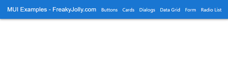
Let’s link all these pages in the index.js main landing page using the MUI Navigation component. Open the ~pages/index.js file and update it with the following:
// pages/index.js

import * as React from "react";
import Link from "next/link";
import { AppBar, Toolbar, Typography, Box } from "@mui/material";

export default function Index() {
  return (
    <Box sx={{ flexGrow: 1 }}>
      <AppBar position="static">
        <Toolbar>
          <Typography variant="h6" component="div" sx={{ flexGrow: 1 }}>
            MUI Examples
          </Typography>

          <Box sx={{ display: "flex", gap: 2 }}>
            <Link href="/buttons">Buttons</Link>

            <Link href="/cards">Cards</Link>

            <Link href="/dialogs">Dialogs</Link>

            <Link href="/datagrid">Data Grid</Link>

            <Link href="/form">Form</Link>

            <Link href="/radiolist">Radio List</Link>
          </Box>
        </Toolbar>
      </AppBar>
    </Box>
  );
}
Conclusion
We have successfully integrated MUI or Material UI library in our Next js application and created sample pages to demonstrate various UI components like Forms, Databtables, Dialog box, Cards, Buttons Radio List etc. you can start using MUI components and customer them using the themes object to style our app from one place.
hope this was helpful…