In this React tutorial, we’ll learn how to upload single or multiple files by simply dragging and dropping on the uploader zone using the react-dropzone package library. We can display a preview of files and percentage progress bar of files being uploaded.
To make file uploader easy and quick for users, we can add a drop zone where users simply need to select, drag, and drop files that need to be uploaded.
We can display important information meanwhile they are uploading like a preview of files, percentage of upload progress.
The files can be easily converted into an encoded base64 format to upload on the server. Using the react-dropzone we can add a number of configuration and customization to both functionality and style.
Let’s start with the implementation and try it with examples using different configurations available.
Create a React Application
First, we’ll create a new React application using npx create-react-app command
$ npx create-react-app react-dropzone-file-uploader-appMove inside the react app
$ cd react-dropzone-file-uploader-appRun application
$ npm start
Install react-dropzone Package
After creating the React application ready, install the react-dropzone package by running below npm command
$ npm install --save react-dropzone-uploaderAdding React Dropzone Uploader
React Dropzone Uploader is created by importing the Dropzone and also CSS style to apply the basic layout provided by default.
import Dropzone from 'react-dropzone-uploader'
import 'react-dropzone-uploader/dist/styles.css'
The Drop zone is created by adding <Dropzone/> component to create a simple and most basic form of upload container.
<Dropzone
    getUploadParams={getUploadParams}
    onChangeStatus={handleChangeStatus}
    onSubmit={handleSubmit}
    accept="image/*,audio/*,video/*"
/>
Above component is having following method and options properties:
getUploadParams: Define a function triggered when the Submit button is clicked to send payload information with the post URL.onChangeStatus: Return the current status of files being uploaded.onSubmit: Triggered when the submit button is clicked to return uploaded files array.accept: This property is used to limit the type of file that can be uploaded using a Dropzone uploader.
Create a new component file ‘~src/components/simple-dropzone.component.js‘ and update it with below code
// components/simple-dropzone.component.js
import React from "react";

import Dropzone from 'react-dropzone-uploader'
import 'react-dropzone-uploader/dist/styles.css'

const SimpleDropZone = () => {

    // Payload data and url to upload files
    const getUploadParams = ({ meta }) => { return { url: 'https://httpbin.org/post' } }

    // Return the current status of files being uploaded
    const handleChangeStatus = ({ meta, file }, status) => { console.log(status, meta, file) }

    // Return array of uploaded files after submit button is clicked
    const handleSubmit = (files, allFiles) => {
        console.log(files.map(f => f.meta))
        allFiles.forEach(f => f.remove())
    }

    return (
        <Dropzone
            getUploadParams={getUploadParams}
            onChangeStatus={handleChangeStatus}
            onSubmit={handleSubmit}
            accept="image/*,audio/*,video/*"
        />
    );
};

export default SimpleDropZone;
Render Drop Zone Uploader in App
To render the Dropzone, open the App.js file to import the SimpleDropZone component. Then add inside the return block
import React from 'react';
import './App.css';
import SimpleDropZone from './components/simple-dropzone.component';
function App() {
return (
<div className="App">
<SimpleDropZone />
</div>
);
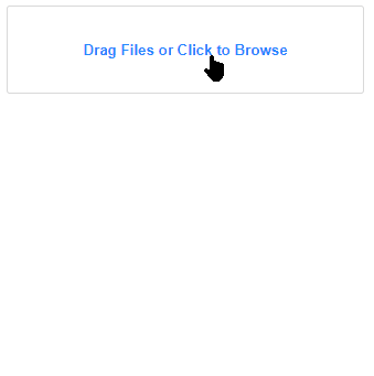
}
export default App;Now run the React application by executing $ npm start to see it working:
Show Warning Message for Un-Accepted Files
The inputContent and styles property can be used to show a custom style message to the user if un-accepted files are drop to upload.
<Dropzone
            getUploadParams={getUploadParams}
            onChangeStatus={handleChangeStatus}
            onSubmit={handleSubmit}
            accept="image/*,audio/*,video/*"

            inputContent={(files, extra) => (extra.reject ? 'Only Image, audio and video files allowed!' : 'Select and Drop Files')}
            styles={{
                dropzoneReject: { borderColor: '#F19373', backgroundColor: '#F1BDAB' },
                inputLabel: (files, extra) => (extra.reject ? { color: '#A02800' } : {}),
            }}
 />

Validation for Minimum and Maximum Files
The Dropzone can have validation for the minimum and maximum files that can be uploaded by using the maxFiles property.
<Dropzone
      onChangeStatus={handleChangeStatus}
      onSubmit={handleSubmit}
      maxFiles={3}
      inputContent="Drop 3 Files"
      inputWithFilesContent={files => `${3 - files.length} more`}
      submitButtonDisabled={files => files.length < 3}
    />
The Submit button will remain disabled until 3 files are not added.
Customize Style of Dropzone
The <Dropzone/> component is a group of sections. These sections include the dropzone, preview section, submit button, and input control. These sections can be modified by defining custom JSX layout to the following properties:
-
LayoutComponent: Customize the complete layout od Dropzone. -
PreviewComponent: Customize the preview section layout. -
InputComponent: Customize the choice to select input control. -
SubmitButtonComponent: Customize the Submit button layout.
Custom Input Control
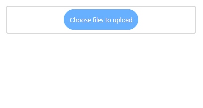
Let’s see how to customize the style of Choose File button and add custom events needed for it to work.
First, we need to install the html5-file-selector npm package to fetch the array of files selected by input file control, then import it in the component.
$ npm install html5-file-selectorImport the package
import { getDroppedOrSelectedFiles } from 'html5-file-selector'Next, define the InputChooseFile JSX component to define in the InputComponent property. We also need to add the getFilesFromEvent property to handle the file change event.
The final component will look like this:
// components/simple-dropzone.component.js
import React from "react";

import Dropzone from 'react-dropzone-uploader'
import 'react-dropzone-uploader/dist/styles.css'
import { getDroppedOrSelectedFiles } from 'html5-file-selector'


const SimpleDropZone = () => {

    const getUploadParams = ({ meta }) => {
        console.log(meta);
        return { url: 'https://httpbin.org/post' }
    }

    const handleChangeStatus = ({ meta, file }, status) => { console.log(status, meta, file) }

    const handleSubmit = (files, allFiles) => {
        console.log(files.map(f => f.meta))
        allFiles.forEach(f => f.remove())
    }

    const getFilesFromEvent = e => {
        return new Promise(resolve => {
            getDroppedOrSelectedFiles(e).then(chosenFiles => {
                resolve(chosenFiles.map(f => f.fileObject))
            })
        })
    }

    const InputChooseFile = ({ accept, onFiles, files, getFilesFromEvent }) => {
        const text = files.length > 0 ? 'Add more files' : 'Choose files to upload'

        const buttonStyle = {
            backgroundColor: '#67b0ff',
            color: '#fff',
            cursor: 'pointer',
            padding: 15,
            borderRadius: 30
        }

        return (
            <label style={buttonStyle}>
                {text}
                <input
                    style={{ display: 'none' }}
                    type="file"
                    accept={accept}
                    multiple
                    onChange={e => {
                        getFilesFromEvent(e).then(chosenFiles => {
                            onFiles(chosenFiles)
                        })
                    }}
                />
            </label>
        )
    }

    return (
        <Dropzone
            getUploadParams={getUploadParams}
            onChangeStatus={handleChangeStatus}
            onSubmit={handleSubmit}
            InputComponent={InputChooseFile}
            getFilesFromEvent={getFilesFromEvent}
            classNames
        />
    );
};

export default SimpleDropZone;
The result will look like this:
Properties of Dropzone
accept: Type of files that can be uploaded using Dropzone.multiple: Boolean value to enable/disable multiple file upload.minSizeBytes: The minimum size of files in bytes allowed.maxSizeBytes: The maximum size of files in bytes allowed.maxFiles: The number of files uploaded in the Dropzone.autoUpload: Boolean value to control auto-upload event after files are dropped.initialFiles: An array of base64 string to upload initially.
Conclusion
The React Dropzone Uploaded provides an awesome solution creating fully-features file uploaded component. There are a number of customization properties available to change the look according to needs. You can check more examples and features on official documentation here.