In this React tutorial, we are going to implement one of the best responsive Image and content carousels Slick in the React application.
The Slick carousel is used as a slider for Images as well as HTML content which supports multiple features. It is responsive and supports multiple devices and screen sizes.
Some of its features are:
- Lazy loaded images
- Responsive layout control
- Autoplay slider
- Loop or infinite image rotation.
- Slides with variable width or auto width support.
- Adaptive height for each slide with smooth animation.
and many more…
We are going to implement this awesomeness in the React application. Here we’ll try to discuss most of the features with examples and customization through CSS style.
So let’s start…
Create a React Application
First, we’ll create a new React application using npx create-react-app command
$ npx create-react-app react-slick-tutorial-appMove inside the react app
$ cd react-slick-tutorial-appRun application
$ npm start
Install react-slick Package
After creating the React application ready, install the react-slick package and also slick-carousel to use CSS style and fonts.
$ npm install react-slick slick-carousel --save
Create Slick Carousel
To create the Slick carousel, import the Slider class from 'react-slick' and also import the basic Slick CSS style and theme files
import Slider from "react-slick";
import "slick-carousel/slick/slick.css";
import "slick-carousel/slick/slick-theme.css";
Now add <Slider /> component to render the slider which also takes configuration properties which we defined in the settings const.
// App.js
import React from 'react';
import './App.css';

import Slider from "react-slick";

import "slick-carousel/slick/slick.css";
import "slick-carousel/slick/slick-theme.css";

function App() {

  const settings = {
    dots: true,
    infinite: true,
    speed: 500
  };

  return (
    <div className="App">
      <Slider {...settings}>
        <div>
          <h3>Slick Slide 1</h3>
        </div>
        <div>
          <h3>Slick Slide 2</h3>
        </div>
        <div>
          <h3>Slick Slide 3</h3>
        </div>
        <div>
          <h3>Slick Slide 4</h3>
        </div>
        <div>
          <h3>Slick Slide 5</h3>
        </div>
      </Slider>
    </div>
  );
}

export default App;
That’s to create a very basic slick slider. Further, we’ll create a good looking slider with dynamic content and images and also discuss the properties we used in the settings in more detail.
Dynamic Slides with Custom Style
Now we’ll add dynamic slide content using a collection of objects and also style images with custom CSS.
This is the object slidesData having id, title and label properties:
const slidesData = [
    {
      id: 1,
      title: 'repellendus id ullam',
      label: 'Dolorem officiis temporibus.'
    }, {
      id: 2,
      title: 'excepturi consequatur est',
      label: 'Officia non provident dolor esse et neque.'
    }, {
      id: 3,
      title: 'eius doloribus blanditiis',
      label: 'Ut recusandae vel vitae molestiae id soluta.'
    }, {
      id: 4,
      title: 'nihil voluptates delectus',
      label: 'Qui vel consequatur recusandae illo repellendus.'
    }, {
      id: 5,
      title: 'nemo dolorem necessitatibus',
      label: 'Placeat odit velit itaque voluptatem.'
    }, {
      id: 6,
      title: 'dolorem quibusdam quasi',
      label: 'Adipisci officiis repudiandae.'
    },
  ];
To render the slides we use map() method inside the JSX template as shown below:
    <Slider {...settings}>

          {slidesData.map((slide) =>

            ...

          )}

      </Slider>
The final code inside the App.js function class will look like this:
// App.js
import React from 'react';
import './App.css';

import Slider from "react-slick";

import "slick-carousel/slick/slick.css";
import "slick-carousel/slick/slick-theme.css";

function App() {

  const settings = {
    dots: true,
    infinite: true,
    speed: 500
  };

  const slidesData = [
    {
      id: 1,
      title: 'repellendus id ullam',
      label: 'Dolorem officiis temporibus.'
    }, {
      id: 2,
      title: 'excepturi consequatur est',
      label: 'Officia non provident dolor esse et neque.'
    }, {
      id: 3,
      title: 'eius doloribus blanditiis',
      label: 'Ut recusandae vel vitae molestiae id soluta.'
    }, {
      id: 4,
      title: 'nihil voluptates delectus',
      label: 'Qui vel consequatur recusandae illo repellendus.'
    }, {
      id: 5,
      title: 'nemo dolorem necessitatibus',
      label: 'Placeat odit velit itaque voluptatem.'
    }, {
      id: 6,
      title: 'dolorem quibusdam quasi',
      label: 'Adipisci officiis repudiandae.'
    },
  ];

  return (
    <div className="App">

      <div className="slider-wrapper">

        <Slider {...settings}>

          {slidesData.map((slide) =>

            <div className="slick-slide" key={slide.id}>
              <h2 className="slick-slide-title">{slide.title}</h2>
              <img className="slick-slide-image" src={`https://picsum.photos/800/400?img=${slide.id}`} />
              <label className="slick-slide-label">{slide.label}</label>
            </div>

          )}

        </Slider>

      </div>

    </div>
  );
}

export default App;
Custom CSS Style for Slick Carousel
Also, we have added some custom classes to style the carousel. Add the following CSS style in the App.css file
.slider-wrapper {
width: 760px;
margin: auto;
}
.slick-slide {
text-align: center;
position: relative;
}
.slick-slide:focus {
outline: none;
}
.slick-slide-title {
text-transform: capitalize;
}
.slick-slide-image {
max-width: 100%;
height: auto;
border-radius: 8px;
box-shadow: 0 13px 27px -5px hsla(240, 30.1%, 28%, 0.25), 0 8px 16px -8px hsla(0, 0%, 0%, 0.3),
0 -6px 16px -6px hsla(0, 0%, 0%, 0.03);
}
.slick-slide-label {
color: #fff;
padding: 10px;
position: absolute;
left: 0px;
font-size: 1.5em;
bottom: 0px;
width: 100%;
}
.slick-prev:before,
.slick-next:before {
color: #777777;
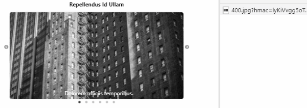
}Now run the React app by hitting $ npm start, it will look like this:

Lazy Loading Images in the Slick Carousel
Lazy loading means that all images or media content will not be loaded at once. Once a user navigates to a slide the images or other media are loaded after that slide is loaded or presented in the viewable area.
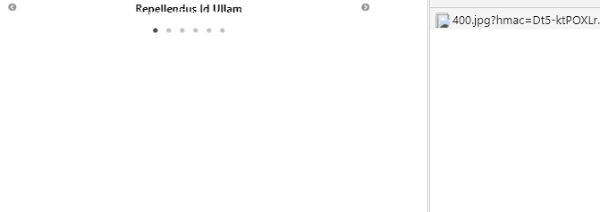
The lazyload property is added in the settings object, it takes two values "ondemand" & "progressive"
When we use lazyLoad: 'ondemand', the images of the visible slides will be loaded.
If we set lazyLoad: 'progressive', then all images will be loaded one after the other in a progressive way without stressing the performance.
const settings = {
    dots: true,
    infinite: true,
    speed: 500,
    lazyLoad: 'progressive'
  };
Responsive Slick Slider Configuration
The slick slider can be configured to adapt to different screen sizes. The response property takes breakpoint having settings for each.
const settings = {
    dots: true,
    infinite: true,
    speed: 500,
    responsive: [
      {
        breakpoint: 700,
        settings: {
          arrows: false,
          slidesToShow: 3
        }
      },
      {
        breakpoint: 500,
        settings: {
          arrows: false,
          slidesToShow: 2
        }
      },
      {
        breakpoint: 400,
        settings: {
          arrows: false,
          slidesToShow: 1
        }
      }
    ]
  };
The nextArrow and prevArrowproperties can be used to modify the Next and Prev navigation arrows by adding a custom template.
const settings = {
    slidesToShow: 1,
    slidesToScroll: 1,
    nextArrow: (
      <div>
        <div className="next-slick-arrow"> ⫸ </div>
      </div>
    ),
    prevArrow: (
      <div>
        <div className="prev-slick-arrow"> ⫷ </div>
      </div>
    )
  };
Update App.css with style
.slick-prev {
  left: -52px !important;
}

.slick-next:before,
.slick-prev:before {
  content: "" !important;
}
.next-slick-arrow,
.prev-slick-arrow {
  color: #000000;
  font-size: 48px;
}
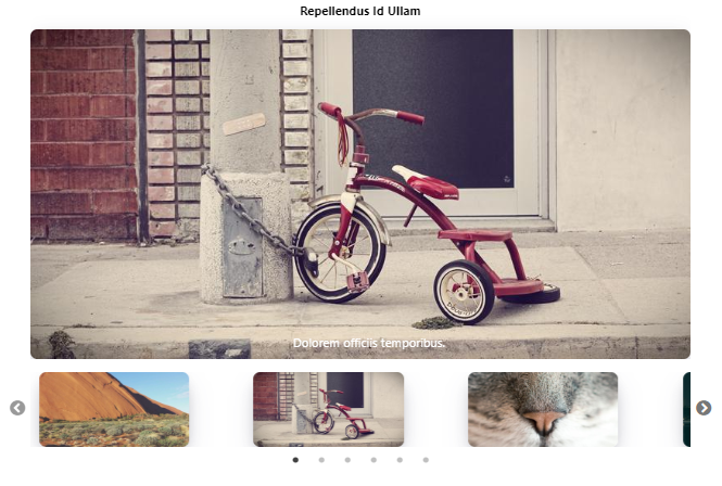
Slick Carousel with Thumbnails
The asNavFor property can be used to connect two Click slider carousel in which one will act as the main Carousel and other will work as Thumbnails slider.
For this, we will define two settings objects settingsMain and settingsThumbs. Also, we will keep nav1, nav2, slider1 and slider2 states.
The useEffect will be used in the function component class to initialize the nav1 and nav2 states.
In addition, we’ll use the asNavFor and ref properties on each slider to communicate the two Slider components.
// App.js
import React, { useState, useEffect } from 'react';
import './App.css';

import Slider from "react-slick";

import "slick-carousel/slick/slick.css";
import "slick-carousel/slick/slick-theme.css";

function App() {
  const [nav1, setNav1] = useState(null);
  const [nav2, setNav2] = useState(null);
  const [slider1, setSlider1] = useState(null);
  const [slider2, setSlider2] = useState(null);

  useEffect(() => {

    setNav1(slider1);
    setNav2(slider2);

  });


  const settingsMain = {
    slidesToShow: 1,
    slidesToScroll: 1,
    arrows: false,
    fade: true,
    asNavFor: '.slider-nav'
  };

  const settingsThumbs = {
    slidesToShow: 3,
    slidesToScroll: 1,
    asNavFor: '.slider-for',
    dots: true,
    centerMode: true,
    swipeToSlide: true,
    focusOnSelect: true,
    centerPadding: '10px'
  };

  const slidesData = [
    {
      id: 1,
      title: 'repellendus id ullam',
      label: 'Dolorem officiis temporibus.'
    }, {
      id: 2,
      title: 'excepturi consequatur est',
      label: 'Officia non provident dolor esse et neque.'
    }, {
      id: 3,
      title: 'eius doloribus blanditiis',
      label: 'Ut recusandae vel vitae molestiae id soluta.'
    }, {
      id: 4,
      title: 'nihil voluptates delectus',
      label: 'Qui vel consequatur recusandae illo repellendus.'
    }, {
      id: 5,
      title: 'nemo dolorem necessitatibus',
      label: 'Placeat odit velit itaque voluptatem.'
    }, {
      id: 6,
      title: 'dolorem quibusdam quasi',
      label: 'Adipisci officiis repudiandae.'
    },
  ];

  return (

    <div className="App">

      <div className="slider-wrapper">

        <Slider
          {...settingsMain}
          asNavFor={nav2}
          ref={slider => (setSlider1(slider))}
        >

          {slidesData.map((slide) =>

            <div className="slick-slide" key={slide.id}>
              <h2 className="slick-slide-title">{slide.title}</h2>
              <img className="slick-slide-image" src={`https://picsum.photos/800/400?img=${slide.id}`} />
              <label className="slick-slide-label">{slide.label}</label>
            </div>

          )}

        </Slider>
        <div className="thumbnail-slider-wrap">
          <Slider
            {...settingsThumbs}
            asNavFor={nav1}
            ref={slider => (setSlider2(slider))}>

            {slidesData.map((slide) =>

              <div className="slick-slide" key={slide.id}>
                <img className="slick-slide-image" src={`https://picsum.photos/800/400?img=${slide.id}`} />
              </div>

            )}

          </Slider>
        </div>
      </div>

    </div>
  );
}

export default App;
Also, update the App.css with the following style
.thumbnail-slider-wrap {
  margin-top: 15px;
  height: 85px;
}
.thumbnail-slider-wrap .slick-track .slick-slide {
  text-align: center;
}
.thumbnail-slider-wrap .slick-track .slick-slide img {
  width: 70%;
}
Now run the app it will look like this:
Other Useful Properties of Slick Slider
Following are some other useful properties to customize carousel behavior:
adaptiveHeight: Slides with different heights can be adjusted automatically. Default is false.arrows: Show/ Hide navigation arrows. Default is true.autoplaySpeed: Autoplay Speed in milliseconds. Default is 3000ms.autoplay: Enable autoplay. Default is true.centerMode: Active slide stays at center. Default is false.className: Custom Class name.dotsClass: Custom dots class namedots: Show/ hide navigation dots. Default is true.draggable: Enable mouse dragging. Default is true.fade: Enable Fade Effect. Default is false.infinite: Enable to loop after slides ends. Default is true.initialSlide: The numbr of inital slide.lazyLoad: LazyLoadTypes; Enable lazy loading of slide images.pauseOnDotsHover: Enable pause on hovering Dots. Default is false.pauseOnFocus: Enable pause on focus. Default is false.pauseOnHover: Enable pause on hovering slider. Default is false.responsive: ResponsiveObject[]; Set resonsive breakpoints for slider.rows: Setting this to more than 1 initializes grid mode. Use slidesPerRow to set how many slides should be in each row. Default is 1rtl: Right to left alignment.slidesPerRow: With grid mode initialized via the rows option, this sets how many slides are in each grid row.speed: Speed of slide transition. Default is 300msvertical: Enable sliding slides in verticle direction.
Methods and Event handling
Following method events can be used on slick slider:
onSwipe(): Return the direction of swipe on slides.afterChange(): After the slide is finished it returns the current slide number.beforeChange(): Return the slide number before slide starts.
function App() {

....

  function onSwipeEvent(swipeDirection) {
    console.log(swipeDirection);
  }
  function afterChangeEvent(currentSlide) {
    console.log(currentSlide);
  }
  function beforeChangeEvent(currentSlide) {
    console.log(currentSlide);
  }

  return (
    <div className="App">

      <div className="slider-wrapper">

        <Slider
               onSwipe={onSwipeEvent}
               afterChange={afterChangeEvent}
               beforeChange={beforeChangeEvent}>

          .....

        </Slider>

      </div>

    </div>
  );
}

export default App;
Conclusion
Finally, we’re done with the Slick carousel tutorial in the React application. here we discussed how to install the required packages and render the Slick carousel with static as well as dynamic content.
Also, we discussed the important features with properties and methods which can be used to modify the behavior of the Carousel.
Slick carousel is an awesome option to use in the application as it can fill out any gaps or challenges using wide range of feature options.
you can check the official documentation here.