React responsively carousel example in React js application; You will learn how to add a responsive image carousel in React js application. For this, we will use a very popular library named react-responsive-carousel. We will discuss how to add custom animation, including fade effect, and configure using a wide range of props.
React Responsive Carousel library is a popular image slider plugin with loads of configurations. We will go through a step-by-step tutorial on how to add a react-responsive carousel and discuss its features. Moreover, we will throw light on how to configure it with custom CSS styles.
Using the responsive carousel you can create a carousel or slider with any kind of content in it. In this tutorial, we will create a content slider with Bootstrap image cards in it.
Let’s have a look at important features of react-responsive-carousel:
- Responsive and mobile-friendly layout.
- Touch support with a swipe to slide.
- Autoplay, Infinite Loop with keyboard navigation.
- Server-side rendering.
- Horizontal and Vertical direction play.
- Slider for Images, Videos, HTML or any type of content.
- Customizable Thumbnails, Arrows, Animations etc.
How to Add Responsive Content Slider in React App?
Step 1 – Create React Application
Step 2 – Install React Responsive Carousel
Step 3 – Adding React Responsive Carousel
Step 4 – Run React App
Step 1 – Create React Application
To start, let’s create a new React Js application. Execute the following command in the terminal window:
npx create-react-app react-content-slider-appThen, move inside the application directory:
cd react-content-slider-appStep 2 – Install React Responsive Carousel
Now, we will install the React Responsive Carousel and Bootstrap packages in the react application. Execute the following npm command at application root:
npm install react-responsive-carousel bootstrap --saveStep 3 – Adding React Responsive Carousel
Next, open the App.js file and import the Carousel component. For styling import the carousel.min.css and bootstrap.min.css files from respective packages.
We will add Bootstrap cards for each Carousel slide. Update the App.js file with the following code:
import React, { Component } from "react";
import "react-responsive-carousel/lib/styles/carousel.min.css"; // requires a loader
import "bootstrap/dist/css/bootstrap.min.css"; // requires a loader
import { Carousel } from "react-responsive-carousel";
class App extends Component {
onChange = (event) => {
console.log(event);
};
render() {
return (
<div className="container carousel-wrapper">
<Carousel autoPlay="true" onChange={this.onChange}>
<div>
<img
className="card-img-top"
src="https://picsum.photos/500/300?img=1"
alt="Card image cap"
/>
<div className="card">
<div className="card-body">
<h5 className="card-title">Slide Card 1</h5>
<p className="card-text">
Some quick example text to build on the card title and make up
the bulk of the card's content.
</p>
<a href="#" className="btn btn-primary">
Go somewhere
</a>
</div>
</div>
</div>
<div>
<img
className="card-img-top"
src="https://picsum.photos/500/300?img=2"
alt="Card image cap"
/>
<div className="card">
<div className="card-body">
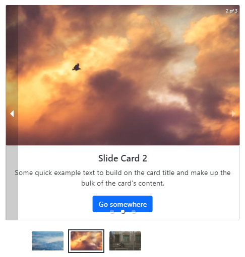
<h5 className="card-title">Slide Card 2</h5>
<p className="card-text">
Some quick example text to build on the card title and make up
the bulk of the card's content.
</p>
<a href="#" className="btn btn-primary">
Go somewhere
</a>
</div>
</div>
</div>
<div>
<img
className="card-img-top"
src="https://picsum.photos/500/300?img=3"
alt="Card image cap"
/>
<div className="card">
<div className="card-body">
<h5 className="card-title">Slide Card 3</h5>
<p className="card-text">
Some quick example text to build on the card title and make up
the bulk of the card's content.
</p>
<a href="#" className="btn btn-primary">
Go somewhere
</a>
</div>
</div>
</div>
</Carousel>
</div>
);
}
}
export default App;The autoPlay:true will auto slide image slides. The onChange event handler will return the current slide index number.
Step 4 – Run React App
Finally, you can hit the following command to see the CKEditorin action.
npm startCheck out your React app on the following URL:
http://localhost:3000
Conclusion
We have completed the implementation of reacting responsive carousel and added HTML content in each slide. You can check the Image slides implementation here with other properties and configuration details. The React Responsive Carousel packages provide a number of customisation properties and features. you can check on official documentation here.