Material-Table React is a profound library to create rich-featured and outstanding datatable grids. In this guide, we will find out the best way to use Icons in the React material table grid.
React Material-Table uses material icons to show at various places including checkboxes, search, sorting arrows, export, cross, filter etc. Furthermore, we can effortlessly add more action icons at the table or row level.
We have already explored how to use material tables in React application in our previous tute. In continuation to that, here we will focus on how to expeditiously and accurately add and use material icons in your React app.
You can visit our previous elaborated and comprehensive tutorial on getting started with material tables in React application.
How to Add Material Icons in React Application?
You can easily start using the material-table components, by installing the material-table and its material core UI packages:
npm install material-table --save
npm install @material-ui/core --save
In addition to that, to use material icons, you need to install the Material Icons as well by installing the material icons package:
npm install @material-ui/icons --saveConsequently, you’re ready to go ahead and use icons in your app. Going forward, you will learn how to use icons efficiently in the next section.
How to Start using Material Icons in React Application?
In-built Action Icons
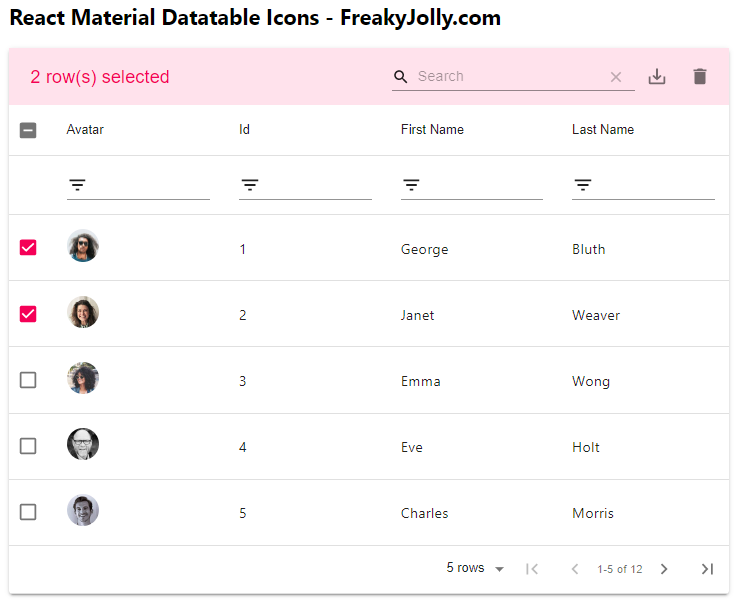
React material tables includes two types of icons, firstly the basic components for instance Sorting, Search, Checkboxes, Filter, Cross, Grouping, Export, Tree hierarchy etc use SVG icons.
For including in-built icons, you just need to import each icon from @material-ui/icons and define it as forwardRef to generate SVG components. The constant variable for example tableicons is then passed to the icons prop.
import React, { Component } from "react";
import "./App.css";
import MaterialTable from "material-table";

// Import Material Icons
import { forwardRef } from 'react';

import AddBox from '@material-ui/icons/AddBox';
import ArrowDownward from '@material-ui/icons/ArrowDownward';
import Check from '@material-ui/icons/Check';
import ChevronLeft from '@material-ui/icons/ChevronLeft';
import ChevronRight from '@material-ui/icons/ChevronRight';
import Clear from '@material-ui/icons/Clear';
import DeleteOutline from '@material-ui/icons/DeleteOutline';
import Edit from '@material-ui/icons/Edit';
import FilterList from '@material-ui/icons/FilterList';
import FirstPage from '@material-ui/icons/FirstPage';
import LastPage from '@material-ui/icons/LastPage';
import Remove from '@material-ui/icons/Remove';
import SaveAlt from '@material-ui/icons/SaveAlt';
import Search from '@material-ui/icons/Search';
import ViewColumn from '@material-ui/icons/ViewColumn';

const tableIcons = {
  Add: forwardRef((props, ref) => <AddBox {...props} ref={ref} />),
  Check: forwardRef((props, ref) => <Check {...props} ref={ref} />),
  Clear: forwardRef((props, ref) => <Clear {...props} ref={ref} />),
  Delete: forwardRef((props, ref) => <DeleteOutline {...props} ref={ref} />),
  DetailPanel: forwardRef((props, ref) => <ChevronRight {...props} ref={ref} />),
  Edit: forwardRef((props, ref) => <Edit {...props} ref={ref} />),
  Export: forwardRef((props, ref) => <SaveAlt {...props} ref={ref} />),
  Filter: forwardRef((props, ref) => <FilterList {...props} ref={ref} />),
  FirstPage: forwardRef((props, ref) => <FirstPage {...props} ref={ref} />),
  LastPage: forwardRef((props, ref) => <LastPage {...props} ref={ref} />),
  NextPage: forwardRef((props, ref) => <ChevronRight {...props} ref={ref} />),
  PreviousPage: forwardRef((props, ref) => <ChevronLeft {...props} ref={ref} />),
  ResetSearch: forwardRef((props, ref) => <Clear {...props} ref={ref} />),
  Search: forwardRef((props, ref) => <Search {...props} ref={ref} />),
  SortArrow: forwardRef((props, ref) => <ArrowDownward {...props} ref={ref} />),
  ThirdStateCheck: forwardRef((props, ref) => <Remove {...props} ref={ref} />),
  ViewColumn: forwardRef((props, ref) => <ViewColumn {...props} ref={ref} />)
};

class App extends Component {
  render() {
    // Material Table Columns
    const columns = [ ... ];

    // Material Table Columns Rows
    const data = [ ... ]

    const tableRef = React.createRef();

    return (
      <div className="App">

        <MaterialTable
          title="Material Table Actions"
          tableRef={tableRef}
          icons={tableIcons}
          columns={columns}
          data={data}
        />
      </div>
    );
  }
}
export default App;
Adding Other Actions Icons
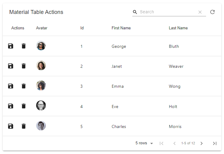
In Material Table, we can add additional custom actions with a defined onClick handler. For that, we add the actions array with definitions including icon, tooltip, onClick and other properties. If react material table icons not working, in the next section you will see how to import them to use directly.
To use icons on Material Table actions, we can directly import the required then assign them to the icon property as shown below:
...
// Additional action icons
import Delete from '@material-ui/icons/Delete';
import Refresh from '@material-ui/icons/Refresh';
import Save from '@material-ui/icons/Save';

...

class App extends Component {
  render() {
    // Material Table Columns
    const columns = [ ... ];

    // Material Table Columns Rows
    const data = [ ... ]

    const tableRef = React.createRef();

    return (
      <div className="App">

        <MaterialTable
          title="Material Table Actions"
          tableRef={tableRef}
          icons={tableIcons}
          columns={columns}
          data={data}
          actions={[
            {
              icon: Refresh,
              tooltip: 'Refresh Data',
              isFreeAction: true,
              onClick: () => tableRef.current && tableRef.current.onQueryChange()
            },{
              icon: Save,
              tooltip: 'Save User',
              onClick: (event, rowData) => console.log("You saved ",rowData)
            },
            {
              icon: Delete,
              tooltip: 'Delete User',
              onClick: (event, rowData) => console.log("You want to delete ",rowData)
            }
          ]}
        />
      </div>
    );
  }
}
export default App;
Above, we have Refresh, Save and Delete icons used directly. For Refresh the isFreeAction:true will show the icon on the top right side of the table grid.
Summery
If the project building process is not having tree-shaking, then it is preferred to import each icon from the material-ui/icon library. We discussed how to import icons and use them inside the grid and also on additional actions we added.
Hope this was helpful…