Hey there! Today we’ll discuss how to create and implement awsome responsive graphical charts in the React Js application by using one of the top and best charts library known as Recharts.
In many data-driven web applications, we represent information in the form of graphical interfaces known as charts. These play an important role to communicate the required and relevant information to the user at a single glance.
Charts come in multiple forms like Line, Bar, Column, Pie, Scatter, Dot, Area, or sometimes the combination of multiple types.
With the popularity of application development to React, it is the requirement of time to represent our data to convert it into a nice-looking graphical unit with coll animations.
We are going to create some popular forms of charts in the React 16+ application using Recharts library.
What is Recharts?
Recharts is a component-based charting library, which is exclusively built for React applications. Library provided easy to use and reusable chart components build using D3 library-based submodules.
These are created by using the SVG vector elements in the HTML dom. Which makes them sharp and full of animation support.
Highly customizable properties are available which can be further tweaked by passing to custom components.
Let’s start the implementation!
Create a React Application
First, we’ll create a new React application using npx create-react-app command
$ npx create-react-app recharts-tutorial-appMove inside the react app
$ cd recharts-tutorial-appRun application
$ npm start
Install recharts Package
After creating the React application ready, install the recharts package by running below npm command
$ npm install recharts
Creating Chart Components
We’ll create reusable components for each type of Chart under the ~src/components folder with the following component file:
- line.rechart.js
- area.rechart.js
- pie.rechart.js
Line Chart using Recharts
A line chart or line plot or line graph or curve chart is a type of chart that displays data as a series of points called ‘markers’ connected by straight line segments.
For creating a chart using Recharts we need to import the required components from 'recharts'.
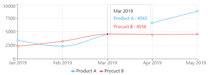
Here we are creating a Line chart to compare the sales of two products in a single chart. Update the line.rechart.js file with the following code:
// src/components/line.rechart.js

import React from "react";
import { LineChart, Line, YAxis, XAxis, CartesianGrid, Tooltip, Legend } from 'recharts';

class LineRechartComponent extends React.Component {

    data = [
        {
            "name": "Jan 2019",
            "Product A": 3432,
            "Procuct B": 2342
        },
        {
            "name": "Feb 2019",
            "Product A": 2342,
            "Procuct B": 3246
        },
        {
            "name": "Mar 2019",
            "Product A": 4565,
            "Procuct B": 4556
        },
        {
            "name": "Apr 2019",
            "Product A": 6654,
            "Procuct B": 4465
        },
        {
            "name": "May 2019",
            "Product A": 8765,
            "Procuct B": 4553
        }
    ]

    render() {
        return (
            <LineChart width={730} height={250} data={this.data}
                margin={{ top: 5, right: 30, left: 20, bottom: 5 }}>
                <CartesianGrid strokeDasharray="3 3" />
                <XAxis dataKey="name" />
                <YAxis />
                <Tooltip />
                <Legend />
                <Line type="monotone" dataKey="Product A" stroke="#0095FF" />
                <Line type="monotone" dataKey="Procuct B" stroke="#FF0000" />
            </LineChart>
        )
    };
}

export default LineRechartComponent;
This will create a chart as shown below:
Area Chart using Recharts
An area chart or area graph displays graphically quantitative data. It is based on the line chart. The area between axis and line are commonly emphasized with colors, textures, and hatchings. Commonly one compares two or more quantities with an area chart.
Update the area.rechart.js file with the following code:
// src/components/area.rechart.js

import React from "react";
import { AreaChart, Area, YAxis, XAxis, CartesianGrid, Tooltip, Legend } from 'recharts';

class AreaRechartComponent extends React.Component {

    data = [
        {
            "name": "Jan 2019",
            "Product A": 3432,
            "Procuct B": 2342
        },
        {
            "name": "Feb 2019",
            "Product A": 2342,
            "Procuct B": 3246
        },
        {
            "name": "Mar 2019",
            "Product A": 4565,
            "Procuct B": 4556
        },
        {
            "name": "Apr 2019",
            "Product A": 6654,
            "Procuct B": 4465
        },
        {
            "name": "May 2019",
            "Product A": 8765,
            "Procuct B": 4553
        }
    ]

    render() {
        return (
            <AreaChart width={730} height={250} data={this.data}
                margin={{ top: 10, right: 30, left: 0, bottom: 0 }}>
                <defs>
                    <linearGradient id="colorUv" x1="0" y1="0" x2="0" y2="1">
                        <stop offset="5%" stopColor="#8884d8" stopOpacity={0.8} />
                        <stop offset="95%" stopColor="#8884d8" stopOpacity={0} />
                    </linearGradient>
                    <linearGradient id="colorPv" x1="0" y1="0" x2="0" y2="1">
                        <stop offset="5%" stopColor="#82ca9d" stopOpacity={0.8} />
                        <stop offset="95%" stopColor="#82ca9d" stopOpacity={0} />
                    </linearGradient>
                </defs>
                <XAxis dataKey="name" />
                <YAxis />
                <CartesianGrid strokeDasharray="3 3" />
                <Tooltip />
                <Legend />
                <Area type="monotone" dataKey="Product A" stroke="#8884d8" fillOpacity={1} fill="url(#colorUv)" />
                <Area type="monotone" dataKey="Procuct B" stroke="#82ca9d" fillOpacity={1} fill="url(#colorPv)" />
            </AreaChart>
        )
    };
}

export default AreaRechartComponent;
This will create a chart as shown below:

Pie Chart using Recharts
A pie chart is a circular statistical graphic, which is divided into slices to illustrate numerical proportions. In a pie chart, the arc length of each slice is proportional to the quantity it represents.
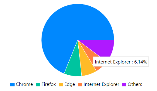
Here we are going to display browser popularity in a Pie chart. There will be different colors for slice of the pie chart. We have formatted the Tooltip text to show a percentage sign after the value.
Update the pie.rechart.js file with the following code:
// src/components/pie.rechart.js

import React from "react";
import { PieChart, Pie, Cell, Tooltip, Legend } from 'recharts';

class PieRechartComponent extends React.Component {

    COLORS = ['#0088FE', '#00C49F', '#FFBB28', '#FF8042', '#AF19FF'];

    pieData = [
        {
            "name": "Chrome",
            "value": 68.85
        },
        {
            "name": "Firefox",
            "value": 7.91
        },
        {
            "name": "Edge",
            "value": 6.85
        },
        {
            "name": "Internet Explorer",
            "value": 6.14
        },
        {
            "name": "Others",
            "value": 10.25
        }
    ];

    CustomTooltip = ({ active, payload, label }) => {
        if (active) {
            return (
                <div className="custom-tooltip" style={{ backgroundColor: '#ffff', padding: '5px', border: '1px solid #cccc' }}>
                    <label>{`${payload[0].name} : ${payload[0].value}%`}</label>
                </div>
            );
        }

        return null;
    };

    render() {
        return (
            <PieChart width={730} height={300}>
                <Pie data={this.pieData} color="#000000" dataKey="value" nameKey="name" cx="50%" cy="50%" outerRadius={120} fill="#8884d8" >
                    {
                        this.pieData.map((entry, index) => <Cell key={`cell-${index}`} fill={this.COLORS[index % this.COLORS.length]} />)
                    }
                </Pie>
                <Tooltip content={<this.CustomTooltip />} />
                <Legend />
            </PieChart>
        )
    };
}

export default PieRechartComponent;
This will create a chart as shown below:
Show All Charts in the App
As we have created three types of chart components, now we will import them and render them inside the App function component.
Open the App.js file and update with Pie, Line and Area chart components
//App.js

import React from 'react';
import './App.css';

import LineRechartComponent from './components/line.rechart';
import AreaRechartComponent from './components/area.rechart';
import PieRechartComponent from './components/pie.rechart';

function App() {
  return (
    <div className="App">
      <h2>Line Rechart</h2>
      <LineRechartComponent />

      <h2>Area Rechart</h2>
      <AreaRechartComponent />

      <h2>Pie Rechart</h2>
      <PieRechartComponent />

    </div>
  );
}

export default App;
Source Code
Find the source code of this tutorial in my Github repository here.
Conclusion
We discussed how to easily create beautiful SVG based Charts in the React application with help of Recharts library. The Rechart components provide lots of configuration for each component. You can check official Rechart documentation here.