In this React 16+ tutorial, we’ll learn how to implement Bootstrap Modals in a ReactJs application and configure its size, position, pass data, fetch data, etc.
In a ReactJs application, we can easily use Bootstrap UI components by installing the react-bootstrap package module in the project.
React Bootstrap provides almost all type of Bootstrap UI components which are exclusively converted and built for ReactJs applications. Here we are going to discuss the implementation of Bootstrap popular Modals UI components in the React application.
Also, we will discuss how to configure by using various properties to modify its behavior. In a Modal, we can easily pass data and also fetch back any information from the modal itself.
Let’s start…
Create a React Application
First, we’ll create a new React application using npx create-react-app command
$ npx create-react-app react-bootstrap-modals-appMove inside the react app
$ cd react-bootstrap-modals-appRun application
$ npm start
Install React Bootstrap Package
After creating the react application, now we’ll install the React Bootstrap package by running below command
$ npm install react-bootstrap bootstrap
Showing Bootstrap Modal in React App
To show a Bootstrap Modal in a component, we need to import the Modal class from ‘react-bootstrap’ also import the Button component
import { Modal, Button } from 'react-bootstrap'Now, we need to import bootstrap.min.css file to happy Bootstrap styling to its components.
import 'bootstrap/dist/css/bootstrap.min.css';
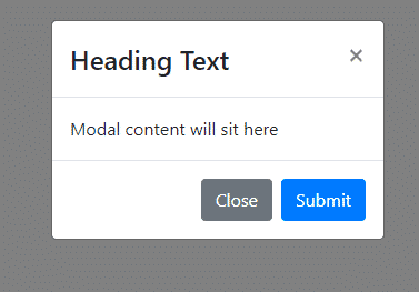
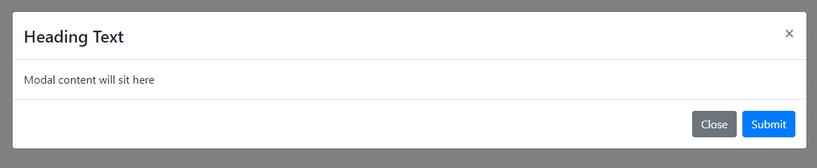
A Bootstrap Modal is created using the following components for its different sections.
Modal: A wrapper containing other section components explained below.
Modal.Header: The header section of the modal having Close (Icon) and Title text.
Modal.Title: The title of the Modal is displayed
Modal.Body: Content of Modal body is placed inside this component
Modal.Footer: The bottom section of the modal having action buttons like Close, Submit added in the footer section.
<Modal show={show} onHide={handleClose}>

        <Modal.Header closeButton>
          <Modal.Title>Heading Text</Modal.Title>
        </Modal.Header>

        <Modal.Body>Modal content will sit here</Modal.Body>

        <Modal.Footer>

          <Button variant="secondary" onClick={handleClose}>Close</Button>
          <Button variant="primary" onClick={handleClose}>Submit</Button>

        </Modal.Footer>

      </Modal>
Open App.js function component and update as shown below:
// App.js
import React, { useState } from 'react';
import './App.css';

import 'bootstrap/dist/css/bootstrap.min.css';
import { Modal, Button } from 'react-bootstrap'

function App() {

  const [show, setShow] = useState(false);

  const handleClose = () => setShow(false);
  const handleShow = () => setShow(true);

  return (
    <div>
      <Button variant="primary" onClick={handleShow}>
        Launch Bootstrap Modal
      </Button>

      <Modal show={show} onHide={handleClose}>

        <Modal.Header closeButton>
          <Modal.Title>Heading Text</Modal.Title>
        </Modal.Header>

        <Modal.Body>Modal content will sit here</Modal.Body>

        <Modal.Footer>

          <Button variant="secondary" onClick={handleClose}>Close</Button>
          <Button variant="primary" onClick={handleClose}>Submit</Button>

        </Modal.Footer>

      </Modal>

    </div>
  );
}

export default App;
The setShow method is controlling the show variable state using the handleClose and handleOpen methods defined inside the App function component using the useState method with the initial value false.
show: Property is used to control the visibility of Modal.
onHide: The event handler is fired when the Modal is closed.

Configuration for Bootstrap Modal
Let’s have a look at important properties and event handlers available on Bootstrap Modal components.
Disable Modal Close on Clicking Outside
Bootstrap Modal overlays can be closed normally by clicking on the close icon or simply clicking anywhere outside the modal.
But sometimes to check the accidental closing of Modal, we can easily disable the closing of Modal on ESC keypress and backdrop click by setting the backdrop="static" and keyboard={false} properties on the Modal component.
Now the user will only be able to close the Modal deliberately by clicking the close icon in the Header or footer buttons handling custom events.
<Modal show={show} onHide={handleClose} <strong>backdrop="static" keyboard={false}</strong>>
    ...
    ...
</Modal>
Open Modal with Animation
The animation transition effect on Modals can be turned off by setting animation={false}
<Modal show={show} onHide={handleClose} <strong>animation={false}</strong> >
    ...
    ...
</Modal>
Vertically Center Modal on Page
By default, the Modal is opened on page center top with a small top margin. It can be managed to be opened on the exact center of the page vertically by adding the centered property
<Modal show={show} onHide={handleClose} <strong>centered</strong> >
    ...
    ...
</Modal>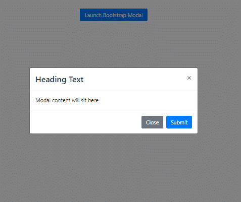
Size of Modal
Size of the React Bootstrap modal can be changed by setting the size property.
The Bootstrap by default provides three sizes:
sm: Small-sized modal
lg: Large-sized modal

xl: Extra-large modal
Custom sized modal with custom class
We can also add a custom class by using the dialogClassName="full-screen-modal"
<Modal show={show} onHide={handleClose} dialogClassName="fullscreenmodal">
    ...
    ...
</Modal>
Then add the following style in App.css
.full-screen-modal {
  max-width: 100%;
}
To open a fullscreen bootstrap modal on-page.
Auto Focus in Modal
When a Bootstrap model is open, it transfers the focus inside the modal elements. The following properties can manage to play with a focus on Bootstrap modals.
<strong>autoFocus</strong>: When true The modal will automatically shift focus to itself when it opens, and replace it to the last focused element when it closes. The default is set to true.
enforceFocus: When true The modal will prevent focus from leaving the Modal while open. The default is set to true.
restoreFocus: When true The modal will restore focus to the previously focused element once modal is hidden. The default is set to true.
Create a Bootstrap Modal Component
In a real application, you may need Bootstrap modal in different areas, so it’s better to create a separate component for Bootstrap Modals.
To reuse the Bootstrap modal, we’ll create a new component MyModalComponent at this location ~src/components/bootstrap-modal.component.js file as shown below:
// src/components/bootstrap-carousel.component.js
import React, { Component } from "react";

import { Modal, Button } from 'react-bootstrap';
import 'bootstrap/dist/css/bootstrap.min.css';

class MyModalComponent extends Component {

    render() {

        return (
            <div>
                <Modal show={this.props.show} onHide={() => this.props.onHide({ msg: 'Cross Icon Clicked!' })}>

                    <Modal.Header closeButton>
                        <Modal.Title>
                            {this.props.title}
                        </Modal.Title>
                    </Modal.Header>

                    <Modal.Body>
                        {this.props.body}

                        <ul>
                            {this.props.data.map(item => (
                                <li key={item.id}>Name: {item.name} | Address: {item.address}</li>
                            ))}
                        </ul>

                    </Modal.Body>

                    <Modal.Footer>
                        <Button variant="secondary" onClick={() => this.props.onClick({ msg: 'Modal Closed!' })} >Close</Button>
                        <Button variant="primary" onClick={() => this.props.onClick({ msg: 'Modal Submitted!' })}  >Submit</Button>
                    </Modal.Footer>

                </Modal>
            </div>
        )
    };
}

export default MyModalComponent;
If you look closely, there are props used on Model event handler onHide and the show property is getting boolean value to control visibility from the parent component where it is used.
Props are used to pass a state from parent component to its child component. These are used to pass any type of value from simple strings to Objects and even methods.
On the Button components as well we are sending back the callbacks to the parent where we are having the actual methods.
Pass Data from Parent to Bootstrap Modal
The Model.Body component shows the list of items that is iterated from a data Object passed from parent inside the Bootstrap modal. To loop over the Object values we used map() method. The key property is required to optimize the rerender process by React under the hood.
Sending Back Data from Bootstrap Modal to Parent
We are sending back objects with a message as a property of the method callback on onClick and onHide as shown above.
Using Bootstrap Modal Component in the App
The Bootstrap Modal component which we created can be called from any component, here we are calling from the App class component.
We have converted the App function component into a class stateful component.
After converting the App.js file will look like this:
// App.js
import React, { Component } from 'react';
import './App.css';
import 'bootstrap/dist/css/bootstrap.min.css';
import { Button } from 'react-bootstrap'
import MyModalComponent from './components/bootstrap-model.component';

class App extends Component {


  constructor(props) {
    super(props);

    this.state = {
      show: false,
      title: '',
      body: '',
      data: []
    };
  }

  handleShow = () => {

    const myObject = [
      {
        id: 1,
        name: 'Victor Rippin',
        address: '4032 Cordia Streets'
      }, {
        id: 2,
        name: 'Jamey Zieme',
        address: '3733 Tremblay Throughway'
      }, {
        id: 3,
        name: 'Madelyn Ruecker Sr.',
        address: '44487 Reba Drive'
      },
    ];

    this.setState({
      show: true,
      title: 'Group People',
      body: 'Hi, find my group details',
      data: myObject
    });
  };

  handleClose = (fromModal) => {
    alert(fromModal.msg);

    this.setState({
      show: false
    });
  };


  render() {


    return (
      <div>
        <Button variant="primary" onClick={this.handleShow} >
          Launch Bootstrap Modal
        </Button>

        <MyModalComponent
          show={this.state.show}
          title={this.state.title}
          body={this.state.body}
          data={this.state.data}
          onClick={this.handleClose}
          onHide={this.handleClose} />

      </div>
    );
  }

}

export default App;
Let’s have a look what’s going on
The MyModalComponent is passing dynamic values and functions to the Bootstrap Modal via props.
The events handlers required on the Modal components are defined in the parent component App because we simply cant pull values from child to parent in the Reactjs.
The myObject data is getting passed to the Bootstrap Modal to show inside the body.
Source Code
Find source code of React Bootstrap application with dynamic modals and data communication in my GitHub repository here.
Conclusion
Modals are important and well-known components provided by Bootstrap. In React application as well we can easily implement these modal components by installing the React Bootstrap package.