Masking on the form controls like input, allows a user to enter predefined patterns. Adding a mask-like Number, Alphanumeric, Date etc prevents misinformation submission informs and also helps users to make data entry more friendly.
We can add validation to show errors after the user enters a wrong value, but this process takes unnecessary time to validate and even network consumption if validation is server-side. Masking helps in validating data in real-time and filling up correct details in specified formats.
In this guide, you will learn how to easily add Pattern making with various examples in a React js application. W will be using a profound library known as iMask JS in our React application. You can easily add some predefined masks on input controls also create custom patterns with ease in few steps.
Let’s get started!
How to Add Pattern Mask on Input Fields in React JS App?
- Step 1 – Create React App
- Step 2 – Install iMask Js Library Package
- Step 3 – Using iMask Input Controls in React App
- Step 4 – Phone, Email, Number, Username, Function, Date, Range Numbers Mask Example
- Step 5 – Bootstrap Styles Input Tags with IMaskInput
- Step 6 – See in Action
Step 1 – Create React App
if you already have an app, skip this step. Else execute the below command to download and create a new react application.
npx create-react-app react-mask-appMove inside the application root
cd react-mask-appStep 2 – Install iMask Js Library Package
After creating the React app, we will install the React adapter plugin for iMask Js. Execute the following npm command to install the package in our app:
npm install react-imaskStep 3 – Using iMask Input Controls in React App
To use the iMask feature in react js component, you simply need to import the IMaskInput component and use it in the template render function. Open the App.js file with the function component and add the <IMaskInput> component that will create an Input control that allows only Numbers.
import React from "react";
import "./App.css";
import { IMaskInput } from "react-imask";

export default function App() {
  return (
    <div className="container parent-component">
      <h1>Add Form Control Pattern Mask using iMask Plugin @ FreakyJolly</h1>

      <h4>Number Mask</h4>
      <IMaskInput
        mask={Number}
        value="123"
        onAccept={(value, mask) => console.log(value, mask)}
        placeholder="Enter number here"
      />

    </div>
  );
}
It will create a simple native Input control, having a number mask on it. The user will not be able to enter anything else Numbers.
Let’s have a look at various types of Mask implementation based on built-in Masks, Pattern Regex based Masks, Functions Masks and String masks as well.
We will also discuss how to use hooks provided by iMask to implement Mask on any existing Input control without any major modifications.
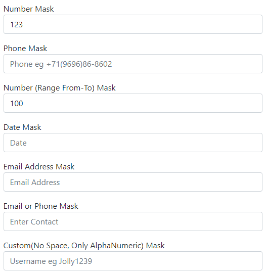
Step 4 – Phone, Email, Number, Username, Function, Date, Range Numbers Mask Example
We have updated the App.js function component to display various types on input controls with various Masks to restrict unintended values in the form controls.
We covered the following in our example implementation:
- Number Mask
- Phone Mask using String
- Number (Range From-To) Mask
- Date Mask
- Email Address Mask using Regex
- Email or Phone Mask using Min Max props
- Custom(No Space, Only AlphaNumeric) Mask using functions
Open the App.js file and update as shown below:
import React from "react";
import "./App.css";
import { IMaskInput } from "react-imask";

const PhoneMask = "+{00}(0000)00-0000";
const EmailMask = /^\S*@?\S*$/;
const phoneEmailMask = [
  {
    mask: PhoneMask,
  },
  {
    mask: EmailMask,
  },
];

const customMask = function (value) {
  var pattern = new RegExp(/^[a-z0-9]+$/i);
  console.log(value, pattern.test(value));
  return pattern.test(value);
};

export default function App() {
  return (
    <div className="container parent-component">
      <h1>Add Form Control Pattern Mask using iMask Plugin @ FreakyJolly</h1>

      <h4>Number Mask</h4>
      <IMaskInput
        mask={Number}
        value="123"
        onAccept={(value, mask) => console.log(value, mask)}
        placeholder="Enter number here"
      />

      <h4>Phone Mask</h4>
      <IMaskInput
        mask={PhoneMask}
        value=""
        onAccept={(value, mask) => console.log(value, mask)}
        placeholder="Phone eg +71(9696)86-8602"
      />

      <h4>Number (Range From-To) Mask</h4>
      <IMaskInput
        mask={Number}
        min={100}
        max={2000}
        value=""
        onAccept={(value, mask) => console.log(value, mask)}
        placeholder="Number 100 - 2000"
      />

      <h4>Date Mask</h4>
      <IMaskInput
        mask={Date}
        min={new Date(2019, 0, 1)}
        max={new Date(2022, 0, 1)}
        onAccept={(value, mask) => console.log(value, mask)}
        placeholder="Date"
      />

      <h4>Email Address Mask</h4>
      <IMaskInput
        mask={EmailMask}
        onAccept={(value, mask) => console.log(value, mask)}
        placeholder="Email Address"
      />

      <h4>Email or Phone Mask</h4>
      <IMaskInput
        mask={phoneEmailMask}
        onAccept={(value, mask) => console.log(value, mask)}
        placeholder="Enter Contact"
      />

      <h4>Custom(No Space, Only AlphaNumeric) Mask</h4>
      <IMaskInput mask={customMask} placeholder="Username eg Jolly1239" />
    </div>
  );
}
You can see the working demo on StackBlitz on the tutorial’s end.
Step 5 – Bootstrap Styles Input Tags with IMaskInput
To add bootstrap style, you need to install the bootstrap package in the React JS app:
npm install bootstrapAfter that, import the bootstrap.min.css file into App.js file. Then you just need to add classes and put labels as shown below:
import React from "react";
import "./App.css";
import "../node_modules/bootstrap/dist/css/bootstrap.min.css";
import { IMaskInput, IMaskMixin } from "react-imask";

const PhoneMask = "+{00}(0000)00-0000";
const EmailMask = /^\S*@?\S*$/;
const phoneEmailMask = [
  {
    mask: PhoneMask,
  },
  {
    mask: EmailMask,
  },
];

const customMask = function (value) {
  var pattern = new RegExp(/^[a-z0-9]+$/i);
  console.log(value, pattern.test(value));
  return pattern.test(value);
};

export default function App() {
  return (
    <div className="container parent-component">
      <form>
        <h1>Bootstrap Styles IMask Controls @ FreakyJolly</h1>

        <div className="form-group mt-3">
          <label>Number Mask</label>
          <IMaskInput
            className="form-control"
            mask={Number}
            value="123"
            onAccept={(value, mask) => console.log(value, mask)}
            placeholder="Enter number here"
          />
        </div>
        <div className="form-group mt-3">
          <label>Phone Mask</label>
          <IMaskInput
            className="form-control"
            mask={PhoneMask}
            value=""
            onAccept={(value, mask) => console.log(value, mask)}
            placeholder="Phone eg +71(9696)86-8602"
          />
        </div>

        <div className="form-group mt-3">
          <label>Number (Range From-To) Mask</label>
          <IMaskInput
            className="form-control"
            mask={Number}
            min={100}
            max={2000}
            value=""
            onAccept={(value, mask) => console.log(value, mask)}
            placeholder="Number 100 - 2000"
          />
        </div>

        <div className="form-group mt-3">
          <label>Date Mask</label>
          <IMaskInput
            className="form-control"
            mask={Date}
            min={new Date(2019, 0, 1)}
            max={new Date(2022, 0, 1)}
            onAccept={(value, mask) => console.log(value, mask)}
            placeholder="Date"
          />
        </div>

        <div className="form-group mt-3">
          <label>Email Address Mask</label>
          <IMaskInput
            className="form-control"
            mask={EmailMask}
            onAccept={(value, mask) => console.log(value, mask)}
            placeholder="Email Address"
          />
        </div>

        <div className="form-group mt-3">
          <label>Email or Phone Mask</label>
          <IMaskInput
            className="form-control"
            mask={phoneEmailMask}
            onAccept={(value, mask) => console.log(value, mask)}
            placeholder="Enter Contact"
          />
        </div>

        <div className="form-group mt-3">
          <label>Custom(No Space, Only AlphaNumeric) Mask</label>
          <IMaskInput
            className="form-control"
            mask={customMask}
            placeholder="Username eg Jolly1239"
          />
        </div>
      </form>
    </div>
  );
}
Here we added the className prop with bootstrap classes. instead on Bootstrap, you can customise Input controls as per your needs in a similar manner.
Step 6 – See in Action
Finally, you can run the application by hitting npm start to start the application at the following URL:
http://localhost:3000Check working demo @ StackBlitz here: