In this Angular tutorial, we’ll discuss How to implement Toggle Switch UI component to add an on/ off button using the ngx-ui-switch package in the Angular 10/9/8/7/6/5/4 application.
Toggle Switch components are a new trend and used widely event in place of Checkboxes and Radio controls. These are generic controls found in the iOS operating systems.
In this article, we are going to implant similar Switch controls ina super simple ways with the help of the ngx-ui-switch package an also discuss various events emitted by the control.
Let’s get started…
Setup Angular CLI
First, install or update the Angular CLI tool to the latest version by running the below NPM command
$ npm install -g @angular/cliYou can check the version of Angular currently installed
$ ng --version
Create a New Angular Application
Run following ng command to create a new Angular project
$ ng new ngx-ui-switch-app
# ? Would you like to add Angular routing? No
# ? Which stylesheet format would you like to use? SCSS
Enter the project directory
$ cd ngx-ui-switch-appRun the application
$ ng serve --open
Install the ngx-ui-switch Package
Run following NPM command to install the ngx-ui-switch package in Angular project
$ npm install ngx-ui-switch --save
Update App Module
After installation of the package, open the app.module.ts file, to update the imports array with <span class="variable other module js">UiSwitchModule</span> module
// app.module.ts
import { BrowserModule } from '@angular/platform-browser';
import { NgModule } from '@angular/core';
import { UiSwitchModule } from 'ngx-ui-switch';

import { AppComponent } from './app.component';

@NgModule({
  declarations: [
    AppComponent
  ],
  imports: [
    BrowserModule,

    UiSwitchModule
  ],
  providers: [],
  bootstrap: [AppComponent]
})
export class AppModule { }
Add CSS Default Style
By default, the package provides the Switch Toggle Button style in the ui-switch.component.css file. This file can be imported in the project in two following ways:
# Update angular.json file
Open the angular.json file to update the styles property as shown below:
# Import in styles.scss file
Or you can simply import the file inside the styles.scss file at the project root
Adding Toggle Switch in Component
The switch is created by adding the <ui-switch/> component directive in the template
<ui-switch></ui-switch>to create a very simple switch button
# Two-way Data Binding
The state of Switch can be controlled by assign the [(ngModel)] property as shown below
<ui-switch [(ngModel)]="isSwitchedOn"></ui-switch>

<button (click)="isSwitchedOn = !isSwitchedOn">Toggle : {{isSwitchedOn}}</button>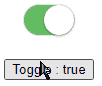
# Check/ Uncheck
Instead of using the [(ngModel)] the [checked] property can also be used by passing the boolean value.
<ui-switch [checked]="isSwitchedOn"></ui-switch>
  </div>
# Enable/ Disable the Toggle
The [<span class="entity other attribute-name html">disabled</span>]=<span class="punctuation definition string begin html">"</span>true" property can be added to disable the toggle action.
# Loading State
A loading state can be shown inside the toggle button by setting [loading]="isLoading" property.
<ui-switch [loading]="isLoading" [(ngModel)]="isSwitchedOn">
      <span *ngIf="isLoading">Loading...</span>
</ui-switch>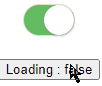
# Method Event handling
Following methods events are available on the ui-switch component.
(change): Triggered when the state of the switch changes, return true/false depicting the current state.(changeEvent): Triggered when the state of the switch changes, returns event for the control.(valueChange): Triggered when the state of the switch changes, return true/false depicting the current state.
<div style="text-align: center;">

  <div>
      <ui-switch
      [checked]="isSwitchedOn"
      [(ngModel)]="isSwitchedOn"
      (change)="onChange($event)"
      (changeEvent)="onChangeEvent($event)"
      (valueChange)="onValueChange($event)">
      </ui-switch>
  </div>

  <div style="margin-top: 20px;">
    <button (click)="isSwitchedOn = !isSwitchedOn">Loading : {{isSwitchedOn}}</button>
  </div>

</div>
Update Class
// app.component.ts
import { Component } from '@angular/core';

@Component({
  selector: 'app-root',
  templateUrl: './app.component.html',
  styleUrls: ['./app.component.scss']
})
export class AppComponent {
  title = 'ngx-ui-switch-app';
  isSwitchedOn = true;

  onChange($event) {
    console.log('onChange', $event);
  }
  onChangeEvent($event) {
    console.log('onChangeEvent', $event);
  }
  onValueChange($event) {
    console.log('onValueChange', $event);
  }
}
# UI Customizations
The UI od toggle switch can be customized by using below properties available:
Size
It takes three sizes small, medium(default) and large
<ui-switch size="small"></ui-switch>
  <ui-switch size="medium"></ui-switch>
  <ui-switch size="large"></ui-switch>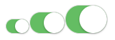
Color
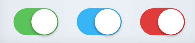
The color property can take color value in any format:
  <ui-switch color="#523F6D"></ui-switch>
  <ui-switch color="blue"></ui-switch>
  <ui-switch color="rgb(255,138,55)"></ui-switch>
switchColor
The color of toggle handle can be changed by using the switchColor property
<ui-switch color="#9A76CD" switchColor="#554171"></ui-switch>
Unchecked Background Color
The color of background state when unchecked can be changed by using the defaultBgColor property.
<ui-switch color="#00D000" switchColor="#2C67F0" defaultBgColor="#F04248"></ui-switch>
Custom labels
Custom toggle labels can be added by using the checkedLabel and uncheckedLabel properties.
<ui-switch checkedLabel="Let's Go" uncheckedLabel="Let's Stay"></ui-switch>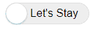
Custom label colors
Lebel colors can also be changed by using checkedTextColor and uncheckedTextColor properties.
<ui-switch checkedTextColor="#ffffff" uncheckedTextColor="red">
  </ui-switch>
Global Configuration
Configuration can also be added globally in the AppModule as well.
import { UiSwitchModule } from 'ngx-ui-switch';
import { AppComponent } from './app.component';

@NgModule({
  imports: [
    BrowserModule,
    UiSwitchModule.forRoot({
      size: 'small',
      color: 'rgb(0, 189, 99)',
      switchColor: '#80FFA2',
      defaultBgColor: '#00ACFF',
      defaultBoColor : '#476EFF',
      checkedLabel: 'on',
      uncheckedLabel: 'off'
    })
  ],
  declarations: [AppComponent],
  bootstrap: [AppComponent]
})
export class AppModule {}
So that there will be no need to customize each Switch compoennt everywhere.
Conclusion
Finally, we are done a detailed tutorial on How to implement a Custome Switch Toggle button in Angular application with the help of ngx-ui-switch package.
We also discussed various configurations available to fully customize the switch component according to the needs.
Do share your feedback in the comment section…
Stay Safe!