In general Autocomplete or Auto, suggestion control is used to show/ fetch related items from a local or remote server as user types to make a selection from available items.
In this tutorial, we will discuss the angular-ng-autocomplete package using which we can easily implement a fully-featured autocomplete without using any third party framework like Material or Bootstrap.
This package provides many inbuilt features to make Autocomplete control more user-friendly for a user.
Let’s quickly get into installation steps, after that, we will discuss its main features and options available to make it more customized according to the needs of a project.
Installation steps for angular-ng-autocomplete Package:
We already have a project up and running and using Angular’s latest version 8.2.14:
Install
Run following npm command in the terminal window at project root to install the angular-ng-autocomplete package:
$ npm i angular-ng-autocompleteConfigure App Module
Next, in the app.module.ts file import AutocompleteLibModule then add in the imports array as shown below:
// app.module.ts
import { BrowserModule } from '@angular/platform-browser';
import { NgModule } from '@angular/core';
import { FormsModule } from '@angular/forms';

import { AppComponent } from './app.component';
import { AppRoutingModule } from './app-routing.module';

import { AutocompleteComponent } from './components/autocomplete/autocomplete.component';

import { AutocompleteLibModule } from 'angular-ng-autocomplete';


@NgModule({
  declarations: [
    AppComponent,
    AutocompleteComponent
  ],
  imports: [
    FormsModule, // <-- required to use [(ngModule)] in HTML component
    BrowserModule,
    AppRoutingModule,

    AutocompleteLibModule
  ],
  providers: [],
  bootstrap: [AppComponent]
})
export class AppModule { }
Adding Autocomplete
Now in component’s HTML template add ng-autocomplete directive with some properties and method events.
Here we have AutocompleteComponent’s template in autocomplete.component.html file, just place below code:
<div class="ng-autocomplete">
    <ng-autocomplete [data]="data" [searchKeyword]="keyword" (selected)='selectEvent($event)'
        (inputChanged)='onChangeSearch($event)' (inputFocused)='onFocused($event)' [itemTemplate]="itemTemplate"
        [notFoundTemplate]="notFoundTemplate">
    </ng-autocomplete>

    <ng-template #itemTemplate let-item>
        <a [innerHTML]="item.name"></a>
    </ng-template>

    <ng-template #notFoundTemplate let-notFound>
        <div [innerHTML]="notFound"></div>
    </ng-template>
</div>
The [itemTemplate] and [notFoundTemplate] are used to customize the item shown in results and Not Found string respectively.
In component class file autocomplete.component.ts place below code:
// autocomplete.component.ts
import { Component, OnInit } from '@angular/core';
@Component({
selector: 'app-autocomplete',
templateUrl: './autocomplete.component.html',
styleUrls: ['./autocomplete.component.css']
})
export class AutocompleteComponent implements OnInit {
keyword = 'name';
data = [
{
id: 1,
name: 'Dakota Gaylord PhD',
address: '14554 Smith Mews'
},
{
id: 2,
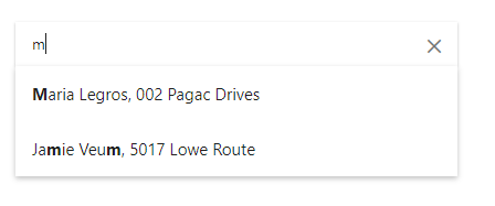
name: 'Maria Legros',
address: '002 Pagac Drives'
},
{
id: 3,
name: 'Brandyn Fritsch',
address: '8542 Lowe Mountain'
},
{
id: 4,
name: 'Glenna Ward V',
address: '1260 Oda Summit'
},
{
id: 5,
name: 'Jamie Veum',
address: '5017 Lowe Route'
}
];
constructor() { }
ngOnInit() {
}
selectEvent(item) {
// do something with selected item
}
onChangeSearch(val: string) {
// fetch remote data from here
// And reassign the 'data' which is binded to 'data' property.
}
onFocused(e){
// do something when input is focused
}
}
Show Multiple Values in Results
In the above object data, there are two important properties name and address. To show both of them in search results we can modify the item template as shown below:
...
    <ng-template #itemTemplate let-item>
        <a href="javascript:void(0)">
            <span [innerHTML]="item.name"></span>,
            <span [innerHTML]="item.address"></span>
        </a>
    </ng-template>
...
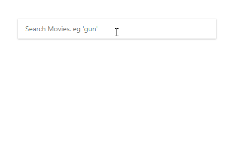
Server Side Response in Autocomplete
Let’s have a look in dynamic Autocomplete where search results are fetched from the server using HTTP Client. Here are using OMDb API service to fetch matching movies in Autocomplete suggestions.
Using (inputChanged) event handler will call getServerResponse method which in turn fetch server response using http’s get method and feed the data object.
Check the below code in HTML template:
<div class="ng-autocomplete">
    <ng-autocomplete
        [data]="data"
        [searchKeyword]="keyword"
        (selected)='selectEvent($event)'
        (inputChanged)='getServerResponse($event)'
        (inputFocused)='onFocused($event)'
        [itemTemplate]="itemTemplate"
        (inputCleared)="searchCleared()"
        [notFoundTemplate]="notFoundTemplate"
        [debounceTime]="600"
        [isLoading]="isLoadingResult"
        [minQueryLength]="2"
        placeHolder="Search Movies. eg 'gun'"
    >
    </ng-autocomplete>

    <ng-template #itemTemplate let-item>
        <a href="javascript:void(0)">
            <div class="row">
                <div class="col-2">
                    <img [src]="item.Poster" style="width:50px" />
                </div>
                <div class="col-10">
                    <span [innerHTML]="item.Title"></span><i>({{item.Year}})</i>
                </div>
            </div>
        </a>
    </ng-template>

    <ng-template #notFoundTemplate let-notFound>
        {{errorMsg}}
    </ng-template>
</div>
Let’s discuss some of the available properties and methods we used above:
[data] : Data of items list. It can be array of strings or array of objects. [searchKeyword] : Variable name to filter data with. Like here we have ‘Title’
[notFoundTemplate] : Set template with message when no result found.[itemTemplate] : Set template for each item shown in results suggetions.
[debounceTime] : Delay time while typing.[isLoading] : Show loader in autocomplete control when set to true.[minQueryLength] : The minimum number of characters the user must type before a search is performed.placeHolder : HTML <input> placeholder text.<strong>(selected)</strong> : Event is emitted when an item from the list is selected.<strong>(inputChanged)</strong> : Event is emitted when an input is changed.<strong>(inputFocused)</strong> : Event is emitted when an input is focused.<strong>(inputCleared)</strong> : Event is emitted when an input is cleared.
Now in component class place following code:
// autocomplete.component.ts
import { Component, OnInit } from '@angular/core';
import { HttpClient } from '@angular/common/http';

@Component({
  selector: 'app-autocomplete',
  templateUrl: './autocomplete.component.html',
  styleUrls: ['./autocomplete.component.css']
})
export class AutocompleteComponent implements OnInit {

  keyword = 'Title';

  data: any;
  errorMsg: string;
  isLoadingResult: boolean;

  constructor(
    private http: HttpClient
  ) { }

  ngOnInit() {
  }

  getServerResponse(event) {

    this.isLoadingResult = true;

    this.http.get("http://www.omdbapi.com/?apikey=[YOUR_API_KEY]&s=" + event)
      .subscribe(data => {
        if (data['Search'] == undefined) {
          this.data = [];
          this.errorMsg = data['Error'];
        } else {
          this.data = data['Search'];
        }

        this.isLoadingResult = false;
      });
  }

  searchCleared() {
    console.log('searchCleared');
    this.data = [];
  }

  selectEvent(item) {
    // do something with selected item
  }

  onChangeSearch(val: string) {
    // fetch remote data from here
    // And reassign the 'data' which is binded to 'data' property.
  }

  onFocused(e) {
    // do something when input is focused
  }

}
So here we got to know how to implement an Autocomplete very easily using the angular-ng-complete package module which supports many features like custom templates, server-side dynamic response, debounceTime which reduces the unwanted requests to the server on every keypress.
You can also opt for Angular Material based autocomplete but it required a lot of configurations and not preferred if only Autocomplete is required.
Leave a Reply