Angular Material provides a vast library of UI components for building professional web applications.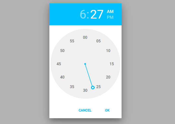 However, it lacks an out-of-the-box time picker component. This is where the ngx-material-timepicker comes in handy. In this article, we will learn how to install, configure and use ngx-material-timepicker to add time-picking functionality in Angular apps with Material design.
Installing and Importing ngx-material-timepicker
To use ngx-material-timepicker, first install it via npm:
npm install --save ngx-material-timepicker
npm install --save luxon
Once installed, import NgxMaterialTimepickerModule in your app’s main module. Make sure to import the BrowserAnimationsModule as TimePicker use animations, but you can also disable them as well:
import { NgModule } from '@angular/core';
import { BrowserModule } from '@angular/platform-browser';
import { AppComponent } from './app.component';
import { BrowserAnimationsModule } from '@angular/platform-browser/animations';
import { NgxMaterialTimepickerModule } from 'ngx-material-timepicker';

@NgModule({
  declarations: [AppComponent],
  imports: [
    BrowserModule,
    BrowserAnimationsModule,
    NgxMaterialTimepickerModule,
  ],
  providers: [],
  bootstrap: [AppComponent],
})
export class AppModule {}
This makes the time picker component available to use in your app.
Using ngx-material-timepicker
Let’s look at how to add a basic time picker in your component:
In the template, add the time picker component:
import { Component } from '@angular/core';

@Component({
  selector: 'app-root',
  templateUrl: './app.component.html',
  styleUrls: ['./app.component.css'],
})
export class AppComponent {
  time = '';

  onTimeSet(time: string) {
    this.time = time;
  }
}
In the template, add the time picker component:
<div>
  <input [ngxTimepicker]="picker">
  <ngx-material-timepicker #picker (timeSet)="onTimeSet($event)"></ngx-material-timepicker>
</div>
Selected Time: {{time}}
The (timeSet) output binding calls the onTimeSet() method whenever a time is selected and passes the chosen time.
Form Validation and Error Handling
To use Timepicker in forms, add it to a FormGroup:
timeForm = new FormGroup({
  time: new FormControl('', Validators.required)
});
Pass this form group to the timepicker using [formControl] binding.
To show errors, check form validity on submit:
onSubmit() {
  if (this.timeForm.invalid) {
    return;
  }

  // form valid, submit data
}
Display the timepicker error below the input:
<form [formGroup]="timeForm" (ngSubmit)="onSubmit()">

  <div>
    <input matInput [ngxTimepicker]="picker2" formControlName="time">
    <ngx-material-timepicker #picker2  timeFormat="HH:mm"></ngx-material-timepicker>
  </div>
  <div *ngIf="timeForm.controls.time.invalid && this.timeForm.touched">
    <span style="color: red;" *ngIf="timeForm.controls.time.errors && timeForm.controls.time.errors['required']">
      Please select time
    </span>
  </div>
  <button>Submit</button>

</form>

<div>
  Selected Time: {{time}}
</div>
The complete component class will look like this:
import { Component } from '@angular/core';
import { FormControl, FormGroup, Validators } from '@angular/forms';

@Component({
  selector: 'app-root',
  templateUrl: './app.component.html',
  styleUrls: ['./app.component.css'],
})
export class AppComponent {
  time = '';

  timeForm = new FormGroup({
    time: new FormControl('', Validators.required),
  });

  onTimeSet(time: string) {
    this.time = time;
  }

  onSubmit() {
    if (this.timeForm.invalid) {
      console.log(this.timeForm.touched);
      return;
    }

    console.log(this.timeForm.value);
  }
}
Switch Time Format 12/24 Hours
By providing the format property to 12 or 24 as the number we can set the hours format:
<div class="12hr-example">
  <input placeholder="12hr format (default settings)" aria-label="12hr format" [ngxTimepicker]="default" readonly>
  <ngx-material-timepicker #default></ngx-material-timepicker>
</div>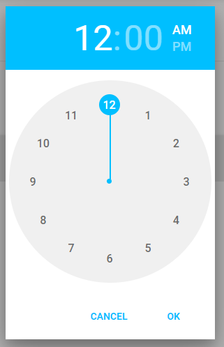
<div class="24hr-example">
  <input placeholder="24hr format" aria-label="24hr format" [ngxTimepicker]="fullTime" [format]="24" readonly>
  <ngx-material-timepicker #fullTime></ngx-material-timepicker>
</div>
Custom Theme for TimePicker
We can assign customer-style themes in [theme] property
<div class="custom-theme-example">
  <input placeholder="Custom theme" aria-label="Custom theme" [ngxTimepicker]="darkPicker" readonly>
  <ngx-material-timepicker #darkPicker [theme]="darkTheme"></ngx-material-timepicker>
</div>
Add dartTheme object of type NgxMaterialTimepickerTheme in class:
  darkTheme: NgxMaterialTimepickerTheme = {
    container: {
      bodyBackgroundColor: '#424242',
      buttonColor: '#fff',
    },
    dial: {
      dialBackgroundColor: '#555',
    },
    clockFace: {
      clockFaceBackgroundColor: '#555',
      clockHandColor: '#9fbd90',
      clockFaceTimeInactiveColor: '#fff',
    },
  };
Show Inline TimePicker on Input
We can show an inline time selector on Input control by adding the <ngx-timepicker-field> component
<div class="ngx-timepicker-field-example">
  <ngx-timepicker-field [defaultTime]="'11:11 am'"></ngx-timepicker-field>
</div>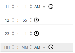
Internationalization
By default, it has en-US locale. But Timepicker supports locales in format BCP 47. We can switch the locale as shown below:
import {NgModule} from '@angular/core';
import {NgxMaterialTimepickerModule} from 'ngx-material-timepicker';

@NgModule({
  imports: [NgxMaterialTimepickerModule.setOpts('ar-AE', 'arab')]
})
export class MyModule {}
Handle Output Events
TimePicker supports the following event handlers:
  <ngx-material-timepicker #picker
  (timeSet)="onTimeSet($event)"
  (opened)="onOpened()"
  (closed)="onClosed()"
  (hourSelected)="onHourSelected($event)"
  (timeChanged)="onTimeChanged($event)"
  ></ngx-material-timepicker>
These events defined in the class:
  onTimeSet(time: string) {
    this.time = time;
  }

  onOpened() {
    // opened
  }

  onClosed() {
    // closed
  }

  onHourSelected(hour: any) {
    // hour selected
  }

  onTimeChanged(time: any) {
    // time changed
  }
Also, we can have (timeChanged) event handler on the Input control:
<input [ngxTimepicker]="picker" [format]="24" (timeChanged)="onTimeChanged($event)">
Conclusion
By adding NGX Material Timepicker can implement a time selection widget in any form. We can easily customer the theme, handle events, chnage format and event internationalisation. To get more fine-grain control we can set Min, Max or Disable the control and even add validations.
It also provides the inline time selection fields with similar kinds of flexibility.