Customize Alerts, confirm messages using sweetalert2 in Angular example; In this Angular tutorial, we’ll learn how to implement custom Alert, Confirm and Toast messages in Angular 10/9/8/7/6/5/4 application by using the Sweetalert2 package.
Sweetalert2 is an awesome package to show customized, animated, and beautiful Alert components. These are fully responsive and supported by multiple operating systems.

The Alert messages created by Sweetalert2 adds up more customization to the native Javascript Alerts. We can easily customize and create a user-friendly notification for users to adapt our application style.
We’ll discuss Sweetalert2 examples with all important properties and configurations in this tutorial.
So let’s get started…
Setup Angular CLI
First, install or update the Angular CLI tool to the latest version by running the below NPM command
$ npm install -g @angular/cliYou can check the version of Angular currently installed
$ ng --version
Create a New Angular Application
Run following ng command to create a new Angular project
$ ng new angular-sweetalert2-tutorial
# ? Would you like to add Angular routing? No
# ? Which stylesheet format would you like to use? CSS
Enter the project directory
$ cd angular-sweetalert2-tutorialRun the application
$ ng serve --open
Install the sweetalert2 Package
Run following NPM command to install the sweetalert2 package in Angular project
$ npm install --save sweetalert2
Creating Sweet Alerts
Let’s check how to show these Sweet alerts in the component. In a component class, we import Swal namespace
import Swal from 'sweetalert2';We can directly use methods in this namespace without adding inside the constructor() method.
That’s it now we can easily create Alert messages by calling the Swal.fire() method.
Simple Alert
To create a simple Alert with a message call the Swal.fire() method with a string value as the first parameter to take Alert title.
Swal.fire('This is a simple and sweet alert')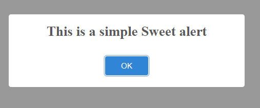
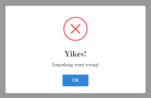
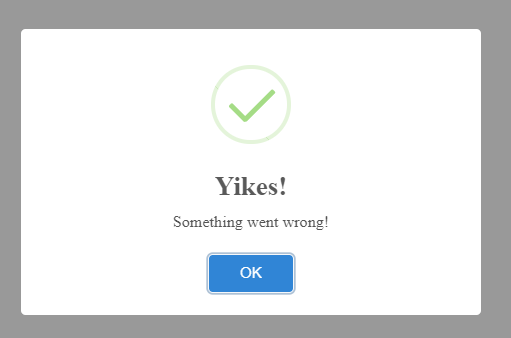
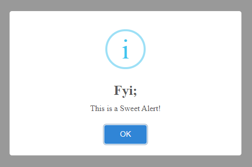
Alert Messages of Error, Success, Info, and Warning Types
SweetAlert provides predefined color and style themes for Error, Success, Information and Warning alert messages. The Swal.fire() methods take three arguments title, message, and type.
# Error Alert
// Error
  showErrorAlert() {
    Swal.fire('Yikes!', 'Something went wrong!', 'error')
  }
# Success Alert
// Success
  showSuccessAlert() {
    Swal.fire('Yikes!', 'Something went wrong!', 'success')
  }
# Info Alert
// Information
  showInfoAlert() {
    Swal.fire('Fyi;', 'This is a Sweet Alert!', 'info')
  }
# Warning Alert
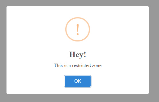
// Warning
  showWarningAlert() {
    Swal.fire('Hey!', 'This is a restricted zone', 'warning')
  }
# Question Alert
// Question
  showQuestionAlert() {
    Swal.fire('There?', 'Are we still connected?', 'question')
  }
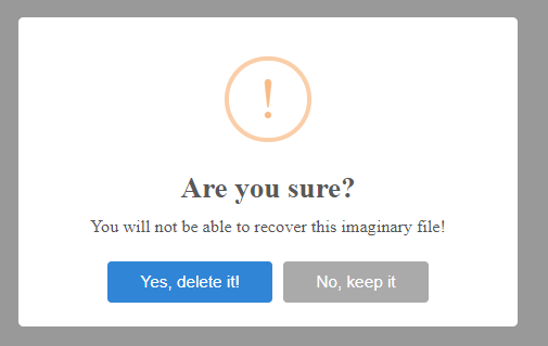
Handling Button Click Events in Alert Box
The buttons on the Alert box can be customized to have custom text. Also, we can handle events triggered by these buttons to perform the required actions.
The cancel button can be displayed by setting the showCancelButton: true property.
For example, the warning Alert message with custom buttons and event handling is shown below:
// Custom Buttons
  handleWarningAlert() {

    Swal.fire({
      title: 'Are you sure?',
      text: 'You will not be able to recover this imaginary file!',
      icon: 'warning',
      showCancelButton: true,
      confirmButtonText: 'Yes, delete it!',
      cancelButtonText: 'No, keep it',
    }).then((result) => {

      if (result.isConfirmed) {

        console.log('Clicked Yes, File deleted!');

      } else if (result.isDismissed) {

        console.log('Clicked No, File is safe!');

      }
    })

  }
The Sweet alert box can have a Footer section to show HTML content by using the footer property.
// Alert with footer
  showAlertWithFooter() {
    Swal.fire({
      icon: 'error',
      title: 'Oops...',
      text: 'Something went wrong!',
      footer: `
      <a href>FAQ</a>
      <a href>Contact Us</a>
      <a href>Check Details</a>
      `
    })
  }
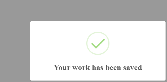
Custom Position of Alert Box
The position property can be used to change the position of Alert box visibility on screen. It can have the following properties: 'top', 'top-start', 'top-end', 'top-left', 'top-right', 'center', 'center-start', 'center-end', 'center-left', 'center-right', 'bottom', 'bottom-start', 'bottom-end', 'bottom-left', 'bottom-right'
// Custom Position
  changeAlertPosition() {
    Swal.fire({
      position: 'bottom-right',
      icon: 'success',
      title: 'Your work has been saved',
      showConfirmButton: false,
      timer: 1500
    })
  }
Custom Animation to Show/ Hide Alert
The showClass and hideClass properties can be used to override the default animation style. Any animation style can be used by adding the Animate.css file.
Swal.fire({
  title: 'Custom animation with Animate.css',
  showClass: {
    popup: 'animate__animated animate__fadeInDown'
  },
  hideClass: {
    popup: 'animate__animated animate__fadeOutUp'
  }
})
Alert boxes can also have Form controls like Input, Textarea, Radio, Checkboxes, File, etc. You can check working examples here.
Conclusion
Using Sweetalert2 you can create awesome Alert boxes with lots for possibilities for customization. There are a number of use cases that can be created. You can check working examples on official documentation here.