In this tutorial, you will learn how to create a reusable, Select box dropdown component using the Reactive Forms approach in Angular.
The Select dropdown component that we will create can be easily used in any parent component, allowing you to add single or multiple dropdowns with dynamic options. These Selecboxes will have their own change event handlers and require validation.
The reactive forms API Selectbox component will be flexible, which will enable us to customize its behaviour according to the requirements.
One of the key features that we will implement is the ability to pass dynamic options as a parameter to the component. This will allow us to populate the dropdown with different sets of dynamic options without having to modify the component’s code. We can easily fetch and provide these option objects to our Selectbox dropdowns via static or remote HTTPS API responses. Using this the component will automatically update, rendering the new options for selection.
Each dynamic dropdown will have the Parent’s formGroup, so that each of them will be created as part of a single parentForm as a new FormControl. This flow enables us to easily scan our application with any number of dynamic form controls.
Along with the event handlers, we will also implement an optional form validation error message that will show up if the form is submitted without selecting a value. The required validation for a Dropdown can be turned on/off based on the param input provided.
Furthermore, our selection dropdown component can have single and multi-select options that can be configured by passing the input parameter.
How to Create Reusable Dropdown Component Using Reactive Forms Approach in Angular?
This is a step-by-step process to create a reusable selection drop-down in Angular using Reactive Forms API. This Dropdown can be configured to have required validation, single or multi-selection, event handlers etc:
Step 1 – Create an Angular Application
Step 2 – Update App Module with Reactive Forms Module
Step 3 – Using Bootstrap Styles
Step 4 – Create a Reactive Dropdown Component
Step 5 – Using Dropdown Component in Parent
Step 6 – Start Development Server
Step 1 – Create an Angular Application
Before we begin, ensure that you have the following installed on your machine:
- Node.js
- Angular CLI
After that, you can execute the following ng command to create a new Angular project with latest version:
ng new angular-dropdown-app
Thereafter, move inside the application directory:
cd angular-dropdown-app
Step 2 – Update App Module with Reactive Forms Module
After setting up our Angular application, next we need to import the ReactiveFormsModule which provides the APIs to implement Reactive Forms in our Angular app.
Now, update the imports array to include the imported module as shown below:
import { NgModule } from '@angular/core';
import { BrowserModule } from '@angular/platform-browser';

import { AppRoutingModule } from './app-routing.module';
import { AppComponent } from './app.component';
import { ReactiveFormsModule } from '@angular/forms';

@NgModule({
  declarations: [AppComponent],
  imports: [BrowserModule, AppRoutingModule, ReactiveFormsModule],
  providers: [],
  bootstrap: [AppComponent],
})
export class AppModule {}
Step 3 – Using Bootstrap Styles
This step is optional and depends on which UI library you want to use in your project. But to keep our demo attractive and to keep it simple, we will use the Bootstrap 5 UI styles.
We can easily integrate Bootstrap by installing it as an npm package in our app:
npm install bootstrap
After the npm package is installed, you can modify the styles array inside the angular.json file at your project’s root to consume the bootstrap CSS file:
...
            "styles": [
              "node_modules/bootstrap/dist/css/bootstrap.min.css",
              "src/styles.css"
            ],
...
Step 4 – Create a Reactive Dropdown Component
Moving forward, we will quickly create the Reactive Dropdown component by executing the below ng generate command provided by NG CLI:
ng generate component reusable-dropdown
Now we have our ReactiveDropdownComponent is ready to be modified with all the features we discussed earlier. First, update the reactive-dropdown.component.ts file with the following code then we will have a look on various parts of it:
import { Component, Input, Output, EventEmitter } from '@angular/core';
import { FormControl, FormGroup, Validators } from '@angular/forms';

@Component({
  selector: 'app-reactive-dropdown',
  templateUrl: './reactive-dropdown.component.html',
  styleUrls: ['./reactive-dropdown.component.css'],
})
export class ReactiveDropdownComponent {
  @Input() options: any[] = [];
  @Input()
  label!: string;
  @Input()
  controlName!: string;
  @Input()
  parentForm!: FormGroup;
  @Input() isMultiselect = false;
  @Input() enableValidation = true; // New input for validation control
  @Output() selectionChange = new EventEmitter<any>();

  ngOnInit(): void {
    const control = this.isMultiselect
      ? new FormControl([], this.enableValidation ? Validators.required : null)
      : new FormControl(
          null,
          this.enableValidation ? Validators.required : null
        );
    this.parentForm.addControl(this.controlName, control);
  }

  onSelectionChange(value: any) {
    this.selectionChange.emit(value);
  }
}
Head towards the template file reactive-dropdown.component.html and update it with the following code:
<div [formGroup]="parentForm" class="mb-3">
    <label for="{{ controlName }}" class="form-label">{{ label }}</label>
    <select formControlName="{{ controlName }}" (change)="onSelectionChange(parentForm.get(controlName)?.value)"
        class="form-select" [multiple]="isMultiselect">
        <option *ngFor="let option of options" [ngValue]="option">
            {{ option.label }}
        </option>
    </select>
    <div
        *ngIf="enableValidation && parentForm.get(controlName)?.invalid && (parentForm.get(controlName)?.dirty || parentForm.get(controlName)?.touched)">
        <small class="text-danger">This field is required.</small>
    </div>
</div>
Let’s have a look at the various parts of components we created above.
At the beginning of our component class, we have configurable @Input() variables. These can be dynamically passed from the parent component, in our case, the parent will be App Component.
Following are the various Input params with their use:
| Input | Description |
|---|---|
| options | An array of objects representing the dropdown options. Each object will have label and value keys. |
| label | This will be the label of the dropdown component. |
| controlName | The control name in the parent form. |
| parentForm | A FormGroup instance representing the parent form in which the dropdown component is included. So that current Dropdown component can join as a group of existing Reactive form in parent. |
| isMultiselect | A boolean value to determines if the dropdown should allow multiple selections. |
| enableValidation | A boolean value to controls whether the validation should be enabled for the dropdown component. |
| selectionChange | An EventEmitter that emits the selected value(s) when the selection changes in the dropdown component. |
We also have the onSelectionChange() change event handler bind to each Dynamic select box dropdown.
Inside the ngOnInit() hook, we are creating the dropdown control using the Reactive Forms approach and adding it as a control to the parentFrom, so that it can contribute to the existing Form in Parent.
In the template part, we have created a Bootstrap styles dropdown with label, selection and error validation elements.
The <select> tag is using various Input parameters to configure accordingly.
Step 5 – Using Dropdown Component in Parent
Our Reactive Dropdown Component is now ready to be consumed anywhere in our application. We will use the AppComponent to consume the Dropdown component.
Open the app.component.html and update as shown below:
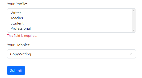
<div class="container mt-5">
  <div class="row">
    <div class="col-md-6">

      <h2 class="mb-4">Select Dropdowns usign Reactive Forms in Angular</h2>

      <form [formGroup]="parentForm" (submit)="onSubmit()" novalidate>

        <app-reactive-dropdown
          [options]="dropdownOptions"
          [label]="'Your Profile:'"
          [controlName]="'dropdownProfile'"
          [parentForm]="parentForm"
          [isMultiselect]="true"
          (selectionChange)="onDropdownSelectionChange($event, 'dropdownProfile')"
          [enableValidation]="true">
        </app-reactive-dropdown>

        <app-reactive-dropdown
          [options]="dropdownOptions"
          [label]="'Your Hobbies:'"
          [controlName]="'dropdownHobbies'"
          [parentForm]="parentForm"
          [isMultiselect]="false"
          (selectionChange)="onDropdownSelectionChange($event, 'dropdownHobbies')"
          [enableValidation]="true"
        ></app-reactive-dropdown>

        <button type="submit" class="btn btn-primary mt-3">Submit</button>

      </form>

    </div>
  </div>
</div>
Open the App component class file app.component.ts and update it with the following:
import { Component } from '@angular/core';
import { FormGroup } from '@angular/forms';

@Component({
  selector: 'app-root',
  templateUrl: './app.component.html',
  styleUrls: ['./app.component.css'],
})
export class AppComponent {
  parentForm: FormGroup = new FormGroup({});

  dropdownOptionsProfile = [
    { value: 1, label: 'Writer' },
    { value: 2, label: 'Teacher' },
    { value: 3, label: 'Student' },
    { value: 4, label: 'Professional' },
  ];
  dropdownOptionsHobbies = [
    { value: 1, label: 'Writing' },
    { value: 2, label: 'CopyWriting' },
    { value: 3, label: 'Teaching' },
    { value: 4, label: 'Painting' },
    { value: 5, label: 'Singing' },
    { value: 6, label: 'Travelling' },
  ];

  onSubmit() {
    if (this.parentForm.valid) {
      console.log(this.parentForm.value);
    } else {
      this.parentForm.markAllAsTouched();
    }
  }

  onDropdownSelectionChange(value: any, controlName: string) {
    console.log(`Selected value for ${controlName}: `, value);
  }
}
In the class, we have added the static dropDown objects that can also be fetched from a remote API using HTTP call and used as a DropDown options source.
The onDropdownSeelectionChange event is bound to the (selectionChange) event handler to update the dropdown values. These selected values are shown in the console if the validation criteria are fulfilled, otherwise, an error message on the required select box is displayed.
Step 6 – Start Development Server
Finally, we are ready to see our Angular application with Reactive Select Dropdown select boxes in action.
Execute npm start or directly run ng serve command to start the webserver and run your Angular app at http://localhost:4200/

Conclusion
We have successfully implemented the reusable Selectbox Dropdown component which used the Reactive Forms approach. Moreover, we have any number of Select Dropdowns with configurable properties for required validation, single or multiselection.
Also, we can pass the dynamic options object to each of them to be rendered on the page which will be part of the parent FormGroup and helps in keeps a single Forms Object.