In this detailed guide, you will learn how to work with Radio button form controls provided by the Material library in the Angular project. We will create forms using Template Driven and Reactive Forms approach and also implement required validation to throw a warning message if the form is submitted without selection.
Angular Material Radio Buttons are based on HTML native elements <input type="radio"> but have added features, theming options, and accessibility enhancements. The Radio controls are used in situations where only a single value out of options needs to be selected.
The examples we are going to create will have Template driven and Reactive forms approach to add validation and create multiple Radio list groups.
How to Create Material Radio List in Angular Application with Validation?
Follow these steps to add material radio list groups in the Angular app:
Step 1 – Create a new Angular App
Step 2 – Add Material Library
Step 3 – Import Required Modules
Step 4 – Understanding Basic Radio Options
Step 5 – Create Radio List Groups with Validation
Step 1 – Create a new Angular App
Install the latest version of Angular CLI by executing the below command:
npm install -g @angular/cli
Thereafter create a new Angular app using the ng new command:
ng new angular-radio-list-app
Enter into the application directory:
cd angular-radio-list-app
Step 2 – Add Material Library
We are ready with our Angular app, next, we will add the Material library by executing the below command and selecting the configuration options. You can simply hit enter to select the default options:
ng add @angular/material
Step 3 – Import Required Modules
To use the Material Radio we need to import the required modules into the AppModule. Open the app.module.ts file and update the imports array with all the required modules we need for our example application.
import { NgModule } from '@angular/core';
import { BrowserModule } from '@angular/platform-browser';

import { AppComponent } from './app.component';
import { BrowserAnimationsModule } from '@angular/platform-browser/animations';

import { FormsModule, ReactiveFormsModule } from '@angular/forms';
import { MatFormFieldModule } from '@angular/material/form-field';
import { MatRadioModule } from '@angular/material/radio';

@NgModule({
  declarations: [AppComponent],
  imports: [
    BrowserModule,
    BrowserAnimationsModule,
    FormsModule, // <- Add this
    ReactiveFormsModule, // <- Add this
    MatFormFieldModule, // <- Add this
    MatRadioModule, // <- Add this
  ],
  providers: [],
  bootstrap: [AppComponent],
})
export class AppModule {}
Step 4 – Understanding Basic Radio Options
Before we dive into a fully functional example with Radio Group Lists with validation using the Template Driven and Reactive Forms approach, let’s have a look of some of the common options and configuration steps:
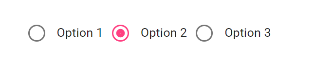
Basic Radio Buttons:
To create a group of basic radio buttons, use the mat-radio-group and mat-radio-button components as follows:
<mat-radio-group [(ngModel)]="selectedOption">
  <mat-radio-button value="option1">Option 1</mat-radio-button>
  <mat-radio-button value="option2">Option 2</mat-radio-button>
  <mat-radio-button value="option3">Option 3</mat-radio-button>
</mat-radio-group>
...
export class AppComponent {
  selectedOption = 'option2';
}
In this example, selectedOption is a property in your component that will store the value of the selected radio button.
Disabled Radio Buttons:
To disable a radio button, use the disabled attribute:

Vertical Layout:
By default, Angular Material Radio Buttons are displayed horizontally. However, you can create a vertical layout by adding a custom class named <span >vertical-radio-group </span>
.vertical-radio-group {
  display: flex; flex-direction: column;
  margin: 15px 0;
}
Then add the class to the Radio group wrapper:
<label id="example-radio-group-label">Pick your favorite season</label>

<mat-radio-group [(ngModel)]="selectedOption" class="vertical-radio-group">
  <mat-radio-button value="option1">Option 1</mat-radio-button>
  <mat-radio-button value="option2">Option 2</mat-radio-button>
  <mat-radio-button value="option3">Option 3</mat-radio-button>
</mat-radio-group>

<div>Selection is: {{selectedOption}}</div>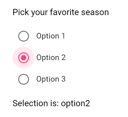
Form Validation:
Angular Material Radio Buttons can be integrated with Angular forms for validation. You can use the required attribute to make the selection mandatory:
<mat-radio-group [(ngModel)]="selectedOption" required>
  <!-- Radio buttons here -->
</mat-radio-group>
Change Events:
You can listen to change events when the selected option changes:
<mat-radio-group [(ngModel)]="selectedOption" (change)="onRadioChange($event)">
  <!-- Radio buttons here -->
</mat-radio-group>
In your component:
onRadioChange(event: MatRadioChange) {
  console.log('Selected value:', event.value);
}
Step 5 – Create Radio List Groups with Validation
Now we will create a list of Radio Groups with the required validation. This radio group list will have a submit button to show a message if none of the values is selected. We will create a similar Radio group list using the template-driven and reactive forms approach.
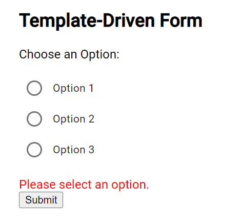
Template Driven Radio Group List Validation
In the HTML template add the following Form with mat-radio-group having mat-radio-button inside it:
<div class="form-container">
  <h2>Template-Driven Form</h2>
  <form (ngSubmit)="onSubmit()" #form="ngForm" novalidate>

    <div>
      <label>Choose an Option:</label>
      <mat-radio-group name="option" [(ngModel)]="selectedOption" required class="vertical-radio-group">
        <mat-radio-button *ngFor="let option of options" [value]="option">
          {{ option }}
        </mat-radio-button>
      </mat-radio-group>
    </div>

    <!-- Validation message for required field -->
    <div class="validation-message" *ngIf="isSubmitted && !form.controls['option'].valid">
      Please select an option.
    </div>

    <!-- Submit button -->
    <button type="submit" mat-raised-button color="primary">Submit</button>

    <!-- Selected values display -->
    <div class="selected-values" *ngIf="isSubmitted && form.controls['option'].valid">
      <h3>Selected Option:</h3>
      <p>{{ selectedOption }}</p>
    </div>

  </form>
</div>
We also have the validation message and a submit button of type=”submit” to trigger the (ngSubmit) event to check if the value is selected or not.
Update the component class to define the Radio list options and onSubmit event handler:
import { Component } from '@angular/core';

@Component({
  selector: 'app-root',
  templateUrl: './app.component.html',
  styleUrls: ['./app.component.css']
})
export class AppComponent {
  options = ['Option 1', 'Option 2', 'Option 3'];
  selectedOption!: string;
  isSubmitted = false;

  onSubmit() {
    this.isSubmitted = true;
    // Perform any additional actions with the selectedOption here
    console.log('Selected Option:', this.selectedOption);
  }
}
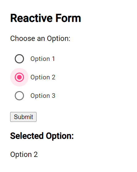
Reactive Form with Radio Button Group Validation
Now we will create a similar form using the Reactive form approach. Here we will have the [formGroup] with (ngSubmit) event handler on the Form.
<div class="form-container">
  <h2>Reactive Form</h2>
  <form [formGroup]="reactiveForm" (ngSubmit)="onSubmit()">

    <div>
      <label>Choose an Option:</label>
      <mat-radio-group formControlName="option">
        <mat-radio-button *ngFor="let option of options" [value]="option">
          {{ option }}
        </mat-radio-button>
      </mat-radio-group>
    </div>

    <!-- Validation message for required field -->
    <div class="validation-message" *ngIf="isSubmitted && reactiveForm.get('option').invalid">
      Please select an option.
    </div>

    <!-- Submit button -->
    <button type="submit" mat-raised-button color="primary">Submit</button>

    <!-- Selected values display -->
    <div class="selected-values" *ngIf="isSubmitted && reactiveForm.valid">
      <h3>Selected Option:</h3>
      <p>{{ reactiveForm.value.option }}</p>
    </div>

  </form>
</div>
Now update the component class with FormGroup and FormBuilder:
import { Component } from '@angular/core';
import { FormBuilder, FormGroup, Validators } from '@angular/forms';

@Component({
  selector: 'app-root',
  templateUrl: './app.component.html',
  styleUrls: ['./app.component.css'],
})
export class AppComponent {
  options = ['Option 1', 'Option 2', 'Option 3'];
  selectedOption!: string;
  isSubmitted = false;
  reactiveForm!: FormGroup;

  constructor(private formBuilder: FormBuilder) {}

  ngOnInit() {
    this.reactiveForm = this.formBuilder.group({
      option: ['', Validators.required],
    });
  }

  onSubmit() {
    this.isSubmitted = true;
    // Perform any additional actions with the selectedOption here
    console.log('Selected Option:', this.reactiveForm.value.option);
  }
}
Conclusion
We have implemented the Radio Group Buttons in a Group list with Template Driven and Reactive forms approach. There is also the required validation so that if the submit button is clicked the message will show up to select a value, else the selected value will be fetched from the radio list and shown.
Hope this will be helpful…