In this Angular Material tutorial, we will walk through various examples of implementing Material Menu, customizing it, interacting with it programmatically, routing from the menu, showing selected values and much more.
What is Angular Material Menu?
Material is a UI component library exclusively developed for Angular by following Google’s material Desing principals which provide the most commonly use and advanced features for quick and user-friendly applications.
The menu component is part of almost every application that enables a user to select an action from a specific list of options which can help to trigger on-screen operation or to navigate the user to another page. A Menu component helps to bundle important action links under one label or icon and saves a lot of space and also cleans the UI at the same time.
What we will discuss today?
The menu is a simple UI component, but it can be used in several ways in various scenarios. By the end of this tutorial, you will learn about the following feature in the Angular Material menu:
- Create Basic Menu
- Menu with Icons
- Dynamically Add Menu Items
- Customize the Style of the Material menu
- Create nested Menu Items with Children
- Programmatically Close/ Open the Menu
- Handling Menu Item Selection Events
- Using Material Menu as Context menu
- Changing the Location of the Menu on Screen
- Link Material menu with routing
- Add Filter Search on Menu Items
Create Angular Application and Install Material
First, let’s create a new Angular app using ng cli. Make sure you have the latest version of ng cli installed by executing the below command:
npm install -g @angular/cli
Now execute the following command to create a new Angular app with the provided name:
ng new material-menu-appAfter creating the Angular app, we will install the Material library by simply executing the ng add command and thereafter selecting the required configuration or just enter of every option to select default.
ng add @angular/material
Import Required Material Modules
After adding the Material library, we need to import the required modules for Menu in our main module.
Open the app.module.ts file and import these three modules named MatMenuModule, MatButtonModule and MatIconModule and update the imports array:
import { NgModule } from '@angular/core';
import { BrowserModule } from '@angular/platform-browser';

import { AppComponent } from './app.component';
import { BrowserAnimationsModule } from '@angular/platform-browser/animations';

import { MatMenuModule } from '@angular/material/menu';
import { MatButtonModule } from '@angular/material/button';
import { MatIconModule } from '@angular/material/icon';

@NgModule({
  declarations: [AppComponent],
  imports: [
    BrowserModule,
    BrowserAnimationsModule,
    MatMenuModule,
    MatButtonModule,
    MatIconModule,
  ],
  providers: [],
  bootstrap: [AppComponent],
})
export class AppModule {}
The MatIconModule is optional and used to add icons to the components. After adding these modules, you will be able to use Material Menu in your application components.
Let’s have a look at examples starting from basic to more advanced going forward.
Create a Basic Material Menu
A material menu can be created using the mat-menu component. In addition to this, a trigger element like a button or icon is also required which helps to open the menu options.
In the component template for example the app.component.html file, add the following code:
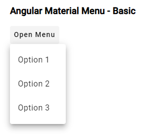
<h3>Angular Material Menu - Basic</h3>

<!-- Trigger button -->
<button mat-button [matMenuTriggerFor]="basicMenu">Open Menu</button>

<!-- Menu -->
<mat-menu #basicMenu="matMenu">
  <button mat-menu-item>Option 1</button>
  <button mat-menu-item>Option 2</button>
  <button mat-menu-item>Option 3</button>
</mat-menu>
Here we have mat-button directive from Angular Material which creates the Menu container to have all the item options in it with mat-menu-item directive.
The[matMenuTriggerFor]="basicMenu" binds the trigger button to the menu by using the reference variable basicMenu.
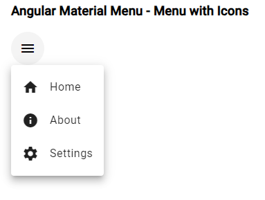
Add Icons to the Menu Items
Mostly we have to add icons to the UI controls. For using the Material icons we have imported the MatIconModule module. Thereafter we can use the mat-icon component to show an icon based on the label provided into it.
Update the button trigger and mat-menu-item to have mat-icon in them as shown below:
<!-- Trigger button -->
<button mat-icon-button [matMenuTriggerFor]="advancedMenu">
  <mat-icon>menu</mat-icon>
</button>

<!-- Menu -->
<mat-menu #advancedMenu="matMenu" class="custom-menu">
  <button mat-menu-item>
    <mat-icon>home</mat-icon>
    Home
  </button>
  <button mat-menu-item>
    <mat-icon>info</mat-icon>
    About
  </button>
  <button mat-menu-item>
    <mat-icon>settings</mat-icon>
    Settings
  </button>
</mat-menu>
Dynamically Add Menu Items
In dynamic applications, we may have Menu items fetched from a remote or locally served via JSON object. In such cases let’s have a look at how to build a dynamic menu by using Angular’s ngFor directive to loop through the array and create menu items for each element.
In the component class we have this array of menu items:
@Component({
  // ...
})
export class AppComponent {
  menuItems = ['Option 1', 'Option 2', 'Option 3'];
}
We will iterate through these items by using the ngFor to loop through the menuItems array and dynamically create menu items:
<button mat-button [matMenuTriggerFor]="dynamicMenu">Open Dynamic Menu</button>

<mat-menu #dynamicMenu="matMenu">
  <button mat-menu-item *ngFor="let item of menuItems">{{ item }}</button>
</mat-menu>
We can easily style the look and feel of menu items by adding the custom CSS as shown below:
/* styles.css */
.custom-menu {
  background-color: #f0f0f0;
  border: 1px solid #ccc;
  border-radius: 4px;
  padding: 8px;
}

.custom-menu button {
  display: flex;
  align-items: center;
}
Thereafter, we need to apply our custom class on the mat-menu wrapper:
<mat-menu #advancedMenu="matMenu" class="custom-menu">
  <!-- menu items here -->
</mat-menu>
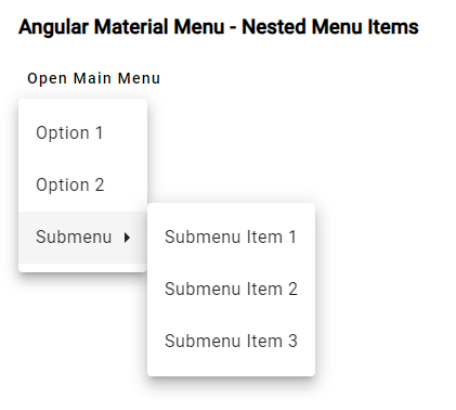
Create Nested Menu Items with Children
We may have multilevel menu items having multiple parents with their own child items. Here we will discuss how to create submenus with Angular Material Menu. We can simply nest another mat-menu inside a menu item to create a submenu.
Here’s an example of a nested menu:
<button mat-button [matMenuTriggerFor]="mainMenu">Open Main Menu</button>
<mat-menu #mainMenu="matMenu">
  <button mat-menu-item>Option 1</button>
  <button mat-menu-item>Option 2</button>
  <button mat-menu-item [matMenuTriggerFor]="submenu">Submenu</button>
</mat-menu>

<mat-menu #submenu="matMenu">
  <button mat-menu-item>Submenu Item 1</button>
  <button mat-menu-item>Submenu Item 2</button>
  <button mat-menu-item>Submenu Item 3</button>
</mat-menu>
Programmatically Close/ Open or Toggle the Menu
Other than the manual trigger, we can also open, close or toggle the menu programmatically. To achieve this we need to use the MatMenuTrigger API provided by Angular Material.
In the component class, we create a reference to trigger the menu:
import { Component, ViewChild } from '@angular/core';
import { MatMenuTrigger } from '@angular/material/menu';

@Component({
  selector: 'app-root',
  templateUrl: './app.component.html',
  styleUrls: ['./app.component.css'],
})
export class AppComponent {
  @ViewChild('menuTrigger')
  menuTrigger!: MatMenuTrigger;

  constructor() {}

  openMenu(): void {
    this.menuTrigger.openMenu();
  }

  closeMenu(): void {
    this.menuTrigger.closeMenu();
  }

  toggleMenu(): void {
    this.menuTrigger.toggleMenu();
  }
}
Now, we can use the openMenu() ,closeMenu() and toggleMenu() methods provided by the MatMenuTrigger API to control the menu programmatically:
<h3>Angular Material Menu - Open Close on Click</h3>

<button mat-button (click)="openMenu()">Open Menu Programmatically</button>
<button mat-button (click)="closeMenu()">Close Menu Programmatically</button>
<button mat-button (click)="toggleMenu()">Toggle Menu Programmatically</button>

<div></div>

<button mat-icon-button #menuTrigger="matMenuTrigger" [matMenuTriggerFor]="programmaticMenuTrigger">
  <mat-icon>menu</mat-icon>
</button>
<mat-menu #programmaticMenuTrigger="matMenu">
  <button mat-menu-item>Option 1</button>
  <button mat-menu-item>Option 2</button>
  <button mat-menu-item>Option 3</button>
</mat-menu>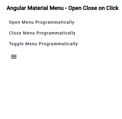
Handling Menu Item Callback Events
Sometimes we may need to handle operations on Menu events. In this section, we will see how to handle callback events like menu open, close, or item selection in Angular Material Menu by using the (opened), (closed), and (select) event bindings.
<button mat-button [matMenuTriggerFor]="menu" (click)="onMenuClick()">Open Menu</button>

<mat-menu #menu="matMenu" (opened)="onMenuOpened()" (closed)="onMenuClosed()">
  <button mat-menu-item (click)="onMenuItemSelect('Option 1')">Option 1</button>
  <button mat-menu-item (click)="onMenuItemSelect('Option 2')">Option 2</button>
  <button mat-menu-item (click)="onMenuItemSelect('Option 3')">Option 3</button>
</mat-menu>
Then update the class to define methods:
...
...

export class AppComponent {
  onMenuClick(): void {
    console.log('Menu clicked.');
  }

  onMenuOpened(): void {
    console.log('Menu opened.');
  }

  onMenuClosed(): void {
    console.log('Menu closed.');
  }

  onMenuItemSelect(option: string): void {
    console.log(`Menu item selected: ${option}`);
  }
}
Changing the Location of the Menu on the Screen
We can control the positioning of the menu using the xPosition and yPosition properties of the MatMenuTrigger.
In the component template, add the xPosition and yPosition properties to the menu trigger element as below:
<button mat-button [matMenuTriggerFor]="advancedMenu" [xPosition]="'before'" [yPosition]="'below'">Open Menu</button>
The menu will be positioned to the left (xPosition: 'before') and below the trigger button (yPosition: 'below').
Link Material Menu with Routing
Options in the Menu can also be used to enable Routing accros different pages in the application. We can add the routerLink directive with path to navigate to the clicked item.
Use the routerLink directive to navigate to different routes as shown below:
<mat-menu #navigationMenu="matMenu">
  <a mat-menu-item routerLink="/">Home</a>
  <a mat-menu-item routerLink="/about">About</a>
  <a mat-menu-item routerLink="/settings">Settings</a>
</mat-menu>
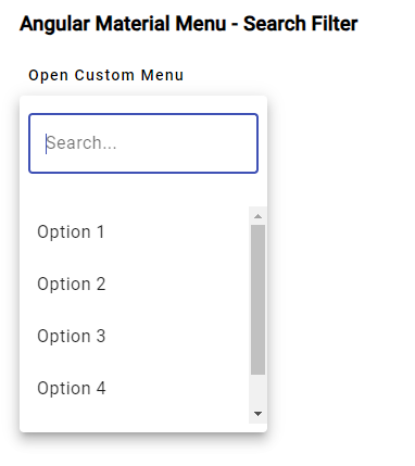
Add Filter Search on Menu Items
Next is very useful feature to search or filter the menu items. The filter feature becomes useful if we have large number of options to chose from. Here will add the Mat Input with Menu from where a user can filter our other searched item to quickly select.
Here is an example of adding a search input to the menu:
    <button mat-button [matMenuTriggerFor]="menu">Open Custom Menu</button>

    <mat-menu #menu="matMenu" (cdkConnectedOverlayOpen)="onMenuOpened()" (menuClosed)="onMenuClosed()">
      <div class="menu-header">
        <mat-form-field appearance="outline">
          <input matInput #searchInput [(ngModel)]="searchTerm" name="search" (click)="$event.stopPropagation()" placeholder="Search...">
        </mat-form-field>
      </div>
      <div class="menu-content">
        <button mat-menu-item *ngFor="let item of filteredItems" (click)="onMenuItemSelect(item)">
          {{ item }}
        </button>
      </div>
    </mat-menu>
Update the component class:
import { Component, ViewChild, ElementRef } from '@angular/core';
import { MatMenu, MatMenuTrigger } from '@angular/material/menu';

@Component({
  selector: 'app-root',
  templateUrl: './app.component.html',
  styleUrls: ['./app.component.css'],
})
export class AppComponent {
  @ViewChild('menu') menu!: MatMenu;
  @ViewChild(MatMenuTrigger) menuTrigger!: MatMenuTrigger;
  @ViewChild('searchInput') searchInput!: ElementRef<HTMLInputElement>;

  items: string[] = [
    'Option 1',
    'Option 2',
    'Option 3',
    'Option 4',
    'Option 5',
  ];
  searchTerm = '';

  ngAfterViewInit(): void {
    this.menuTrigger.menuOpened.pipe().subscribe(() => {
      this.searchInput.nativeElement.focus();
    });
  }

  get filteredItems(): string[] {
    return this.items.filter((item) =>
      item.toLowerCase().includes(this.searchTerm.toLowerCase())
    );
  }

  onMenuOpened(): void {
    this.searchTerm = ''; // Clear the search term when the menu is opened.
  }

  onMenuClosed(): void {
    // Check if the click target is the search input to prevent closing the menu.
    if (document.activeElement === this.searchInput.nativeElement) {
      this.menuTrigger.openMenu(); // Reopen the menu.
    }
  }

  onMenuItemSelect(item: string): void {
    console.log(`Menu item selected: ${item}`);
    this.menuTrigger.closeMenu();
  }
}
Make sure to import the FormsModule, MatFormFieldModule and MatInputModule in the AppModule as shown below:
....
import { FormsModule } from '@angular/forms';
import { MatFormFieldModule } from '@angular/material/form-field';
import { MatInputModule } from '@angular/material/input';

@NgModule({
  declarations: [AppComponent],
  imports: [
    BrowserModule,
    BrowserAnimationsModule,
    FormsModule, // <- Add this
    MatFormFieldModule, // <- Add this
    MatInputModule, // <- Add this
    MatMenuModule,
    MatButtonModule,
    MatIconModule,
  ],
  providers: [],
  bootstrap: [AppComponent],
})
export class AppModule {}
Conclusion
Finally, we have implemented Material Menu from basic to Advanced level with included dynamic menu, Open/Close/Toggle of Menu programmatically on button click Callback for open cose or item selection, adding search filter and much more.
Hope this was helpful…