Angular material tables provide the fully loaded table components in which we can easily add sorting, paging, filter-like features without any much codding. It works like charm in real-world applications and provides a nice user-friendly user interface.
Sometimes our component may represent more than one grid of tabular data, in that case, it becomes a bit confusing on how to add more than one Angular material tables in a single component having respective sorting and pagination components.
In this post, we will create a new Angular project and install Material’s latest version to demonstrate how we can easily put more than one Material grids in a single component.
Let’s get started!
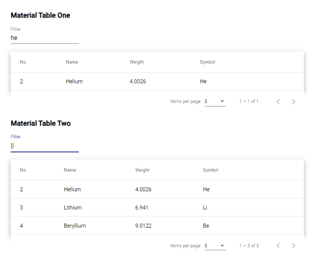
Our Material tables will have Sorting, Pagination and Search filter for better understanding…
Create a new Angular Project
We already have installed the latest version of the NG CLI tool with version 8.3.13.
You can also update you NG CLI version by running following NPM command in your terminal:
$ ng update @angular/cli @angular/coreTo create a new project, run following NG command in your terminal window:
$ ng new angular-material-table
? Would you like to add Angular routing? Yes
? Which stylesheet format would you like to use? CSS
Install and Configure Material
Next, we will install Material in our Angular project by running the following command:
$ ng add @angular/materialThen select from a few options asked after running above command:
? Choose a prebuilt theme name, or "custom" for a custom theme: Indigo/Pink
? Set up HammerJS for gesture recognition? No
? Set up browser animations for Angular Material? Yes
Now we are ready with an Angular project with Material installed!
Create a new component:
To demonstrate Tables, we are going to create a new Components by running following NG command in CLI:
$ ng generate component material-tableUpdate the app-routing.module.ts with updated routes object:
// app-routing.module.ts
import { NgModule } from '@angular/core';
import { Routes, RouterModule } from '@angular/router';
import { MaterialTableComponent } from './material-table/material-table.component';


const routes: Routes = [
  {
    path:'',
    redirectTo:'material-table',
    pathMatch:'full'
  },
  {
    path:'material-table',
    component:MaterialTableComponent
  }
];

@NgModule({
  imports: [RouterModule.forRoot(routes)],
  exports: [RouterModule]
})
export class AppRoutingModule { }
Note: Don’t forget to clean up app.component.html leaving only
router-outlet
Add Material Tables in Project:
To create a Material table and to keep it simple we will add table elements then add Table directive components to it.
Here we added two tables with their respective template reference variables defined for Sorting and Paginator.
Following is the table template with directive components:
<div style="padding:5%">
  <mat-form-field>
    <input
      matInput
      (keyup)="applyFilterOne($event.target.value)"
      placeholder="Filter"
    />
  </mat-form-field>
  <table
    mat-table
    matSort
    [dataSource]="dataSourceOne"
    #TableOneSort="matSort"
    class="mat-elevation-z8"
    style="width: 100%;"
  >
    <!--- Note that these columns can be defined in any order.
            The actual rendered columns are set as a property on the row definition" -->

    <!-- Position Column -->
    <ng-container matColumnDef="position">
      <th mat-header-cell *matHeaderCellDef>No.</th>
      <td mat-cell *matCellDef="let element">{{ element.position }}</td>
    </ng-container>

    <!-- Name Column -->
    <ng-container matColumnDef="name">
      <th mat-header-cell *matHeaderCellDef mat-sort-header>Name</th>
      <td mat-cell *matCellDef="let element">{{ element.name }}</td>
    </ng-container>

    <!-- Weight Column -->
    <ng-container matColumnDef="weight">
      <th mat-header-cell *matHeaderCellDef mat-sort-header>Weight</th>
      <td mat-cell *matCellDef="let element">{{ element.weight }}</td>
    </ng-container>

    <!-- Symbol Column -->
    <ng-container matColumnDef="symbol">
      <th mat-header-cell *matHeaderCellDef mat-sort-header>Symbol</th>
      <td mat-cell *matCellDef="let element">{{ element.symbol }}</td>
    </ng-container>

    <tr mat-header-row *matHeaderRowDef="displayedColumnsOne"></tr>
    <tr mat-row *matRowDef="let row; columns: displayedColumnsOne"></tr>
  </table>

  <mat-paginator
    #TableOnePaginator="matPaginator"
    [pageSize]="3"
    [pageSizeOptions]="[5, 10, 25, 100]"
  ></mat-paginator>

  <mat-form-field>
    <input
      matInput
      (keyup)="applyFilterTwo($event.target.value)"
      placeholder="Filter"
    />
  </mat-form-field>
  <table
    mat-table
    matSort
    [dataSource]="dataSourceTwo"
    #TableTwoSort="matSort"
    class="mat-elevation-z8"
    style="width: 100%;"
  >
    <!--- Note that these columns can be defined in any order.
                The actual rendered columns are set as a property on the row definition" -->

    <!-- Position Column -->
    <ng-container matColumnDef="position">
      <th mat-header-cell *matHeaderCellDef>No.</th>
      <td mat-cell *matCellDef="let element">{{ element.position }}</td>
    </ng-container>

    <!-- Name Column -->
    <ng-container matColumnDef="name">
      <th mat-header-cell *matHeaderCellDef mat-sort-header>Name</th>
      <td mat-cell *matCellDef="let element">{{ element.name }}</td>
    </ng-container>

    <!-- Weight Column -->
    <ng-container matColumnDef="weight">
      <th mat-header-cell *matHeaderCellDef mat-sort-header>Weight</th>
      <td mat-cell *matCellDef="let element">{{ element.weight }}</td>
    </ng-container>

    <!-- Symbol Column -->
    <ng-container matColumnDef="symbol">
      <th mat-header-cell *matHeaderCellDef mat-sort-header>Symbol</th>
      <td mat-cell *matCellDef="let element">{{ element.symbol }}</td>
    </ng-container>

    <tr mat-header-row *matHeaderRowDef="displayedColumnsTwo"></tr>
    <tr mat-row *matRowDef="let row; columns: displayedColumnsTwo"></tr>
  </table>

  <mat-paginator
    #TableTwoPaginator="matPaginator"
    [pageSize]="3"
    [pageSizeOptions]="[5, 10, 25, 100]"
  ></mat-paginator>
</div>
For adding multiple tables we need to take care of the following points:
Sorting: In table element, we need to define a template variable #TableOneSort of matSort
Pagination: On mat-paginator element also we defined a template variable #TableOnePaginator or type matPaginator
Filter: For Filter search, we have defined applyFilterOne method which can have different names for different tables.
Update App Module with Material Modules
To use material modules we need to import them in the app.module.ts file so that these can be used anywhere in the project.
Here we are using table, sorting, pagination, and filter with input field so we will import all these modules in app.module.ts file as shown below:
// app.module.ts
import { BrowserModule } from '@angular/platform-browser';
import { NgModule } from '@angular/core';

import { AppRoutingModule } from './app-routing.module';
import { AppComponent } from './app.component';
import { BrowserAnimationsModule } from '@angular/platform-browser/animations';
import { MaterialTableComponent } from './material-table/material-table.component';

import { MatTableModule } from '@angular/material/table';
import { MatPaginatorModule } from '@angular/material/paginator';
import { MatSortModule } from '@angular/material/sort';
import { MatFormFieldModule } from '@angular/material/form-field';
import { MatInputModule } from '@angular/material/input';

@NgModule({
  declarations: [
    AppComponent,
    MaterialTableComponent
  ],
  imports: [
    BrowserModule,
    AppRoutingModule,
    BrowserAnimationsModule,

    MatTableModule,
    MatPaginatorModule,
    MatSortModule,
    MatFormFieldModule,
    MatInputModule
  ],
  providers: [],
  bootstrap: [AppComponent]
})
export class AppModule { }
Update Component Class
In component class, we will define data for the table also use template reference variable for sorting and paginator for both tables.
Check out the component class code in the material-table.component.ts file below:
// material-table.component.ts
import { Component, OnInit, ViewChild } from '@angular/core';
import { MatSort } from '@angular/material/sort';
import { MatPaginator } from '@angular/material/paginator';
import { MatTableDataSource } from '@angular/material/table';

interface PeriodicElement {
  name: string;
  position: number;
  weight: number;
  symbol: string;
}

const ELEMENT_DATA: PeriodicElement[] = [
  {position: 1, name: 'Hydrogen', weight: 1.0079, symbol: 'H'},
  {position: 2, name: 'Helium', weight: 4.0026, symbol: 'He'},
  {position: 3, name: 'Lithium', weight: 6.941, symbol: 'Li'},
  {position: 4, name: 'Beryllium', weight: 9.0122, symbol: 'Be'},
  {position: 5, name: 'Boron', weight: 10.811, symbol: 'B'}
];

@Component({
  selector: 'app-material-table',
  templateUrl: './material-table.component.html',
  styleUrls: ['./material-table.component.css']
})
export class MaterialTableComponent implements OnInit {

  dataSourceOne: MatTableDataSource<PeriodicElement>;
  displayedColumnsOne: string[] = ['position', 'name', 'weight', 'symbol'];
  @ViewChild('TableOnePaginator', {static: true}) tableOnePaginator: MatPaginator;
  @ViewChild('TableOneSort', {static: true}) tableOneSort: MatSort;


  dataSourceTwo: MatTableDataSource<PeriodicElement>;
  displayedColumnsTwo: string[] = ['position', 'name', 'weight', 'symbol'];
  @ViewChild('TableTwoPaginator', {static: true}) tableTwoPaginator: MatPaginator;
  @ViewChild('TableTwoSort', {static: true}) tableTwoSort: MatSort;

  constructor() {
    this.dataSourceOne = new MatTableDataSource;

    this.dataSourceTwo = new MatTableDataSource;
  }

  ngOnInit() {
    this.dataSourceOne.data = ELEMENT_DATA;
    this.dataSourceOne.paginator = this.tableOnePaginator;
    this.dataSourceOne.sort = this.tableOneSort;

    this.dataSourceTwo.data = ELEMENT_DATA;
    this.dataSourceTwo.paginator = this.tableTwoPaginator;
    this.dataSourceTwo.sort = this.tableTwoSort;
  }

  applyFilterOne(filterValue: string) {
    this.dataSourceOne.filter = filterValue.trim().toLowerCase();
  }

  applyFilterTwo(filterValue: string) {
    this.dataSourceTwo.filter = filterValue.trim().toLowerCase();
  }

}
That’s it in the above example we added two Angular Material tables using template variables which can work separately without messing with each other.
Leave a Reply