In the Angular Material tutorial, we’re going to discuss how to create a Material Autocomplete showing suggestion results by using the mat-autocomplete component in Angular 10/9/8/7/6/5/4 application.
An Autocomplete control looks similar to an input field but it helps a user to select a suggestion matching from a typed string. The list of predefined suggestions shown to the user can be saved on local, in a JSON file or can be fetched from a remote server database.
The Angular Material UI library provides a wide variety of components, today we will discuss Material’s Autocomplete UI component. Material Autocomplete can be added in the template component using the mat-autocomplete directive component.
We’ll create a new Angular 9 project using the latest version of the Angular CLI tool, install and setup the Material UI library. After that, we will start from a basic Autocomplete then move to advanced implementation with available configurations.
Let’s start by upgrading the Angular CLI tool. Make sure you have the latest version of the Angular/ Ng CLI tool installed on your system. It helps in quickly creating an Angular application and also provides other features to generate various components through the terminal.
Update Ng CLI
Run the following command in the terminal window to update the Ng CLI tool.
$ npm install -g @angular/cli
Setup a new Angular project
Let’s create a new Angular project with current version 9.0.6 by executing the below ng command in the terminal window and answer a few questions:
$ ng new angular-material-autocomplete
? Would you like to add Angular routing? No
? Which stylesheet format would you like to use? CSS
After creating the project, move to the project directory
$ cd angular-material-autocompleteThen open the project in Visual Studio Code by hitting the below command:
$ code .Now you can open the terminal by pressing the Ctrl+` shortcut in Visual Studio Code then execute below command to run the project @ http://localhost:4200/:
$ ng serve --open
Install and Configure Angular Material Library
In the older versions of Material, we used to have a lot of manual configurations in the project files, but after version 9 there is only a single npm command which will do all the stuff for you. Thanks to the team 🙂
Run the following npm command in the terminal window at the project root, it will ask few questions to configure Material integration with the Angular project.
$ ng add @angular/materialSelect a theme of your choice. I choose the first one 😛
? Choose a prebuilt theme name, or "custom" for a custom theme: Indigo/PinkIf you want typography styles. Read more about them here.
? Set up global Angular Material typography styles? YesFinally, if you want animations, just hit yes
? Set up browser animations for Angular Material? YesThat’s it after answering these simple questions, you have installed Material library in your project.
Update App Module
The Material UI library provides a number of UI components, so we need to include API of that component which we are going to use in the project. We need to define modules in the App’s main module.
Open the app.module.ts file, then import MatAutocompleteModule, MatFormFieldModule and MatInputModule. We’ll also use FormControl so also import the FormsModule and ReactiveFormsModule as well.
// app.module.ts
import { BrowserModule } from '@angular/platform-browser';
import { NgModule } from '@angular/core';

import { AppComponent } from './app.component';
import { BrowserAnimationsModule } from '@angular/platform-browser/animations';

import { MatAutocompleteModule } from '@angular/material/autocomplete';
import { MatFormFieldModule } from '@angular/material/form-field';
import { MatInputModule } from '@angular/material/input';
import { FormsModule, ReactiveFormsModule } from '@angular/forms';

@NgModule({
  declarations: [
    AppComponent
  ],
  imports: [
    BrowserModule,
    BrowserAnimationsModule,
    FormsModule,
    ReactiveFormsModule,

    MatAutocompleteModule,
    MatFormFieldModule,
    MatInputModule
  ],
  providers: [],
  bootstrap: [AppComponent]
})
export class AppModule { }
Now we are ready to add Material Autocomplete in the Angular project.
Adding Material Autocomplete
The Material Autocomplete works in a combination of two things first is the Input control and the second is a list of autocomplete suggestions.
The mat-autocomplete wrapper with each item in the mat-option is used, as shown below:
Simple Autocomplete Example
This will only show Autocomplete items when the user focuses on the Input field
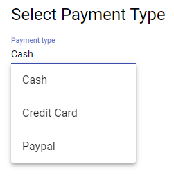
    <mat-form-field class="example-full-width">

      <input type="text" placeholder="Payment type" matInput [formControl]="myControl" [matAutocomplete]="auto">

      <mat-autocomplete #auto="matAutocomplete">
        <mat-option *ngFor="let option of options" [value]="option">
          {{option}}
        </mat-option>
      </mat-autocomplete>

    </mat-form-field>
There is an Input field with the matInputdirective, which will be connected to the mat-autocomplete directive through template variable #auto ( this can be anything you like )
export class AppComponent {
  title = 'angular-material-autocomplete';

  myControl = new FormControl();
  options: string[] = ['Cash', 'Credit Card', 'Paypal'];
}
Filter Autocomplete items as user types in Input
To enable the filter on items we will map Autocomplete items then filter them using a custom _filter method

  <mat-form-field class="example-full-width">

    <input type="text" placeholder="Payment type" matInput [formControl]="myControl" [matAutocomplete]="auto">

    <mat-autocomplete #auto="matAutocomplete">
      <mat-option *ngFor="let option of filteredOptions | async" [value]="option">
        {{option}}
      </mat-option>
    </mat-autocomplete>

  </mat-form-field>
In the class file, we will define the filteredOptions as an Observable. Then we’ll modify the valueChanges observable of FormControl with own _filter() method.
// app.component.ts
import { Component } from '@angular/core';
import { FormControl } from '@angular/forms';
import { Observable } from 'rxjs';
import { map, startWith } from 'rxjs/operators';

@Component({
  selector: 'app-root',
  templateUrl: './app.component.html',
  styleUrls: ['./app.component.css']
})
export class AppComponent {
  title = 'angular-material-autocomplete';

  myControl = new FormControl();
  options: string[] = ['Cash', 'Credit Card', 'Paypal'];

  filteredOptions: Observable<string[]>;

  ngOnInit() {
    this.filteredOptions = this.myControl.valueChanges
      .pipe(
        startWith(''),
        map(value => this._filter(value))
      );
  }

  private _filter(value: string): string[] {
    const filterValue = value.toLowerCase();

    return this.options.filter(option => option.toLowerCase().includes(filterValue));
  }

}
Autocomplete with Custom Object
We can modify the layout of suggestions shown by adding customer element in the mat-option element wrapped inside mat-autocomplete as shown below:
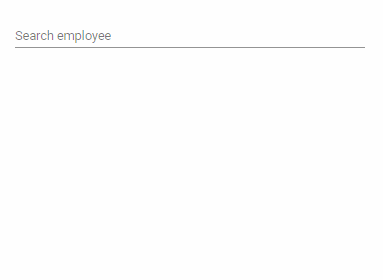
  <mat-form-field class="example-full-width">

    <input matInput placeholder="Search employee" [matAutocomplete]="auto" [formControl]="employeeCtrl">

    <mat-autocomplete #auto="matAutocomplete">
      <mat-option *ngFor="let employee of filteredEmployee | async" [value]="employee.name">

        <img class="example-option-img" aria-hidden [src]="employee.imageUrl" height="25">
        <span>{{employee.name}} [{{employee.jobtype}}]</span>
        <small>Email: {{employee.email}}</small>
        <small>Address: {{employee.address}}</small>

      </mat-option>
    </mat-autocomplete>

  </mat-form-field>
In the class, we have employees object
// app.component.ts
import { Component } from '@angular/core';
import { FormControl } from '@angular/forms';
import { Observable } from 'rxjs';
import { map, startWith } from 'rxjs/operators';

export interface Employee {
  id: number;
  name: string;
  jobtype: string;
  email: string;
  address: string;
  imageUrl: string;
}

@Component({
  selector: 'app-root',
  templateUrl: './app.component.html',
  styleUrls: ['./app.component.css']
})
export class AppComponent {
  title = 'angular-material-autocomplete';

  employeeCtrl = new FormControl();
  filteredEmployee: Observable<Employee[]>;

  employees: Employee[] = [
    {
      "id": 1,
      "name": "Lilla Nitzsche",
      "jobtype": "Human Intranet Liaison",
      "email": "Edwardo_Homenick@gmail.com",
      "address": "11360 Bahringer Squares",
      "imageUrl": "https://s3.amazonaws.com/uifaces/faces/twitter/aleclarsoniv/128.jpg"
    },
    {
      "id": 2,
      "name": "Francisca Considine",
      "jobtype": "Dynamic Web Supervisor",
      "email": "Don_Ernser@yahoo.com",
      "address": "852 Lori Turnpike",
      "imageUrl": "https://s3.amazonaws.com/uifaces/faces/twitter/hiemil/128.jpg"
    },
    {
      "id": 3,
      "name": "Gussie Stoltenberg",
      "jobtype": "Customer Intranet Representative",
      "email": "Leonard.Turcotte17@hotmail.com",
      "address": "10080 Jett Corners",
      "imageUrl": "https://s3.amazonaws.com/uifaces/faces/twitter/necodymiconer/128.jpg"
    },
    {
      "id": 4,
      "name": "Fatima Dickinson",
      "jobtype": "Dynamic Directives Orchestrator",
      "email": "Woodrow_Carter97@gmail.com",
      "address": "3249 Wilkinson Overpass",
      "imageUrl": "https://s3.amazonaws.com/uifaces/faces/twitter/pifagor/128.jpg"
    },
    {
      "id": 5,
      "name": "Edmund Nicolas MD",
      "jobtype": "Future Markets Designer",
      "email": "Garland_Carter@yahoo.com",
      "address": "35163 McKenzie Forest",
      "imageUrl": "https://s3.amazonaws.com/uifaces/faces/twitter/michaelbrooksjr/128.jpg"
    },
  ];

  constructor() {
    this.filteredEmployee = this.employeeCtrl.valueChanges
      .pipe(
        startWith(''),
        map(employee => employee ? this._filterEmployees(employee) : this.employees.slice())
      );
  }

  private _filterEmployees(value: string): Employee[] {
    const filterValue = value.toLowerCase();

    return this.employees.filter(state => state.name.toLowerCase().indexOf(filterValue) === 0);
  }

}
This is how we can use Material Autocomplete using a custom template for options. For complete documentation check here. Also, check this post explaining how to show remote server response in Autocomplete with a loader.