In this React 16+ tutorial, we are going to learn How to implement a custom Select Drop Down Control with Single or Multiple Selection capability having tons of amazing properties using the react-select package in the ReactJs application.
The react-select package provides a number of advanced features that now seem a necessity like a filter or search feature, animates interaction, customization of options, etc.
Today we’ll integrate the react-select drop-down component in the ReactJs applications and discuss various cool features provided to customize and enhance the user experience.
Let’s start the step by step tutorial…
Create a React Application
First, we’ll create a new React application using npx create-react-app command
$ npx create-react-app react-select-appMove inside the react app
$ cd react-select-appRun application
$ npm start
Install React Select package
After creating the Reactjs application, install the React Select package by running below command
$ npm install react-select
Convert App Component from Function to Class
First, we’ll convert the App function component into a class component to use state and add event handlers.
When we create a new ReactJs app using the create-react-app command the App.js file looks like this
// App.js
import React from 'react';
import logo from './logo.svg';
import './App.css';

function App() {
  return (
    <div className="App">
      <header className="App-header">
        <img src={logo} className="App-logo" alt="logo" />
        <p>
          Edit <code>src/App.js</code> and save to reload.
        </p>
        <a
          className="App-link"
          href="https://reactjs.org"
          target="_blank"
          rel="noopener noreferrer"
        >
          Learn React
        </a>
      </header>
    </div>
  );
}

export default App;
After conversion, it will look like this
// App.js
import React, { Component } from 'react';
import logo from './logo.svg';
import './App.css';

class App extends Component {

  render() {
    return (
      <div className="App" >
        <header className="App-header">
          <img src={logo} className="App-logo" alt="logo" />
          <p>
            Edit <code>src/App.js</code> and save to reload.
        </p>
          <a
            className="App-link"
            href="https://reactjs.org"
            target="_blank"
            rel="noopener noreferrer"
          >
            Learn React
        </a>
        </header>
      </div>
    );
  }

}

export default App;
Adding React Select in Application
To use the Select component in a class, import it from ‘react-select’
import Select from 'react-select';
Update the App class as shown below:
// App.js
import React, { Component } from 'react';
import './App.css';
import Select from 'react-select';
const options = [
{ value: 'bugatti', label: 'Bugatti' },
{ value: 'ferrari', label: 'Ferrari' },
{ value: 'am', label: 'Aston Martin' },
{ value: 'koenigsegg', label: 'Koenigsegg' },
{ value: 'bmw', label: 'BMW' },
{ value: 'cadillac', label: 'Cadillac' },
];
class App extends Component {
state = {
selectedOption: null,
};
handleChange = selectedOption => {
this.setState({ selectedOption });
console.log(`Option selected:`, selectedOption);
};
render() {
const { selectedOption } = this.state;
return (
<div className="App" >
<h3>You Favorite Car</h3>
<Select
value={selectedOption}
onChange={this.handleChange}
options={options}
/>
</div>
);
}
}
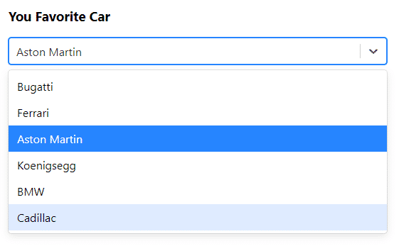
export default App;The options collections is used to create options in the Select component. The handleChange method is setting the state variable selectOption with value using the setState method available inside a class component.
The <Select> component provided by the react-select package, having three properties value, onChange event handler and options to take a collection of data.
The select box control created will look like this:
Enable Multi- Selection of Values
The isMulti property is set to true to enable multi selection of values in the React Select component.
<Select
          isMulti={true}
          value={selectedOption}
          onChange={this.handleChange}
          options={options}
 />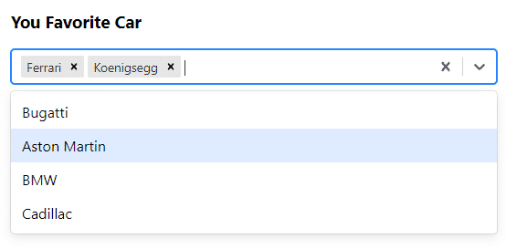
Show Selected Values in Template
Here we will use ternary operator to show values on if selected. The map method will traverse all values selected in the selectedOption state property.
return (
      <div className="App" >
        <h3>You Favorite Car</h3>
        <Select
          isMulti={true}
          value={selectedOption}
          onChange={this.handleChange}
          options={options}
        />

        {this.state.selectedOption.length ? (
          <div>
            <h3>Selected Cars</h3>
            <ul>
              {this.state.selectedOption.map((option) =>
                <li key={option.value}>
                  {option.label}
                </li>
              )}
            </ul>
          </div>) : ''
        }

      </div>
    );
Other Properties of React Select
Following are the properties available on Select component:
autoFocus: This will autofocus the control when it mountsclassName: Add a custom class to add custom stylingclassNamePrefix: Adds a custom prefix to inner classes on control.isDisabled: Boolean value to disable the controlisMulti: To allow multiple selections of values.isSearchable: Enable filter of options values.name: generate an HTML input with this name, containing the current valueonChange: The event handler for on change.options: The collection of objects to build the select box options.placeholder: Placeholder text is shown if no value is selected.value: The value of select control.
Methods Available
Following event handlers are available
onChange(): Triggered when the value is changed.onMenuOpen(): Triggered when the options menu is opened.onMenuClose(): Triggered when the options menu is closed.onInputChange(): Triggered when user types in the value to filter.
Conclusion
The react-select package can be easily installed and ready to use. It can replace the native HTML select control with added features and customization with better event handling.
You can check more details on official documentation.
Hope you enjoyed this post, do share your feedback in the comment section below.
Thanks for reading!
thank u for help