In this React 16+ tutorial, we’ll learn How to add Tooltips in ReactJs application using React Bootstrap package.
What is Tooltip?
A tooltip is a small piece of floating container which is shown by user interaction with elements on the application page. They are generally used to display some sort of information when user clicks or hover over an element.
Tooltips as the name suggests, display a tip about an action that can be done by the element over which the tooltip is displayed.
What is Popover?
A popover is also an overlay like Tooltip but it provides more customization and has different sections for heading and content. It is used to represent more detailed information with custom HTML
As an Overlay, Popovers can be controlled to show up on specific position and can have multiple trigger options like click, hover, and focus.
We’ll implement the Tooltip and Popovers components in the React application by installing the React Bootstrap package module.
What is React Bootstrap?
The React Bootstrap provides a wide variety of ready to use Bootstrap UI components which are exclusively converted and build for React applications. To use Bootstrap we need to install the react-bootstrap package module in the React application.
Create a React Application
First, we’ll create a new React application using npx create-react-app command
$ npx create-react-app react-bootstrap-loaders-appMove inside the react app
$ cd react-bootstrap-loaders-appRun application
$ npm start
Install React Bootstrap Package
After creating the react application, now we’ll install <strong>react-bootstrap</strong> and bootstrap packages by running below command
$ npm install react-bootstrap bootstrap
Adding Bootstrap Tooltips in ReactJs App
After installing the react-bootstrap package above, we can easily import the required components.
The Tooltips and Popovers are created by using the Overlays which in actual use popper.js to position these floating elements. It is installed by default with react-bootstrap package.
For adding Tooltip, we’ll import OverlayTrigger, Overlay, Tooltip and Button from 'react-bootstrap'
import { OverlayTrigger, Overlay, Tooltip, Button } from 'react-bootstrap';Next, we need to import the bootstrap.min.css file as well to apply the bootstrap styling
import 'bootstrap/dist/css/bootstrap.min.css';
Create Simple Hover Tooltip
The OverlayTrigger component creates a simple Hover tooltip passing <Tooltip> component inside the overlay property.
// src/App.js
import React, { useRef, useState } from 'react';
import './App.css';

import { OverlayTrigger, Tooltip, Button } from 'react-bootstrap';
import 'bootstrap/dist/css/bootstrap.min.css';

function App() {

  const [show, setShow] = useState(false);
  const target = useRef(null);

  return (
    <div className="progress-wrapper">
      <OverlayTrigger
            overlay={
              <Tooltip>
                Tooltip on <strong>Top</strong>.
            </Tooltip>
            }
          >

        <Button>Tooltip</Button>

        </OverlayTrigger>
    </div >
  );
}

export default App;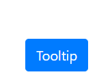
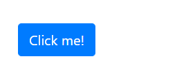
Tooltip with click trigger
The App.js file with App() function will look like this
// src/App.js
import React, { useRef, useState } from 'react';
import './App.css';

import { Overlay, Tooltip, Button } from 'react-bootstrap';
import 'bootstrap/dist/css/bootstrap.min.css';

function App() {

  const [show, setShow] = useState(false);
  const target = useRef(null);

  return (
    <div className="progress-wrapper">
      <Button ref={target} onClick={() => setShow(!show)}>
        Click me!
      </Button>
      <Overlay target={target.current} show={show} placement="right">
        {(props) => (
          <Tooltip  {...props}>
            My Tooltip
          </Tooltip>
        )}
      </Overlay>
    </div >
  );
}

export default App;
We have added the show variable with setter setShow() method using useState(false) to set it false by default.
const [show, setShow] = useState(false);The Button’s ref property is creating reference using target property on <Overlay /> variable
Position of Tooltip
The placement property of OverlayTrigger component takes 'top', 'right', 'bottom' and 'left' values to position the tooltip respective to the element.
<OverlayTrigger
        placement={'top'}
        overlay={
          <Tooltip>
            Tooltip on <strong>Top</strong>.
          </Tooltip>
        }
      >

        <Button>Tooltip on Top</Button>
      </OverlayTrigger>

      <OverlayTrigger
        placement={'right'}
        overlay={
          <Tooltip>
            Tooltip on <strong>Right</strong>.
          </Tooltip>
        }
      >

        <Button>Tooltip on Right</Button>
      </OverlayTrigger>

      <OverlayTrigger
        placement={'left'}
        overlay={
          <Tooltip>
            Tooltip on <strong>Left</strong>.
          </Tooltip>
        }
      >

        <Button>Tooltip on Left</Button>
      </OverlayTrigger>

      <OverlayTrigger
        placement={'bottom'}
        overlay={
          <Tooltip>
            Tooltip on <strong>Bottom</strong>.
          </Tooltip>
        }
      >

        <Button>Tooltip on Bottom</Button>
      </OverlayTrigger>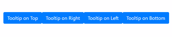
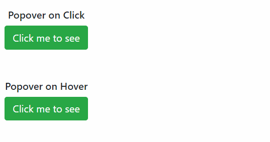
Adding Bootstrap Popovers
To create the Popover, we need to import the Popover component from 'react-bootstrap'.
// src/App.js
import React from 'react';
import './App.css';

import { OverlayTrigger, Popover, Button } from 'react-bootstrap';
import 'bootstrap/dist/css/bootstrap.min.css';

function App() {

  const popover = (
    <Popover id="popover-basic">
      <Popover.Title as="h3">Popover right</Popover.Title>
      <Popover.Content>
        And here's some <strong>amazing</strong> content. It's very engaging.
        right?
      </Popover.Content>
    </Popover>
  );

  return (
    <div className="progress-wrapper">

      <OverlayTrigger trigger="click" placement="right" overlay={popover}>
        <Button variant="success">Click me to see</Button>
      </OverlayTrigger>

    </div >
  );
}

export default App;
In the popover variable, we have passed JSX template for the Popover custom content. Then passed it to the overlay property of the OverlayTrigger component
The trigger property can have 'hover', 'click' or 'focus' type to control the trigger of Popover.
The placement property decides the position of Popover with respect to the element. It can take 'top', 'right', 'bottom' and 'left' value like Tooltip
Conclusion
We looked into the React Bootstrap package module to implement Overlays like Tooltips and Popovers and also discussed its various customizations options available. You can check more details on official documentation.
Adding React Bootstrap in the ReactJs applications can really fasten the app development process by providing the number read to use UI components for multiple device support.
I hope you enjoyed this tutorial. Feel free to share your thoughts in the comment section below.
Thanks for reading!