In this React 16+ tutorial, we’ll learn How to implement Loading Spinners in ReactJs application using React Bootstrap package.
What is a Loader Spinner?
A spinner is an animated loading component displaying a loader in a circular form. These are mainly used to show a user that the task is still in progress but the time it is going to take is indeterminate.
Loader Spinner can have multiple UI forms or animations which are shown until the process is completed.
We’ll implement the Loading Spinner in the React application by installing the React Bootstrap package module.
The React Bootstrap provides a wide variety of ready to use Bootstrap UI components which are exclusively converted and build for React applications.
Let’s go ahead and implement step by step
Create a React Application
First, we’ll create a new React application using npx create-react-app command
$ npx create-react-app react-bootstrap-loaders-appMove inside the react app
$ cd react-bootstrap-loaders-appRun application
$ npm start
Install React Bootstrap Package
After creating the react application, now we’ll install <strong>react-bootstrap</strong> and bootstrap packages by running below command
$ npm install react-bootstrap bootstrap
Adding Loading Spinners in ReactJs App
After installing the react-bootstrap package above, we can easily import the required components.
For adding Loader Spinner, we’ll import Spinner class from 'react-bootstrap'
import { Spinner } from 'react-bootstrap';Next, we need to import the bootstrap.min.css file as well to apply the bootstrap styling
import 'bootstrap/dist/css/bootstrap.min.css';
Simple Loading Spinner
The App.js file with App() function will look like this
// src/App.js
import React from 'react';
import './App.css';

import { Spinner } from 'react-bootstrap';
import 'bootstrap/dist/css/bootstrap.min.css';

function App() {
  return (
    <div>
      <Spinner animation="border" role="status">
        <span className="sr-only">Loading...</span>
      </Spinner>
    </div >
  );
}
export default App;
Animation Style of Spinners
The animation property of <Spinner> takes two style "border"(Default) and "grow"
<h6>Spinner with "Border" Style</h6>
<Spinner animation="border" />

<h6>Spinner with "Grow" Style</h6>
<Spinner animation="grow" />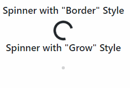
Variants for Spinners
The variant property is used to add different ionic colors of Bootstrap for ‘primary‘ | ‘secondary‘ | ‘success‘ | ‘danger‘ | ‘warning‘ | ‘info‘ | ‘light‘ | ‘dark‘
<Spinner animation="border" variant="primary" />
<Spinner animation="border" variant="secondary" />
<Spinner animation="border" variant="success" />
<Spinner animation="border" variant="danger" />
<Spinner animation="border" variant="warning" />
<Spinner animation="border" variant="info" />
<Spinner animation="border" variant="light" />
<Spinner animation="border" variant="dark" />
<Spinner animation="grow" variant="primary" />
<Spinner animation="grow" variant="secondary" />
<Spinner animation="grow" variant="success" />
<Spinner animation="grow" variant="danger" />
<Spinner animation="grow" variant="warning" />
<Spinner animation="grow" variant="info" />
<Spinner animation="grow" variant="light" />
<Spinner animation="grow" variant="dark" />
Change Size of Spinners
The size of loader Spinners can be changed by adding the size property
<Spinner animation="border" variant="primary" size="sm" />
<Spinner animation="border" variant="secondary" />
<Spinner animation="border" variant="success" size="sm" />
<Spinner animation="border" variant="danger" />
<Spinner animation="border" variant="warning" size="sm" />
<Spinner animation="border" variant="info" />
<Spinner animation="border" variant="light" size="sm" />
<Spinner animation="border" variant="dark" />
<Spinner animation="grow" variant="primary" size="sm" />
<Spinner animation="grow" variant="secondary" />
<Spinner animation="grow" variant="success" size="sm" />
<Spinner animation="grow" variant="danger" />
<Spinner animation="grow" variant="warning" size="sm" />
<Spinner animation="grow" variant="info" />
<Spinner animation="grow" variant="light" size="sm" />
<Spinner animation="grow" variant="dark" />
Conclusion
We looked into the React Bootstrap package module to implement the Spinner UI component and also discussed its various customizations options available.
Adding React Bootstrap in the ReactJs applications can really fasten the app development process by providing the number read to use UI components for multiple device support.
I hope you enjoyed this tutorial. Feel free to share your thoughts in the comment section below.
Thanks for reading!
Leave a Reply