The ion-segment UI components display buttons in a group of a horizontal row.
These button groups are switched on tap with a beautiful sliding effect in Android as well as IOS
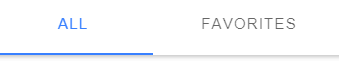
IOS Segment Buttons

Android Segment Buttons
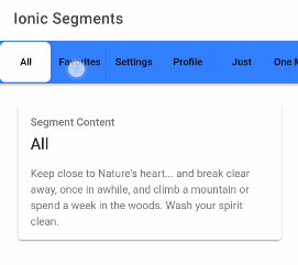
Slidable Segment in Toolbar
Ion Segment component can be used in the toolbar of the component page as shown below:
<ion-header [translucent]="true">: Background color can be changed using default and custom options<ion-toolbar>
<ion-title>
Ionic Segments
</ion-title>
</ion-toolbar><ion-toolbar color="primary">
<ion-segment
value="all"
color="tertiary"
scrollable="true"
mode="ios"
[(ngModel)]="segmentModel"
(ionChange)="segmentChanged($event)"><ion-segment-button value="all">
<ion-label>All</ion-label>
</ion-segment-button><ion-segment-button value="favorites">
<ion-label>Favorites</ion-label>
</ion-segment-button><ion-segment-button value="settings">
<ion-label>Settings</ion-label>
</ion-segment-button><ion-segment-button value="profile">
<ion-label>Profile</ion-label>
</ion-segment-button><ion-segment-button value="just">
<ion-label>Just</ion-label>
</ion-segment-button><ion-segment-button value="onemore">
<ion-label>One More</ion-label>
</ion-segment-button><ion-segment-button value="tofill">
<ion-label>To Fill</ion-label>
</ion-segment-button></ion-segment>
</ion-toolbar>
</ion-header><ion-content [fullscreen]="true" class="ion-padding">
<ion-card *ngIf="segmentModel === 'all'">
<ion-card-header>
<ion-card-subtitle>Segment Content</ion-card-subtitle>
<ion-card-title>All</ion-card-title>
</ion-card-header><ion-card-content>
Keep close to Nature's heart... and break clear away, once in awhile,
and climb a mountain or spend a week in the woods. Wash your spirit clean.
</ion-card-content>
</ion-card><ion-card *ngIf="segmentModel === 'favorites'">
<ion-card-header>
<ion-card-subtitle>Segment Content</ion-card-subtitle>
<ion-card-title>Favorites</ion-card-title>
</ion-card-header><ion-card-content>
Keep close to Nature's heart... and break clear away, once in awhile,
and climb a mountain or spend a week in the woods. Wash your spirit clean.
</ion-card-content>
</ion-card><ion-card *ngIf="segmentModel === 'profile'">
<ion-card-header>
<ion-card-subtitle>Segment Content</ion-card-subtitle>
<ion-card-title>Profile</ion-card-title>
</ion-card-header><ion-card-content>
Keep close to Nature's heart... and break clear away, once in awhile,
and climb a mountain or spend a week in the woods. Wash your spirit clean.
</ion-card-content>
</ion-card><ion-card *ngIf="segmentModel === 'settings'">
<ion-card-header>
<ion-card-subtitle>Segment Content</ion-card-subtitle>
<ion-card-title>Settings</ion-card-title>
</ion-card-header><ion-card-content>
Keep close to Nature's heart... and break clear away, once in awhile,
and climb a mountain or spend a week in the woods. Wash your spirit clean.
</ion-card-content>
</ion-card><ion-card *ngIf="segmentModel === 'just'">
<ion-card-header>
<ion-card-subtitle>Segment Content</ion-card-subtitle>
<ion-card-title>Just</ion-card-title>
</ion-card-header><ion-card-content>
Keep close to Nature's heart... and break clear away, once in awhile,
and climb a mountain or spend a week in the woods. Wash your spirit clean.
</ion-card-content>
</ion-card><ion-card *ngIf="segmentModel === 'onemore'">
<ion-card-header>
<ion-card-subtitle>Segment Content</ion-card-subtitle>
<ion-card-title>One More</ion-card-title>
</ion-card-header><ion-card-content>
Keep close to Nature's heart... and break clear away, once in awhile,
and climb a mountain or spend a week in the woods. Wash your spirit clean.
</ion-card-content>
</ion-card><ion-card *ngIf="segmentModel === 'tofill'">
<ion-card-header>
<ion-card-subtitle>Segment Content</ion-card-subtitle>
<ion-card-title>To Fill</ion-card-title>
</ion-card-header><ion-card-content>
Keep close to Nature's heart... and break clear away, once in awhile,
and climb a mountain or spend a week in the woods. Wash your spirit clean.
</ion-card-content>
</ion-card></ion-content>
</pre>
<pre class="lang:js mark:10,19 decode:true">// home.page.ts
import { Component } from '@angular/core';
@Component({
selector: 'app-home',
templateUrl: 'home.page.html',
styleUrls: ['home.page.scss'],
})
export class HomePage {segmentModel = "favorites";
constructor(
) { }ngOnInit() {
}
segmentChanged(event){
console.log(this.segmentModel);console.log(event);
}}
</pre>
Ion Segment component provides input properties and events to configure its behavior:
<h3>Option Properties:</h3>
<code><strong>color</strong>"primary", "secondary", "tertiary", "success", "warning", "danger", "light", "medium", and"dark".
<strong>disabled</strong>: Segment can be disabled by setting thedisabledproperty totrue.
<strong>mode</strong>: The style of the segment can be changed by setting type"ios" | "md"
<strong>scrollable</strong>: Segments can be scrolled horizontally if segments exceed the screen width.
<strong>value</strong>: To set a default button selected we can usevalueor[(ngModel)]Events
<strong>ionChange</strong>: Emitted when the value property has changed as shown in the example above.Category: Ionic Framework