Ionic UI components prove very helpful in quickly creating responsive view layouts compatible with almost all screen sizes.
But some times we may need a gid system like we rows and columns are popularly known in bootstrap for better and tight distribution of elements Horizontally and Vertically on an app page.
Ionic provides a well-trained Grid system for such tasks.
The ion-grid provides a flexbox custom layout. It is having mainly three components a grid, rows, and columns.
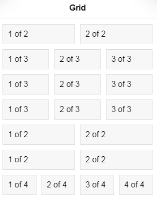
Columns are placed horizontally in a row which can fit automatically by resizing their wdth according to available space in that row.
By default 12 columns can be added in a row but can be customized which we will see in further examples.
Creating Grids:
The simple grid can be created using the following template on the page:
<ion-grid> <ion-row> <ion-col> Col 1 Row 1 </ion-col> <ion-col> Col 2 Row 1 </ion-col> <ion-col> Col 3 Row 1 </ion-col> </ion-row> <ion-row> <ion-col> Col 1 Row 2 </ion-col> <ion-col> Col 2 Row 2 </ion-col> <ion-col> Col 3 Row 2 </ion-col> </ion-row> <ion-row> <ion-col> Col 1 Row 3 </ion-col> <ion-col> Col 2 Row 3 </ion-col> <ion-col> Col 3 Row 3 </ion-col> </ion-row> </ion-grid></pre> <a href="https://www.freakyjolly.com/wp-content/uploads/2019/10/ionic-grid-demo-1.gif"><img class="aligncenter size-full wp-image-2877" src="https://www.freakyjolly.com/wp-content/uploads/2019/10/ionic-grid-demo-1.gif" alt="" width="360" height="314" /></a> A grid is a set of rows with columns which can be created using the following component directives: <h2><strong>IonGrid</strong></h2> The <code>ion-gridis used to add a wrapper around rows and columns of the grid. Under grid wrapper rows are added as vertical structures which is divided into columns to occupy horizontal space to fill row area.Properties:
IonRow
The ion-row component is used to create a single row in the grid layout. Rows are the horizontal structure with varying numbers of columns to fill full row width. By default columns in the row can take full space horizontally and wrap columns to the next line if squeezed. By using the below properties we can modify CSS flexbox properties to override the default behavior.Properties:
fixed: Takes boolean value; If set totruethe grid will have fixed width on the screen size.Column Wrapping:
nowrap: Ifnowrapproperty is added on ion-row, columns will not drop to the next line; Adds CSS propertyflex-wrap: nowrap. wrap-reverse: The columns will wrap in reverse. Adds css propertyflex-wrap: wrap-reverse.Vertically alignment of columns
align-items-start: All columns will be vertically aligned at the top unless they specify their own alignment. Adds css propertyflex-wrap: nowrap. align-items-center: All columns will be vertically aligned in the center, unless they specify their own alignment.Adds CSS propertyflex-wrap: nowrap. align-items-end: All columns will be vertically aligned at the bottom unless they specify their own alignment.; Adds css propertyflex-wrap: nowrap. align-items-stretch: All columns will be stretched to take up the entire height of the row unless they specify their own alignment.; Adds CSS propertyalign-items: stretch. align-items-baseline: All columns will be vertically aligned at their baselines unless they specify their own alignment.; Adds CSS propertyalign-items: baseline.Horizontal alignment of columns
justify-content-start: All columns will be horizontally aligned at the start.; Adds CSS propertyjustify-content: start. justify-content-center: All columns will be horizontally aligned at the center.; Adds CSS propertyjustify-content: center. justify-content-end: All columns will be horizontally aligned at the end.; Adds CSS propertyjustify-content: end. justify-content-around: Adds justify-content: space-around. All columns will be horizontally aligned with equal space around them.; Adds CSS propertyjustify-content: space-around. justify-content-between: Adds justify-content: space-between. All columns will be horizontally aligned with a half-size space on either end.; Adds CSS propertyjustify-content: space-between.IonCol
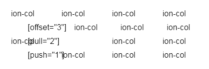
Theion-colcomponent creates a cell/ column in the row. Columns are added inside of a row. They occupy the entire available row space which is divided by columns added in the row. Column alignment can be modified by using the below properties: align-self-start: The column will be vertically aligned at the top; Adds CSS propertyalign-self: flex-start. align-self-center: The column will be vertically aligned in the center; Adds CSS propertyalign-self: center. align-self-end: The column will be vertically aligned at the bottom; Adds CSS propertyalign-self: flex-end. align-self-stretch: The column will be stretched to take up the entire height of the row; Adds CSS propertyalign-self: stretch. align-self-baseline: The column will be vertically aligned at its baseline; Adds CSS propertyalign-self: baseline. size: The number of column space it will take out of total available column slots i:e 12. The default is set to auto to auto-adjust according to available space in the row. offset: Amount of margin added on column start based on total columns available in that row. pull: This adds right CSS property to pull column towards the start of the total available push: This adds left CSS property to colum and push towards the end of row.<ion-grid> <ion-row> <ion-col offset="1"> [offset="3"] </ion-col> <ion-col> ion-col </ion-col> <ion-col> ion-col </ion-col> <ion-col> ion-col </ion-col> </ion-row> <ion-row> <ion-col> ion-col </ion-col> <ion-col pull="2"> [pull="2"] </ion-col> <ion-col> ion-col </ion-col> <ion-col> ion-col </ion-col> </ion-row> <ion-row> <ion-col push="1"> [push="1"] </ion-col> <ion-col> ion-col </ion-col> <ion-col> ion-col </ion-col> <ion-col> ion-col </ion-col> </ion-row> </ion-grid>
Conclusion: Ionic Grid system provides a quick solution to easily distribute and efficiently spread out the content on a page. Ionic Grids are easy to implement and modify according to the needs as explained above.
Category: Ionic Framework