In this Angular 10/9/8/7 Material tutorial, we’ll discuss how to add extra rows and enable Expand and Collapse for single or multiple rows on button click in the material datatable.
Angular material provides a wide variety of UI components, Datatables is one of the topmost used components to create a tabular grid with multiple features and functionality support. The Material Database supports many awesome features like Sorting, Data filter, Pagination, Column and Row freeze, etc.
Today we are going to discuss how to implement Expand and Collapse rows feature in the material data tables. Tables can have varied types of data, sometimes in a hierarchy where each row can in turn have a table or som more data to show. User can click on a row to expand and explore more data which can be loaded from a remote server.
We’ll create a new Angular project, add Material UI package then implement Datatable to explore how to add expand collapse feature. We will add additional row on the table to perform expand/ collapse functionality. There will be a button on top of the grid, a user can click on that button to expand/ collapse multiple rows in the tables.
Let’s start…
Setup a new Angular Project
We’ll create a new Angular project using the Ng CLI tool. Run the following command to set up a new project
$ ng new angular-expand-collapse-datatable
? Would you like to add Angular routing? No
? Which stylesheet format would you like to use? SCSS
Move inside the project directory
$ cd angular-expand-collapse-datatableRun the Angular project
$ ng serve --open
Install & Configure Angular Material
Next, we’ll install the Material UI package in the Angular project to use Datatables. Run the following command and answer a few configurations questions asked
$ ng add @angular/material

? Choose a prebuilt theme name, or "custom" for a custom theme: Indigo/Pink        [ Preview: https://material.angular.io?theme=indigo-pink ]
? Set up global Angular Material typography styles? Yes
? Set up browser animations for Angular Material? Yes
After that, your project will be ready to use Material UI components by importing the required Modules in App Module which we will do next.
Update App Module
The material provides number of UI components, but we only need to import the APIs of required Modules. To create a Material Datatable grid with expandable/ collapsable rows, we will import the MatTableModule, MatListModule and MatButtonModule.
Open the app.module.ts file and update as shown below:
// app.module.ts
import { BrowserModule } from '@angular/platform-browser';
import { NgModule } from '@angular/core';

import { AppComponent } from './app.component';
import { BrowserAnimationsModule } from '@angular/platform-browser/animations';

import { MatTableModule } from '@angular/material/table';
import { MatListModule } from '@angular/material/list';
import { MatButtonModule } from '@angular/material/button';


@NgModule({
  declarations: [
    AppComponent
  ],
  imports: [
    BrowserModule,
    BrowserAnimationsModule,

    // Material Modules for Datatable, List and Buttons
    MatTableModule,
    MatListModule,
    MatButtonModule
  ],
  providers: [],
  bootstrap: [AppComponent]
})
export class AppModule { }
Adding Material Datatable
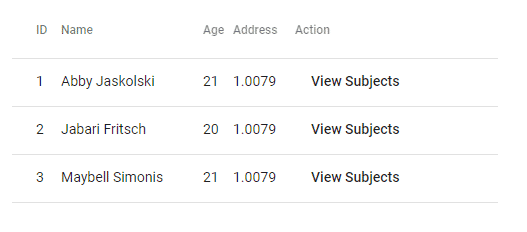
First, we will create a simple Material Datatable representing Students information about subjects.
Each student will have Name, Age and Address details which will be shown in the grid.
In the next step, we will add an expand/collapse feature to display Subjects of each student with Name, Type, and Grade of each subject opted by the student.
Dataset of Students
Let’s have a look at the data object which will be used in our Material Datatable
STUDENTS_DATA = [
    {
       "id":1,
       "name":"Abby Jaskolski ",
       "age":21,
       "address":1.0079,
       "isExpanded":false,
       "subjects":[
          {
             "name":"Bio",
             "type":"Medical",
             "grade":"A"
          },
          {
             "name":"Chemistry",
             "type":"Medical",
             "grade":"A"
          },
          {
             "name":"Physics",
             "type":"Medical",
             "grade":"A"
          }
       ]
    },
    {
       "id":2,
       "name":"Jabari Fritsch",
       "age":20,
       "address":1.0079,
       "isExpanded":false,
       "subjects":[
          {
             "name":"Bio",
             "type":"Medical",
             "grade":"A"
          },
          {
             "name":"Chemistry",
             "type":"Medical",
             "grade":"A"
          },
          {
             "name":"Physics",
             "type":"Medical",
             "grade":"A"
          }
       ]
    },
    {
       "id":3,
       "name":"Maybell Simonis",
       "age":21,
       "address":1.0079,
       "isExpanded":false,
       "subjects":[
          {
             "name":"Bio",
             "type":"Medical",
             "grade":"A"
          },
          {
             "name":"Chemistry",
             "type":"Medical",
             "grade":"A"
          },
          {
             "name":"Physics",
             "type":"Medical",
             "grade":"A"
          }
       ]
    }
 ];
Building Material Datatable
The Material Datatable is created by adding a table with the mat-table directive and [dataSource]="dataStudentsList" property to provide data collection.
In the app.component.html file, place following HTML template
<table mat-table [dataSource]="dataStudentsList">

    <ng-container matColumnDef="id">
      <th mat-header-cell *matHeaderCellDef> ID </th>
      <td mat-cell *matCellDef="let element"> {{element.id}} </td>
    </ng-container>


    <ng-container matColumnDef="name">
      <th mat-header-cell *matHeaderCellDef> Name </th>
      <td mat-cell *matCellDef="let element"> {{element.name}} </td>
    </ng-container>

    <ng-container matColumnDef="age">
      <th mat-header-cell *matHeaderCellDef> Age </th>
      <td mat-cell *matCellDef="let element"> {{element.age}} </td>
    </ng-container>

    <ng-container matColumnDef="address">
      <th mat-header-cell *matHeaderCellDef> Address </th>
      <td mat-cell *matCellDef="let element"> {{element.address}} </td>
    </ng-container>

    <ng-container matColumnDef="actions">
      <th mat-header-cell *matHeaderCellDef> Action </th>
      <td mat-cell *matCellDef="let element">
        <a mat-button href="javascript:void()">View
          Subjects</a>
      </td>
    </ng-container>

    <tr mat-header-row *matHeaderRowDef="displayedStudentsColumnsList;"></tr>
    <tr mat-row *matRowDef="let element; columns: displayedStudentsColumnsList;"></tr>

  </table>
The header and body rows are defined by adding the mat-header-row and mat-row directive having respective definitions *matHeaderRowDef and *matRowDef with Array of the column name in the displayedStudentsColumnsList.
Update App Class
Next, we’ll update the App component class with the DataSource object and Array of columns to display in the table.
Open the app.component.html file and place following code
// app.component.ts
import { Component } from '@angular/core';
import { MatTableDataSource } from '@angular/material/table';


@Component({
  selector: 'app-root',
  templateUrl: './app.component.html',
  styleUrls: ['./app.component.scss']
})
export class AppComponent {

  STUDENTS_DATA = [
    {
      "id": 1,
      "name": "Abby Jaskolski ",
      "age": 21,
      "address": 1.0079,
      "isExpanded": false,
      "subjects": [
        {
          "name": "Bio",
          "type": "Medical",
          "grade": "A"
        },
        {
          "name": "Chemistry",
          "type": "Medical",
          "grade": "A"
        },
        {
          "name": "Physics",
          "type": "Medical",
          "grade": "A"
        }
      ]
    },
    {
      "id": 2,
      "name": "Jabari Fritsch",
      "age": 20,
      "address": 1.0079,
      "isExpanded": false,
      "subjects": [
        {
          "name": "Bio",
          "type": "Medical",
          "grade": "A"
        },
        {
          "name": "Chemistry",
          "type": "Medical",
          "grade": "A"
        },
        {
          "name": "Physics",
          "type": "Medical",
          "grade": "A"
        }
      ]
    },
    {
      "id": 3,
      "name": "Maybell Simonis",
      "age": 21,
      "address": 1.0079,
      "isExpanded": false,
      "subjects": [
        {
          "name": "Bio",
          "type": "Medical",
          "grade": "A"
        },
        {
          "name": "Chemistry",
          "type": "Medical",
          "grade": "A"
        },
        {
          "name": "Physics",
          "type": "Medical",
          "grade": "A"
        }
      ]
    }
  ];


  dataStudentsList = new MatTableDataSource();
  displayedStudentsColumnsList: string[] = ['id', 'name', 'age', 'address', 'actions'];


  ngOnInit() {
    this.dataStudentsList.data = this.STUDENTS_DATA;
  }
}
Now you can run the project to see a simple Datatable.
In the next section, we’ll add the expand/ collapse feature to show Subjects information in the Datagrid.
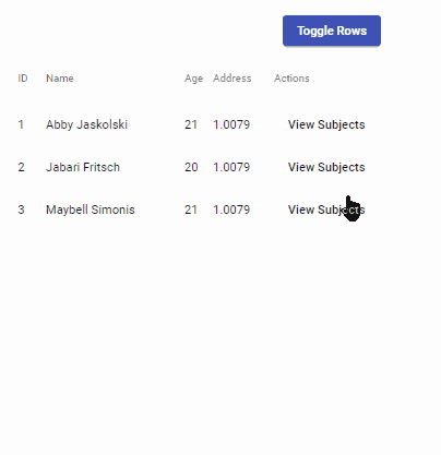
Implement Expand/ Collapse Feature in Material Datatable
In the Datatable, we’ll add an extra row after each existing one to have Subjects information.
This extra row will remain hidden controlled by the isExpanded property having boolean value. We will also add the animation effect to expand and collapse with a smooth transition effect using
Update Datatable Template for Expand/ Collapse Row
Follow these few steps to make changes in the template
Step 1) Adding the multiTemplateDataRows property
The multiTemplateDataRows property is added on the <table> element. This property remains false by default. By adding it allows the Data object to add multiple rows in the datatable.
<table mat-table [dataSource]="dataStudentsList" multiTemplateDataRows>
...
</table>
Step 2) Adding Extra Row
Now we’ll add an extra row with the *matRowDef having one column in the Array
<tr mat-row *matRowDef="let row; columns: ['expandedDetail']" class="student-detail-row"></tr>
Step 3) Template for Expanded Column Row
For the 'expandedDetail' column we’ll add the template.
<ng-container matColumnDef="expandedDetail">
      <td mat-cell *matCellDef="let element" [attr.colspan]="displayedStudentsColumnsList.length">

        <div class="row student-element-detail" [@detailExpand]="element.isExpanded ? 'expanded' : 'collapsed'">
          <mat-list>
            <div mat-subheader>Subjects of {{element.name}}</div>
            <mat-list-item *ngFor="let subject of element.subjects">
              <div mat-line>{{subject.name}}</div>
              <div mat-line> {{subject.type}} | Grade: {{subject.grade}}</div>
            </mat-list-item>
          </mat-list>
        </div>

      </td>
    </ng-container>
In the detail column, we are showing a single table cell expanded to the width of table by setting colspan property to length on actual columns.
The [@detailExpand] is the animation trigger with two states expanded and collapsed determined by the isExpanded boolean property.
The Subjects details are simply shown using the *ngFor loop using the Material list UI component. You can add any type of customized data here.
Step 4) A master Toggle Button
To expand/ collapse all rows of the Material datatable, add a button above the table with (click) event listener.
<a mat-raised-button href="javascript:void()" (click)="toggleTableRows()" color="primary">Toggle Rows</a>
Final Template
The updated app.component.html file will look like this.
<!-- Master Toggle Button -->
  <a mat-raised-button href="javascript:void()" (click)="toggleTableRows()" color="primary">Toggle Rows</a>

  <table mat-table [dataSource]="dataStudentsList" multiTemplateDataRows>

    <ng-container matColumnDef="id">
      <th mat-header-cell *matHeaderCellDef> id </th>
      <td mat-cell *matCellDef="let element"> {{element.id}} </td>
    </ng-container>


    <ng-container matColumnDef="name">
      <th mat-header-cell *matHeaderCellDef> Name </th>
      <td mat-cell *matCellDef="let element"> {{element.name}} </td>
    </ng-container>

    <ng-container matColumnDef="age">
      <th mat-header-cell *matHeaderCellDef> age </th>
      <td mat-cell *matCellDef="let element"> {{element.age}} </td>
    </ng-container>


    <ng-container matColumnDef="address">
      <th mat-header-cell *matHeaderCellDef> address </th>
      <td mat-cell *matCellDef="let element"> {{element.address}} </td>
    </ng-container>


    <ng-container matColumnDef="actions">
      <th mat-header-cell *matHeaderCellDef> actions </th>
      <td mat-cell *matCellDef="let element">
        <a mat-button href="javascript:void()" (click)="element.isExpanded = !element.isExpanded">View
          Subjects</a>
      </td>
    </ng-container>


    <!-- Template for details row -->
    <ng-container matColumnDef="expandedDetail">
      <td mat-cell *matCellDef="let element" [attr.colspan]="displayedStudentsColumnsList.length">

        <div class="row student-element-detail" [@detailExpand]="element.isExpanded ? 'expanded' : 'collapsed'">
          <mat-list>
            <div mat-subheader>Subjects of {{element.name}}</div>
            <mat-list-item *ngFor="let subject of element.subjects">
              <div mat-line>{{subject.name}}</div>
              <div mat-line> {{subject.type}} | Grade: {{subject.grade}}</div>
            </mat-list-item>
          </mat-list>
        </div>

      </td>
    </ng-container>


    <tr mat-header-row *matHeaderRowDef="displayedStudentsColumnsList;sticky: true"></tr>
    <tr mat-row *matRowDef="let element; columns: displayedStudentsColumnsList;" class="student-element-row"
      [class.student-expanded-row]="element.isExpanded"></tr>

    <!-- Extra row to show detail content column -->
    <tr mat-row *matRowDef="let row; columns: ['expandedDetail']" class="student-detail-row"></tr>

  </table>
Update Class Component
Make the following changes in the component class
Step 1) Add Animation Trigger
In the @Component decorator, add the animator property to define trigger with two states
animations: [
    trigger('detailExpand', [
      state('collapsed', style({ height: '0px', minHeight: '0' })),
      state('expanded', style({ height: '*' })),
      transition('expanded <=> collapsed', animate('225ms cubic-bezier(0.4, 0.0, 0.2, 1)')),
    ]),
  ],
The transition() with <=> make sure to apply the animate() transition effect when the state changes from expanded to collapsed or vice-versa.
Step 2) Master Toggle to Expand/ Collapse All Rows
We’ll loop over the Datatable rows to invert the boolean value in the isExpanded property of each row to change the animation state.
toggleTableRows() {
    this.isTableExpanded = !this.isTableExpanded;

    this.dataStudentsList.data.forEach((row: any) => {
      row.isExpanded = this.isTableExpanded;
    })
  }
Final Class
The final class file will look like this
// app.component.ts
import { Component } from '@angular/core';
import { animate, state, style, transition, trigger } from '@angular/animations';
import { MatTableDataSource } from '@angular/material/table';


@Component({
  selector: 'app-root',
  templateUrl: './app.component.html',
  styleUrls: ['./app.component.scss'],
  animations: [
    trigger('detailExpand', [
      state('collapsed', style({ height: '0px', minHeight: '0' })),
      state('expanded', style({ height: '*' })),
      transition('expanded <=> collapsed', animate('225ms cubic-bezier(0.4, 0.0, 0.2, 1)')),
    ]),
  ],
})
export class AppComponent {

  isTableExpanded = false;

  STUDENTS_DATA = [
    {
      "id": 1,
      "name": "Abby Jaskolski ",
      "age": 21,
      "address": 1.0079,
      "isExpanded": false,
      "subjects": [
        {
          "name": "Bio",
          "type": "Medical",
          "grade": "A"
        },
        {
          "name": "Chemistry",
          "type": "Medical",
          "grade": "A"
        },
        {
          "name": "Physics",
          "type": "Medical",
          "grade": "A"
        }
      ]
    },
    {
      "id": 2,
      "name": "Jabari Fritsch",
      "age": 20,
      "address": 1.0079,
      "isExpanded": false,
      "subjects": [
        {
          "name": "Bio",
          "type": "Medical",
          "grade": "A"
        },
        {
          "name": "Chemistry",
          "type": "Medical",
          "grade": "A"
        },
        {
          "name": "Physics",
          "type": "Medical",
          "grade": "A"
        }
      ]
    },
    {
      "id": 3,
      "name": "Maybell Simonis",
      "age": 21,
      "address": 1.0079,
      "isExpanded": false,
      "subjects": [
        {
          "name": "Bio",
          "type": "Medical",
          "grade": "A"
        },
        {
          "name": "Chemistry",
          "type": "Medical",
          "grade": "A"
        },
        {
          "name": "Physics",
          "type": "Medical",
          "grade": "A"
        }
      ]
    }
  ];


  dataStudentsList = new MatTableDataSource();
  displayedStudentsColumnsList: string[] = ['id', 'name', 'age', 'address', 'actions'];


  ngOnInit() {
    this.dataStudentsList.data = this.STUDENTS_DATA;
  }

  // Toggel Rows
  toggleTableRows() {
    this.isTableExpanded = !this.isTableExpanded;

    this.dataStudentsList.data.forEach((row: any) => {
      row.isExpanded = this.isTableExpanded;
    })
  }

}
That’s it we are done with the implementation of Expand/ Collapse Single and Multiple rows in Material database. Now you can run your Angular project to see it working
Demo Link
Find a working demo here.
Source Code
You can find the source code of this application in my GitHub repository here.
Conclusion
We discuss how to implement Expand and Collapse feature in the Material datatable by making few changes in the template HTML. You can also toggle multiple rows in the table using a boolean property in the data source object. The template HTML of the detail expanded row can be modified according to needs we can also put a table to show details.
I hope you enjoyed this tutorial and it was helpful. Do share your thoughts in the comment section…
Thanks for reading…
This is amazing. Thank you.
Great Job! I’m trying with MatSort to order the same table, can you do this?
Thank you for the Tutorial