In this post, we’ll implement Expansion panel which can also be converted into an Accordion component in Angular application using Material UL library.
An Accordion is an interactive component consisting of panels with headers and content section. These panels can be clicked to expand collapse to show description area.
We are very well familiar with jQuery UI library which is having a beautiful accordion component with a number of API options available.
we’ll create a new Angular application then install Material UI library using the latest CLI and Material version 9. After that implement Expansion panel then converts this expansion panel into an Accordion component.
Expansion Panel
In a simple expansion panel, each panel works individually. So we can open multiple panels at the same time. In Angular Material, each expansion panel is created by adding the mat-expansion-panel component.
<mat-expansion-panel> <!-- Panel 1 --> </mat-expansion-panel> <mat-expansion-panel> <!-- Panel 2 --> </mat-expansion-panel></pre> <a href="https://www.freakyjolly.com/wp-content/uploads/2019/06/angular-material-expension-panel-demo.gif"><img class="aligncenter size-full wp-image-4084" src="https://www.freakyjolly.com/wp-content/uploads/2019/06/angular-material-expension-panel-demo.gif" alt="" width="397" height="321" /></a> <h3>Accordion Expansion Panel</h3> An Accordion Panel, on the other hand, has a unique feature, we can open only one expansion panel at a time. You will not be able to open more then one panel if try to do so the clicked panel will open to close previous open panel. We can convert an Expansion panel by simply wrapping the multiple <code>mat-expansion-panelcomponents with amat-accordioncomponent element.<mat-accordion> <mat-expansion-panel> <!-- Panel 1 --> </mat-expansion-panel> <mat-expansion-panel> <!-- Panel 2 --> </mat-expansion-panel> </mat-accordion>
Let's get into more details ...
# Setup Angular CLI
We'll create Angula project in the latest version. Make sure you have updated the Angular CLI tool by running below
npmcommand in the terminal$ npm install -g @angular/cli</pre> <h3># Create an Angular Project</h3> Execute below <code>ngcommand to create an Angular project in latest version 9.1.3. But this tutorial is compatible with previous version 7,6,5 and 4$ ng new angular-material-loaders $ cd angular-material-loaders</pre> <h3></h3> <h3># Install Angular Material in project</h3> After version 8, Angular Material package can be installed by executing the following <code>ngcommand. For configuration, it will ask a few questions related to the theme, browser animations etc$ ng add @angular/material</pre> Answer questions <pre class="wp-block-prismatic-blocks"><code class="language-javascript">? Choose a prebuilt theme name, or "custom" for a custom theme: Indigo/Pink ? Set up global Angular Material typography styles? Yes ? Set up browser animations for Angular Material? Yes</pre> Now our Angular project is ready to use Material components. <h3># Import Material Modules</h3> The Material UI library provides a wide variety of components, so we need to import the API module of the component we are going to use in the App module. Here as we'll be using the Expansion Panel so we need to import <code>MatExpansionModule. Also, we will use form element like button and input so we need to import theMatButtonModule,MatFormFieldModuleandMatInputModulein the app.module.ts file as shown below// app.module.ts import { BrowserModule } from '@angular/platform-browser'; import { NgModule } from '@angular/core'; import { AppRoutingModule } from './app-routing.module'; import { AppComponent } from './app.component'; import { BrowserAnimationsModule } from '@angular/platform-browser/animations'; import { MatExpansionModule } from '@angular/material/expansion'; import { MatButtonModule } from '@angular/material/button'; import { MatFormFieldModule } from '@angular/material/form-field'; import { MatInputModule } from '@angular/material/input'; @NgModule({ declarations: [ AppComponent ], imports: [ BrowserModule, AppRoutingModule, BrowserAnimationsModule, MatExpansionModule, MatButtonModule, MatFormFieldModule, MatInputModule ], providers: [], bootstrap: [AppComponent] }) export class AppModule { }That's it ... we are done with Angular material configuration.
# Adding Expansion Panel
The Expansion panel is created by adding the
mat-expansion-panelelement directive as a wrapper for each panel. Let's discuss Accordion directives which are used in a template to build an Expansion Panel component.Single Expansion Panel
<mat-expansion-panel>in
<mat-expansion-panel-header>
<mat-panel-title>
This is the expansion title
</mat-panel-title>
<mat-panel-description>
This is a summary of the content
</mat-panel-description>
</mat-expansion-panel-header><p>This is the primary content of the panel.</p>
<mat-action-row>
<button mat-button>Click me</button>
</mat-action-row>
</mat-expansion-panel></pre>
<a href="https://www.freakyjolly.com/wp-content/uploads/2019/06/Screenshot_4.jpg"><img class="aligncenter size-full wp-image-2553" src="https://www.freakyjolly.com/wp-content/uploads/2019/06/Screenshot_4.jpg" alt="" width="702" height="312" /></a>
<h4></h4>
<h4></h4>
<h3># Adding Accordion Expansion Panels</h3>
As explained above, an accordion has a feature to keep the only a single panel at a time.To add the capability we need to wrap multiple <code><mat-expansion-panel><mat-accordion>to create an accordion.<mat-accordion>
<mat-expansion-panel>
<mat-expansion-panel-header>
<mat-panel-title>
This is the expansion title
</mat-panel-title>
<mat-panel-description>
This is a summary of the content
</mat-panel-description>
</mat-expansion-panel-header><p>This is the primary content of the panel.</p>
<mat-action-row>
<button mat-button>Click me</button>
</mat-action-row>
</mat-expansion-panel>
<mat-accordion></pre>
<h3># Methods & Properties</h3>
Here are some important methods and properties available
<h3><strong><code><mat-accordion>[multi]: If set to false only one panel can be opened at a time, others will close automatically. If set to true, multiple panels can be opened at the same time.We can also access this directive using a template reference variable to useopenAll()&closeAll()when multi set to true, discuss later in this article.
<mat-expansion-panel>
<strong> [disabled]</strong>: Disable panel
<strong>[expanded]</strong>: Expand panel if set to true and collapse if set to false
<strong>[hideToggle]</strong>: Hide panel toggle indicator
<strong>(opened)</strong>: Event fired when the panel is going to open/ Expand
<strong>(closed)</strong>: Event fired when the panel is going to close/ Collapse
<strong>(afterCollapse)</strong>: After completing the close/ collapse after the animation
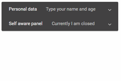
<strong>(afterExpand)</strong>: After completing the open/ expand & after the animation# Dynamic Accordion Template
Here is a dynamic accordion with expansion panels.
<mat-accordionis the template variable to call directive methods like
[displayMode]="flat"
[multi]="true"
#accordion="matAccordion"
><mat-expansion-panel
[disabled]="panel.isDisabled"
[expanded]="panel.isExpanded"
[hideToggle]="true"
(opened)="beforePanelOpened(panel)"
(closed)="beforePanelClosed(panel)"
(afterCollapse)="afterPanelClosed($event)"
(afterExpand)="afterPanelOpened($event)"*ngFor="let panel of accordionList"
#mapanel="matExpansionPanel"
>
<mat-expansion-panel-header>
<mat-panel-title>
<b>Title: {{panel.title}}</b>
</mat-panel-title>
<mat-panel-description>Currently I am {{panel.isExpanded ? 'open' : 'closed'}}
</mat-panel-description>
</mat-expansion-panel-header><p>{{panel.description}}</p>
<mat-action-row>
<button mat-flat-button (click)="mapanel.close()">Click to close</button>
</mat-action-row>
</mat-expansion-panel>
</mat-accordion></pre>
<code>#accordioncloseAll()&openAll()
*ngForis iterating on panel items in theMatAccordion
#mapanelis a template variable added at each panel to call methods available likeclose(),open()&toggle()//app.component.tsobject, we have boolean value to disable and set expand status. Methods available in the component are getting called from template directives.
import { Component, OnInit, ViewChild } from '@angular/core';
import { MatAccordion } from '@angular/material';@Component({
selector: 'app-expansion-demo',
templateUrl: './expansion-demo.component.html',
styleUrls: ['./expansion-demo.component.css']
})
export class ExpansionDemoComponent implements OnInit {
panelOpenState = false;accordionList:any;
@ViewChild('accordion',{static:true}) Accordion: MatAccordion
constructor() {
this.accordionList = [
{
id:"panel-1",
title:"Panel One",
description:"Description One",
isDisabled:false,
isExpanded:false
},{
id:"panel-2",
title:"Panel Two (Disabled)",
description:"Description Two",
isDisabled:true,
isExpanded:false
},{
id:"panel-3",
title:"Panel Three",
description:"Description Three",
isDisabled:false,
isExpanded:true
},
]
}ngOnInit() {
}beforePanelClosed(panel){
panel.isExpanded = false;
console.log("Panel going to close!");
}
beforePanelOpened(panel){
panel.isExpanded = true;
console.log("Panel going to open!");
}afterPanelClosed(){
console.log("Panel closed!");
}
afterPanelOpened(){
console.log("Panel opened!");
}closeAllPanels(){
this.Accordion.closeAll();
}
openAllPanels(){
this.Accordion.openAll();
}}
</pre>
In the <code>accordionList
Conclusion: Angular Material provides a number of components which are very easy to implement and less buggy these days. The accordion component is very common and quick to implement.
Category: Angular
