In this Angular Material tutorial, we’ll learn how to implement Material Datepicker in the application and change the selected date format in the Input field control after selection using moment library by using minimal configuration and quick ways.
Angular Material provides a number of components that can be easily used in the project, one of them is Datepicker. To implement the Datepicker component we use the MatDatepickerModule API.
Let’s quickly create a new Angular project and install the Material UI library
Setup Angular CLI
First, install or update the Angular CLI tool to the latest version by running the below NPM command
$ npm install -g @angular/cliYou can check the version of Angular currently installed
$ ng --version
Angular CLI: 10.0.3
Node: 12.15.0
OS: win32 x64
Create a New Angular Application
Run the following ng command to create a new Angular project
$ ng new angular-mat-datepicker-format
# ? Would you like to add Angular routing? No
# ? Which stylesheet format would you like to use? SCSS
Enter the project directory
$ cd angular-mat-datepicker-formatRun the application
$ ng serve --open
Install Material Package
After creating the Angular project, install the Material UI library by hitting the following ng command
$ ng add @angular/material
? Choose a prebuilt theme name, or "custom" for a custom theme: Indigo/Pink
? Set up global Angular Material typography styles? No
? Set up browser animations for Angular Material? Yes
Using Datepicker Modules
There is a number of Modules available in the Material package, so we need to import the required modules which will be used in the application.
For using the Material Datepicker, we’ll import the MatDatepickerModule. The Datepicker also needs an Adapter to work with Javascript Date methods. There are three options available for Date Adapters.
MatNativeDateModule: Uses native Javascript Date methods.MatMomentDateModule: Uses Moment.js library to work with Date methods.- Custom
DateAdapter: We can also create our own customized Date adapter.
The MatMomentDateModule can be used to show multiple Supported locales which are only 'en-US' for MatNativeDateModule.
Even the Material team says “We highly recommend using the MomentDateAdapter or a custom DateAdapter that works with the formatting/parsing library of your choice.”
If we don’t import any adapter the Material will return this error:
ERROR Error: MatDatepicker: No provider found for DateAdapter. You must import one of the following modules at your application root: MatNativeDateModule, MatMomentDateModule, or provide a custom implementation.To better parse the Date formats in Datepicker, we are going to use Moment.js package library and Adapter as it provides more support by wrapping the native Javascript Date() method.
Install Moment Package
Moment.js is a popular library to provide support for Date related operation in the application. You can check more on its official portal.
Run the following ng command to install the moment package in Angular project
$ npm install momentAlso, install the material adapter for the moment
$ npm install @angular/material-moment-adapter
Import Datepicker and Adapter in App Module
After installing the Material and Moment package, import the MatDatepicker and MatMomentDateModule. The MatInputModule module is also required to use Input control and FormsModule to use [(ngModel)].
In the providers array, we’ll define the MAT_DATE_FORMATS with useValue:MY_FORMATSto declare your own custom formate need to be used.
so the app.module.ts file will look like this:
// app.module.ts
import { BrowserModule } from '@angular/platform-browser';
import { NgModule } from '@angular/core';

import { AppComponent } from './app.component';
import { BrowserAnimationsModule } from '@angular/platform-browser/animations';
import { FormsModule } from '@angular/forms';

import { MatDatepickerModule } from '@angular/material/datepicker';
import { MatInputModule } from '@angular/material/input';
import { MAT_DATE_FORMATS } from '@angular/material/core';
import { MatMomentDateModule } from "@angular/material-moment-adapter";

const MY_FORMATS = {
  parse: {
    dateInput: 'DD MMMM YYYY',
  },
  display: {
    dateInput: 'DD MMMM YYYY',
    monthYearLabel: 'MMMM YYYY',
    dateA11yLabel: 'LL',
    monthYearA11yLabel: 'MMMM YYYY',
  },
};

@NgModule({
  declarations: [
    AppComponent
  ],
  imports: [
    BrowserModule,
    BrowserAnimationsModule,
    FormsModule,

    MatDatepickerModule,
    MatMomentDateModule,

    MatInputModule,
  ],
  providers: [
    { provide: MAT_DATE_FORMATS, useValue: MY_FORMATS },
  ],
  bootstrap: [AppComponent]
})
export class AppModule { }
You can also provide the MAT_DATE_FORMATS at the component level. Here we are setting it globally by defining inside the root module.
Add Datepicker in Template
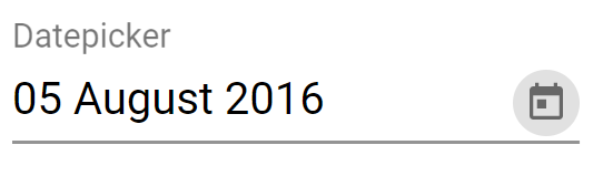
The Material Datepicker is created by adding the <mat-datepicker /> component with <input [matDatepicker] /> as shown below:
<mat-form-field appearance="fill">
<mat-label>Datepicker</mat-label>
<input matInput [matDatepicker]="mydate" [(ngModel)]="date" (dateInput)="addEvent('input', $event)"
(dateChange)="addEvent('change', $event)">
<mat-datepicker-toggle matSuffix [for]="mydate"></mat-datepicker-toggle>
<mat-datepicker #mydate>
</mat-datepicker>
</mat-form-field>
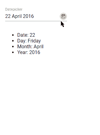
<ul>
<li>Date: {{selDate}}</li>
<li>Day: {{selDay}}</li>
<li>Month: {{selMonth}}</li>
<li>Year: {{selYear}}</li>
</ul>On the <input/> we have [(ngModel)] and event handlers to watch date change.
Update App Component Class
We don’t have much to do inside the App components class. Here we’ll import the moment class to use its method to assign default date and perform Date operations instead of the Date() native javascript method.
// app.component.ts
import { Component } from '@angular/core';
import { MatDatepickerInputEvent } from '@angular/material/datepicker';

import * as _moment from 'moment';
const moment = _moment;

@Component({
  selector: 'app-root',
  templateUrl: './app.component.html',
  styleUrls: ['./app.component.scss']
})
export class AppComponent {
  title = 'angular-mat-datepicker-format';

  date = moment();

  selDate: string;
  selDay: string;
  selMonth: string;
  selYear: string;

  addEvent(type: string, event: MatDatepickerInputEvent<Date>) {
    this.date = moment(event.value);
    this.selDate = this.date.format('DD');
    this.selDay = this.date.format('dddd');
    this.selMonth = this.date.format('MMMM');
    this.selYear = this.date.format('YYYY');
  }

}
That’s it now you can run the application by executing $ ng serve --open.
Conclusion
The Moment library is very popular among developers due to its build-in feature method helping out in making life easy. Even the material team agreed is using the Moment Date Adapter instead of the native Date method due to its wide support for worldwide support for locales. You can check more details here.
Here we discussed how to easily change the Angular Material Datepicker format across application by defining inside the App module at the root.
I hope this was helpful. Do share your comments and feedback.
Stay Safe!