Echarts In Angular project using the ngx-echarts we are going to discuss in this tutorial. The Echarts is javascript based library that provides a wide variety of highly customizable charting options for web applications. The ngx-echarts package module is exclusively customized for Angular projects which can be used to build echart library-based charts in a react application using an Angular framework.
The data information on a page can be converted into graphical interfaces to explore more information out of data with interactive units. Adding charts on a page to represent data adds a lot of value for great user experience and enhancing the overall eye-catching value on-page. Using the Echarts charting library we can create highly interactive, responsive, beautiful looking animation enriched charts on the web application.
Before we start let’s have a look at the library we are going to discuss.
About Echarts
Echarts is an open-source community-powered charting library, managed by a good number of contributors and backed by apache The Echarts library uses the HTML5 based canvas element to build highly interactive charts. These charts can be configured to a much extent, moreover, it enables to merge of different type of charts into a single representation very easily. We can build a wide variety of charts including Line, Bar, Pie, Scatter, Geographical/ Maps based, Radar, Heatmap, Gauge, 3D, Tree charts and much more
What is ngx-echarts?
The Echarts library is converted exclusively for Angular projects to be used in a modular-based architecture. In the Angular project, we need to install the ngx-echarts package module to use charts in the Angular application.
There are few Chart libraries that provide a number of production chart types and free at the same time. E-Charts provides an awesome option sets using which we can configure and create any type of graphical chart. These charts can fulfill any real-world graphical representation of data.
After D3 I find this one a real competitor to choose from. There are a variety of charts we can build using E-Charts library and extinctions like:
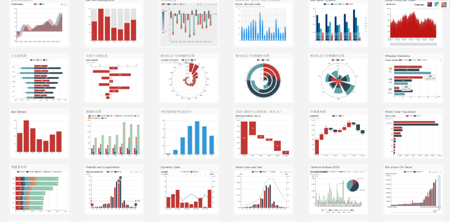
- Line, Bar, Pie, Scatter
- GEO/ Country Map-based
- Candlestick, Waterfall
- Radar, Heatmap, Graph
- Complex Lines, Tree, Treemap Funnel, Gauge Charts
and many more …
Moreover this, E-Charts are very easy and clear to implement with loads of example and documentation support.
These charts are created on canvas and responsive to support multiple device screen sizes.
Let’s check quick tutorials to implement some important types of charts in Angular application.
This tutorial is compatible with Angular 6+ to latest version 9
Version Check
Angular CLI: 9.0.7
Create a new Angular project
Run the following command to create a new Angular project using Angular CLI
$ ng new angular-echarts-tutorial
? Would you like to add Angular routing? No
? Which stylesheet format would you like to use? CSS
Chart Components in Angular project
We’ll create different components for each chart type. Run following ng generate command in the Angular CLI to create new chart component sunder charts directory
$ ng generate component charts/line-chart
Install E-Charts Library Packages
To use E-Chart in Angular application, we will install echarts, ngx-echarts and @types/echarts packages using NPM as shown below:
$ npm install echarts -S
$ npm install ngx-echarts -S
$ npm install @types/echarts -D
The -S option will install it for production and development and -D denotes for development only.
Update App Module
After installation, update the app.module.ts file. Add the NgxEchartsModule in imports array as shown below:
// app.module.ts
import { BrowserModule } from '@angular/platform-browser';
import { NgModule } from '@angular/core';

import { AppRoutingModule } from './app-routing.module';
import { AppComponent } from './app.component';

import { NgxEchartsModule } from 'ngx-echarts';

@NgModule({
  declarations: [
    AppComponent
  ],
  imports: [
    BrowserModule,
    AppRoutingModule,

    NgxEchartsModule
  ],
  providers: [],
  bootstrap: [AppComponent]
})
export class AppModule { }
Line Chart in Angular using Echarts
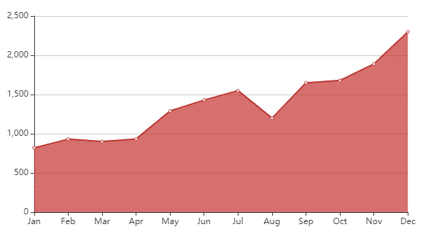
A line chart or line plot or line graph or curve chart is a type of chart that displays data as a series of data points called ‘markers’ connected by straight line segments.
We’ll create a line chart to represent the earnings of a store during calendar months.
Open the charts > <strong>line-chart.component.ts</strong> file and update with following code
// line-chart.component.ts
import { Component } from '@angular/core';
import { EChartOption } from 'echarts';

@Component({
  selector: 'app-line-chart',
  templateUrl: './line-chart.component.html',
  styleUrls: ['./line-chart.component.css']
})
export class LineChartComponent {

  chartOption: EChartOption = {
    xAxis: {
      type: 'category',
      boundaryGap: false,
      data: ['Jan', 'Feb', 'Mar', 'Apr', 'May', 'Jun', 'Jul', 'Aug', 'Sep', 'Oct', 'Nov', 'Dec']
    },
    yAxis: {
      type: 'value'
    },
    series: [{
      data: [820, 932, 901, 934, 1290, 1430, 1550, 1200, 1650.1450, 1680.1890],
      type: 'line',
      areaStyle: {}
    }]
  }

}
Update the template with a div having the echarts directive and [options] property to define data and other configurations
<div echarts [options]="chartOption" class="demo-chart"></div>This will create a line chart as shown below:
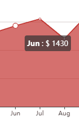
Adding Tooltip
Tooltips play an important part to communicate more on a data point. In the echarts a tooltip can be integrated by adding the tooltip property in the options object.
The tooltip > formatter property can be used to format the content of a tooltip.
  chartOption: EChartOption = {
    xAxis: {
      type: 'category',
      boundaryGap: false,
      data: ['Jan', 'Feb', 'Mar', 'Apr', 'May', 'Jun', 'Jul', 'Aug', 'Sep', 'Oct', 'Nov', 'Dec']
    },
    yAxis: {
      type: 'value'
    },
    tooltip: {
      trigger: 'item',
      showDelay: 0,
      transitionDuration: 0.2,
      formatter: function (params) {
        return `<b>${params['name']}</b> : $ ${params['value']}`;
      }
    },
    series: [{
      data: [820, 932, 901, 934, 1290, 1430, 1550, 1200, 1650.1450, 1680, 1890, 2300],
      type: 'line',
      areaStyle: {}
    }]
  }
Conclusion
The Echart charting library provides a number of configuration options, adding multiple axis for Y and X, formatting the tooltip content, adding click events, rendering with dynamic data. Here we discussed how to integrate the Echarts using the ngx-echarts package module to create multiple types of charts.
You can visit its official site to check various types of charts and demos available. The options can be configured to create highly productive charts.