In this Angular Material tutorial, we’ll learn How to Add Tooltip using Material UI matTooltip component in the Angular 10/9/8/7/6/5/4 project.
The tooltip component is a piece of information shown to the user for actions. Tooltips prove very handy for developers to communicate with users with useful messages in the application. The best thing is developer doesn’t need to care about space as they are overlays floating above content.
Angular material provides a number of useful components that are very easy to use after configuration.
In this article, we will discuss How to add Angular Material Tooltip in the application. There is a number of parameters and options available for customizing tooltip behavior.
Also, we’ll check how to conditionally show Tooltip on an element using expressions and customize look and feel using custom CSS stylings.
Let’s get started!
Setup Angular CLI
We’ll create the Angular project in the latest version. Make sure you have updated the Angular CLI tool by running below npm command in the terminal
$ npm install -g @angular/cli
Create an Angular Project
Execute below ng command to create an Angular project.
$ ng new angular-material-tooltips
$ cd angular-material-tooltips
Install Angular Material in project
After version 8, the Angular Material package can be installed by executing the following ng command. For configuration, it will ask a few questions related to the theme, browser animations, etc
$ ng add @angular/materialAnswer configuration questions
? Choose a prebuilt theme name, or "custom" for a custom theme: Indigo/Pink
? Set up global Angular Material typography styles? Yes
? Set up browser animations for Angular Material? Yes
Now our Angular project is ready to use Material components.
Import Material Modules
The Material UI library provides a wide variety of components, so we need to import the API module of the component we are going to use in the App module.
To use the Tooltip component in the Material library, we’ll import the MatTooltipModule module in the app.module.ts file as shown below:
// app.module.ts
import { BrowserModule } from '@angular/platform-browser';
import { NgModule } from '@angular/core';

import { AppComponent } from './app.component';
import { BrowserAnimationsModule } from '@angular/platform-browser/animations';

import { MatTooltipModule } from '@angular/material/tooltip';

@NgModule({
  declarations: [
    AppComponent
  ],
  imports: [
    BrowserModule,
    BrowserAnimationsModule,

    MatTooltipModule
  ],
  providers: [],
  bootstrap: [AppComponent]
})
export class AppModule { }
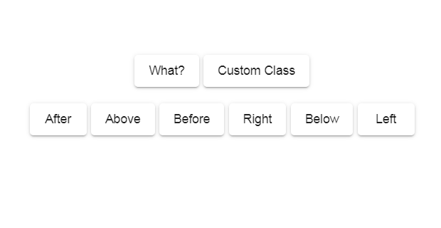
Add a Basic Material Tooltip
To show tooltip on any element add matTooltip directive with text
<button
  matTooltip="This is simple Tooltip">
      Simple Tooltip
</button>
Position of Tooltip
The matTooltipPosition property is used to position tooltip. Available options are
<button
matTooltip="Info about the action"
matTooltipPosition="after">
Tooltip with Position
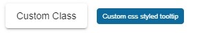
</button>How to Add Custom Style to Tooltip
Tooltip style can be changed by adding a custom class using the matTooltipClass property
 <button
        matTooltip="Info about the action"
        matTooltipClass="custom-tooltip-blue">
  Custom Tooltip
</button>
Then add the CSS style in the SCSS file
/* styles.css */
.custom-tooltip-blue{
    background-color: #0C6A9E;
    color: #ffffff;
}
Add Delay to show/ hide the tooltip
Custom delay can be added to show/ hide tooltip using the matTooltipShowDelay & matTooltipHideDelay properties with time value in milliseconds
<button
        matTooltip="Info about the action"
        matTooltipShowDelay="1000"
        matTooltipHideDelay="2000">
  Delayed Tooltip
</button>
How to Disable/ Enable Tooltip
<button
        matTooltip="Info about the action"
        matTooltipDisabled="true">
  Disabled Tooltip
</button>
we can use this property to conditionally show hide the tooltip by adding expressions
<button matTooltip="Info about the action" matTooltipDisabled="isTooltipDisabled ? true : false"> Conditional Tooltip </button>Manually Show/ Hide/ Toggle tooltip
To manually control tooltip programmatically we can call show(),hide() or toggle() method by using #template variable. Using template variable tooltips can be controlled from the component as well.
<button
        #tooltip="matTooltip"
        matTooltip="Info about the action" >
  Manual Tooltip
</button>
<button
      (click)="tooltip.show()">
  Show
</button>
<button
      (click)="tooltip.hide()">
  Hide
</button>
<button
      (click)="tooltip.toggle()">
  Toggle
</button>
Here we used #tooltip="matTooltip" property to expose its methods inside the class component using the @ViewChild decorator.
<div#tooltip="matTooltip" matTooltip="Info about the action"> Manual Tooltip </div>

<button (click)="showTooltip()"> Show </button>
<button (click)="hideTooltip()"> Hide </button>
<button (click)="toggleTooltip()"> Toggle </button>
Class component methods
// app.component.ts
import { Component, ViewChild } from '@angular/core';
import { MatTooltip } from '@angular/material/tooltip';

@Component({
  selector: 'app-root',
  templateUrl: './app.component.html',
  styleUrls: ['./app.component.scss']
})
export class AppComponent {
  title = 'tooltip-demo';

  @ViewChild('tooltip') tooltip: MatTooltip

  showTooltip() {
    this.tooltip.show();
  }
  hideTooltip() {
    this.tooltip.hide();
  }
  toggleTooltip() {
    this.tooltip.toggle();
  }
}
Angular material tooltips are very easy to implement and configure as per needs. These can be used to make the application more directed and user-friendly.
Conclusion
That’s how we can Implement Material tooltips with various properties to control and customize its behavior.