Using models in application really helps by adding a new layer of space on-page to add more information to users. They are the very common and most preferred way of displaying data.
Bootstrap modals in an Angular project are super easy to add and use anywhere in the project. But modals opens on some underlying data that a user can miss when modal is open. It can be closed easily but what if there is some hard filled data?
In this tutorial, we will add an extra amazing feature of dragging the Bootstrap modal using a handle using which a user can drag the modal a bit to see underlying info then simply release the icon to revert its original position.
Sounds great? let’s do it in just 2 steps 🙂
Adding Ng-bootstrap in Angular Project
First, to use bootstrap modals, let’s quicky install bootstrap to Angular project:
Run following NPM command in terminal:
$ npm install --save @ng-bootstrap/ng-bootstrapNow open the app.module.ts file then add in imports array as shown below:
import {NgbModule} from '@ng-bootstrap/ng-bootstrap';

@NgModule({
  ...
  imports: [NgbModule, ...],
  ...
})
export class YourAppModule {
}
Next, add Bootstrap.css in Project. The best method is to include it in index.html file’s head section:
<!doctype html>
<html lang="en">

<head>
  <meta charset="utf-8">
  <title>Angular Project</title>
  <base href="/">
  <meta name="viewport" content="width=device-width, initial-scale=1">
  <link rel="icon" type="image/x-icon" href="favicon.ico">
  <!-- Bootstrap CSS -->
  <link rel="stylesheet" href="https://stackpath.bootstrapcdn.com/bootstrap/4.4.1/css/bootstrap.min.css">
</head>

<body>
  <app-root></app-root>
</body>

</html>
Add Bootstrap Modal
Here we have created a new component DraggablemodalComponent which will show up in modal for demo.
Run the following command to create using ng cli’s generate command:
$ ng generate component components/draggablemodalNow replace the contents of draggablemodal.component.html file with following code:
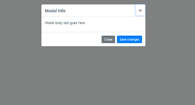
<div class="modal-header">
<h5 class="modal-title">Modal title</h5>
<button type="button" class="close" data-dismiss="modal" (click)="activeModal.close('close')">
<span aria-hidden="true">×</span>
</button>
</div>
<div class="modal-body">
<p>Modal body text goes here.</p>
</div>
<div class="modal-footer">
<button type="button" class="btn btn-secondary" data-dismiss="modal">Close</button>
<button type="button" class="btn btn-primary">Save changes</button>
</div>Open Modal
In app.component.ts file add openModal method which will be called from template:
<button type="button" class="btn btn-info" (click)="openModal()">Open Modal</button>// app.component.ts
import { Component } from '@angular/core';
import { NgbModal } from '@ng-bootstrap/ng-bootstrap';
import { DraggablemodalComponent } from './components/draggablemodal/draggablemodal.component';
@Component({
selector: 'app-root',
templateUrl: './app.component.html',
styleUrls: ['./app.component.css']
})
export class AppComponent {
title = 'angular-demo-project';
constructor(
private modalService: NgbModal,
) { }
openModal(){
const modalRef = this.modalService.open(DraggablemodalComponent, {
// scrollable: true,
// windowClass: 'customClass',
// keyboard: false,
// backdrop: 'static'
});
modalRef.result.then(
result => {
console.log(result);
},
reason => {}
);
}
}
Here we also need to import the NgbModal class to call its open method where we passed the modal component.
Make Bootstrap Modal Draggable
Now we have working Angular Bootstrap Modal, let’s add Drag functionality:
Step 1) We will use the jQuery UI Draggable method, so include jQuery and jQuery UI libraries in index.html as shown below:
...
...
<body>
  <app-root></app-root>


  <!-- For Draggable -->
  <script src="https://code.jquery.com/jquery-3.3.1.min.js" crossorigin="anonymous"></script>
  <script src="https://code.jquery.com/ui/1.12.1/jquery-ui.min.js" crossorigin="anonymous"></script>

</body>
...
...
Step 2) Now open component of Modal which is DraggablemodalComponent in our case then call the draggable method in ngOnInit hook:
// draggablemodal.component.ts
import { Component, OnInit } from '@angular/core';
import { NgbActiveModal } from '@ng-bootstrap/ng-bootstrap';

declare var $: any;

@Component({
  selector: 'app-draggablemodal',
  templateUrl: './draggablemodal.component.html',
  styleUrls: ['./draggablemodal.component.css']
})
export class DraggablemodalComponent implements OnInit {

  constructor(
    // Close Bootstrap Modal
    public activeModal: NgbActiveModal
  ) { }

  ngOnInit() {

    $(document).ready(function () {
      let modalContent: any = $('.modal-content');
      modalContent.draggable({
        handle: '.modal-header',
        revert: true,
        revertDuration: 300
      });
    });

  }

}
That’s it now when you will open modal, it can be dragged on screen after releasing mouse it will go back to the original position as we have set the revert property to true.
awesome!!!!!!!!!!!!!!!!!!! you helped me so much