Using Angular’s Animation package we can implement custom animation in our project which adds up a lot of value to the application by improving the way it behaves in front of users.
We will go from basic to advance level with examples. So let’s begin…
Enable Animations
The two main modules which are required for animations are @angular/animations and @angular/platform-browser which are installed by default if the project is created using NgCLI tool.
So here we just need to import the BrowserAnimationsModule in our app.module.ts file:
// app.module.ts
import { NgModule } from '@angular/core';
import { BrowserModule } from '@angular/platform-browser';
import { BrowserAnimationsModule } from '@angular/platform-browser/animations';

@NgModule({
  imports: [
    BrowserModule,
    BrowserAnimationsModule
  ],
  declarations: [ ],
  bootstrap: [ ]
})
export class AppModule { }
That’s it we are ready to use animations in our component.
Adding Animations
Animations in a component are enabled by adding the animations array in @Component metadata.
The animations array, in turn, will have triggers.
@Component({
  selector: 'app-root',
  templateUrl: 'app.component.html',
  styleUrls: ['app.component.css'],
  animations: [
    // animation triggers go here
  ]
})
Triggers
The triggers method takes a name and metadata as an array of states. There can be an array of triggers under animations property
  animations: [
    trigger('divState',[
      // different states here
    ])
  ]
States
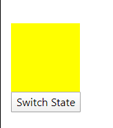
The state is simply a way to putting style with some style for example here we have two states
<div style="height: 100px; width: 100px;" [@divState]="stateName" ></div>

<button (click)="switchState()">Switch State</button>
In the App Component update animations property and also add switchState() method
// app.component.ts
import { Component, OnInit } from '@angular/core';
import {
  trigger,
  state,
  style
} from '@angular/animations';

@Component({
  selector: 'app-root',
  templateUrl: './app.component.html',
  styleUrls: ['./app.component.css'],
  animations: [
    trigger('divState',[
      state('yellowbox',style({
        backgroundColor:'yellow',
        transform:'translateX(0)'
      })),
      state('redbox',style({
        backgroundColor:'red',
        transform:'translateX(250)'
      }))
    ])
  ]
})
export class AppComponent implements OnInit{

  stateName='yellowbox'

  constructor(
   ) { }

   switchState(){
    this.stateName = this.stateName === 'yellowbox' ? 'redbox' : 'yellowbox'
   }

   ngOnInit(){
   }

}
Transitions
With state, we can use transition method to animate with a smooth transition from one state to other
// app.component.ts
import { Component, OnInit } from '@angular/core';
import {
trigger,
state,
style,
transition,
animate
} from '@angular/animations';
@Component({
...
...
animations: [
trigger('divState',[
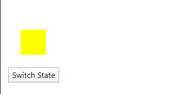
state('yellowbox',style({
backgroundColor:'yellow',
transform:'translateX(0) scale(0.5)'
})),
state('redbox',style({
backgroundColor:'red',
transform:'translateX(250px) scale(1)'
})),
transition('yellowbox => redbox',animate(500)),
transition('redbox => yellowbox',animate(500)),
//transition('redbox <=> yellowbox',animate(500)),
])
]
})
export class AppComponent implements OnInit{
...
...
}
Keyframes
To define the state of animation during the transition at each point of time we use keyframes.
The keyframes method is available in the animate method’s metadata
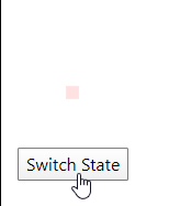
      transition('redbox => yellowbox',
        animate(500,
          keyframes([
            style({
              transform: 'translateX(0px) scale(0.1)',
              opacity: 0.1,
              offset: 0
            }),
            style({
              transform: 'translateX(10px) scale(0.2)',
              opacity: 0.2,
              offset: 0.2
            }),
            style({
              transform: 'translateX(30px) scale(0.5)',
              opacity: 0.5,
              offset: 0.5
            }),
            style({
              transform: 'translateX(150px) scale(1)',
              opacity: 1,
              offset: 1
            })
          ])
        )
      ),
Above every keyframe is equally divided but we can control it using the offset property which starts from 0 to 1 to cover the animation time which is 500 ms.
      transition('redbox => yellowbox',
        animate(500,
          keyframes([
            style({
              transform: 'translateX(0px) scale(0.1)',
              opacity: 0.1,
              offset: 0
            }),
            style({
              transform: 'translateX(0px) scale(0.2)',
              opacity: 0.2,
              offset: 0.2
            }),
            style({
              transform: 'translateX(0px) scale(0.5)',
              opacity: 0.5,
              offset: 0.5
            }),
            style({
              transform: 'translateX(0px) scale(1)',
              opacity: 1,
              offset: 1
            })
          ])
        )
      ),
Animation Callbacks
Yes! Callbacks are also available which get triggered after completion of an animation
There two callback events available start and done which are used with the same selector
<div style="height: 100px; width: 100px;"
    [@divState]="stateName"
    (@divState.start)="animationStarted($event)"
    (@divState.done)="animationDone($event)">
</div>